Data and Statistics
Not sure you’re ready?
Take the ~3-minute readiness diagnostic and see where you stand.
A solitary measurement—the exact temperature of a cup of coffee at 8:00 AM or the height of a specific oak tree—tells us a single, isolated fact about the universe at one specific moment. But the world is rarely so uniform. If we measure the temperature of a hundred cups of coffee poured across a city, or the heights of a thousand trees in a forest, we immediately encounter a fundamental property of nature: variation. Data and statistics represent our mathematical toolkit for making sense of this variation. By organizing a chaos of individual measurements into recognizable patterns, we uncover the hidden structures governing everything from student test scores to planetary orbits.
To do statistics, we must begin by asking the right kind of question. We differentiate strictly between deterministic inquiries and statistical ones based entirely on how we expect the world to answer us.
A question with a single deterministic fact as an answer is not a statistical question. If you ask, "What is the exact height of the Empire State Building?", you are asking for a fact. There is no spread; there is no distribution. Conversely, a statistical question anticipates variability in the data collected to answer the question. If you ask, "What are the heights of the skyscrapers in New York City?", you are anticipating a collection of differing numbers. It is this very variability that necessitates the tools of statistics to summarize, describe, and interpret the data.
When confronted with a massive list of varying numbers, the human mind naturally asks, "What is the typical value?" We answer this by finding a "center," but importantly, there are multiple, mathematically distinct ways to define the center of a dataset.
The Mean: The Mathematical Balance Point
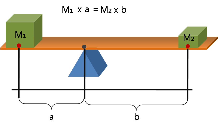
The mean is the mathematical sum of all data values divided by the total number of data values. If we imagine our data points sitting on a number line like physical weights on a seesaw, the mean represents the mathematical balance point for a set of numerical data. It is the precise fulcrum where the weight of the values below it perfectly balances the weight of the values above it.
The Median: The Middle Ground
The median is the exact middle value of a dataset ordered from least to greatest. To find it, you must first sort your data. If you have an odd number of data points, the median is the lone number standing in the dead center. However, the median of an even-numbered dataset is the arithmetic mean of the two middlemost values.
Why two different centers? The mean cares about the magnitude of every single number. The median only cares about their order. This makes the median a mathematically resistant measure of center. Extreme statistical outliers rarely alter the median of a large dataset because a wildly large number at the end of a list is still just one position away from the center. An extreme outlier value disproportionately affects the mean compared to the median, violently shifting the "balance point" toward itself while leaving the median untouched.
The Mode: The Popular Vote
The mode is the specific value appearing most frequently in a dataset. Unlike the mean or median, the mode has fascinating behavioral quirks:
- A numerical dataset can have exactly one statistical mode.
- A numerical dataset can have multiple statistical modes simultaneously (such as a bimodal distribution where two values tie for highest frequency).
- A numerical dataset can have zero statistical modes, which happens when every value appears exactly once.
Data is rarely static. If we add or remove observations, our statistical summaries react predictably.
Shifting the Mean
Because the mean includes every value in its calculation, injecting new information changes the balance point:
- Adding a new data value strictly greater than the current mean increases the overall mean of the dataset.
- Adding a new data value strictly less than the current mean decreases the overall mean of the dataset.
- Adding a new data value exactly equal to the current mean results in no change to the overall mean. You are simply adding weight directly onto the fulcrum of the seesaw.
Measuring and Shifting the Spread (Range)
Beyond the center, we must measure the spread. The range is the numerical difference calculated by subtracting the minimum value from the maximum value in a dataset (Range=Max−Min).
How does the range react to changes in the dataset?
- Adding a data point outside the existing minimum and maximum boundaries strictly increases the range of the dataset.
- Removing the absolute maximum value from a dataset decreases or maintains the calculated range (it maintains the range if the maximum value was duplicated).
- Removing the absolute minimum value from a dataset decreases or maintains the calculated range.
Skewness: When Symmetry Breaks
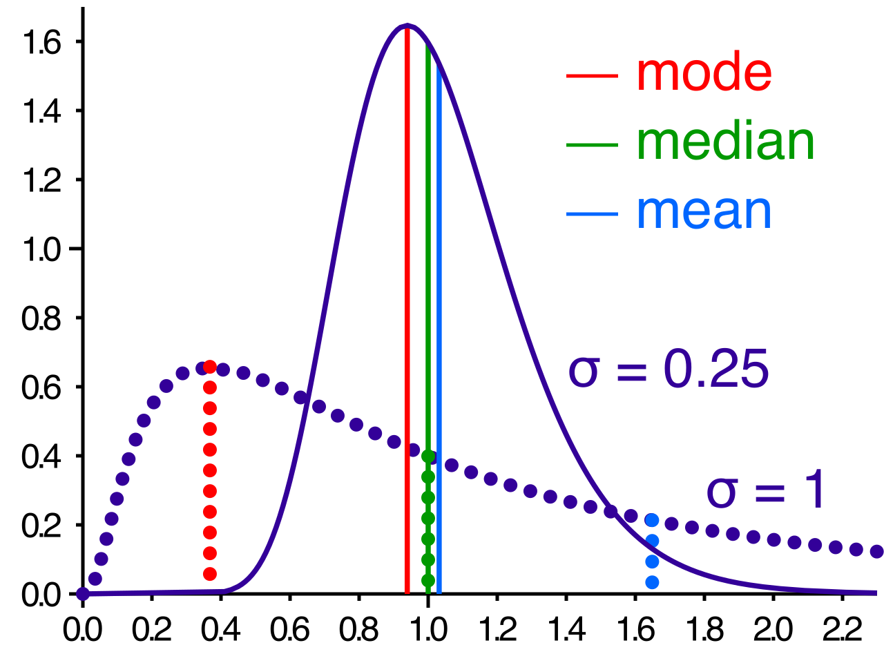
By comparing the mean and the median, we can deduce the "shape" of our data without even looking at a graph.
| Data Distribution Shape | Relationship between Mean and Median | Explanation |
|---|---|---|
| Symmetrical | Mean ≈ Median | A symmetrical data distribution has a mean and median that are approximately equal, as the data tapers off evenly on both sides. |
| Right-Skewed | Mean > Median | A right-skewed data distribution typically has a mean that is numerically greater than the median. The "tail" of extreme high values pulls the mean to the right. |
| Left-Skewed | Mean < Median | A left-skewed data distribution typically has a mean that is numerically less than the median. The "tail" of extreme low values drags the mean to the left. |
Numbers in a spreadsheet obscure patterns; visual representations illuminate them. Different types of data require entirely distinct visual displays.
Visualizing Discrete Data: Line and Dot Plots
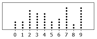
When dealing with simple, discrete numerical data (like the number of pets owned by students in a classroom), we use straightforward frequency plots.
- A line plot displays individual numerical data points as discrete marks (often an "X") above a horizontal number line.
- Similarly, a dot plot displays data frequencies by placing individual dots vertically above corresponding values on a number line. Both intuitively show exactly how many times each specific value occurs.
Visualizing Continuous Data: Histograms
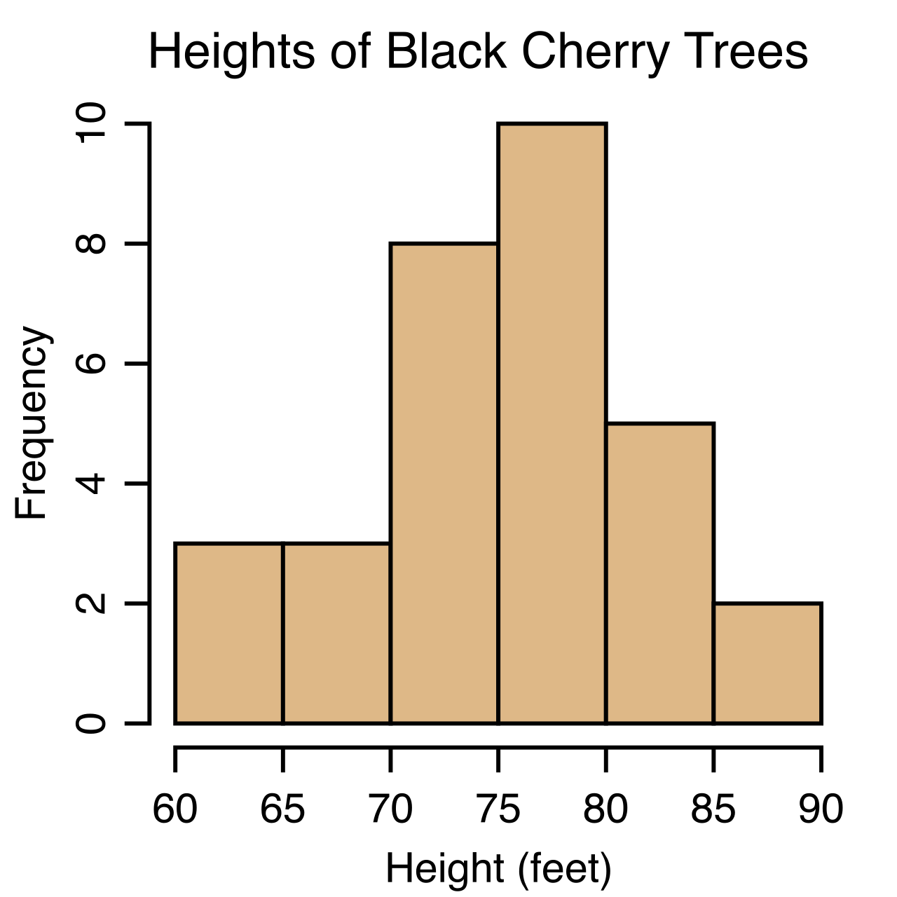
If we are measuring time, distance, or weight, the data is continuous. It makes no sense to use a dot plot for continuous data because exact identical matches are rare (e.g., 1.452 seconds vs 1.459 seconds). Instead, we use a histogram.
A histogram visualizes the frequency distribution of continuous numerical data using contiguous vertical bars. Notice that the bars touch—this represents the unbroken flow of the number line. The width of each individual bar in a histogram represents a distinct numerical interval of data (a "bin"), and the height represents how many data points fall into that interval.
Analyzing Spread: The Boxplot
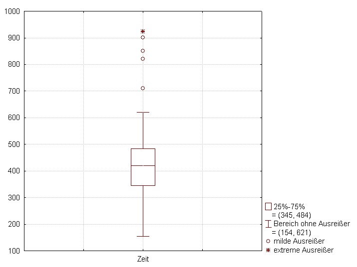
A boxplot (or box-and-whisker plot) strips away the noise and provides a graphical representation of the five-number statistical summary of a numerical dataset.
The Five-Number Summary:
- Minimum value
- First Quartile (Q1)
- Median
- Third Quartile (Q3)
- Maximum value
To understand the boxplot, you must understand quartiles. The first quartile represents the statistical median of the lower half of an ordered dataset. The third quartile represents the statistical median of the upper half of an ordered dataset.
Because we have sliced the data in half (at the median), and then sliced those halves in half again (at the quartiles), each of the four defined sections within a boxplot encapsulates approximately twenty-five percent of the total data points.
The physical "box" in the middle spans from the first quartile to the third quartile. The span of this box is called the interquartile range (IQR). The interquartile range is the numerical difference between the third quartile and the first quartile (IQR=Q3−Q1). Because it spans from the 25th percentile to the 75th percentile, the interquartile range explicitly measures the statistical spread of the middle fifty percent of the data, providing an excellent view of the "typical" variation while entirely ignoring extreme outliers.
Finding Relationships: The Scatterplot
Thus far, we have looked at single variables. But what if we want to know if taller students generally weigh more, or if more study time leads to higher test scores?
A scatterplot displays the statistical relationship between two paired continuous numerical variables. A scatterplot utilizes a two-dimensional Cartesian coordinate system to plot individual paired data points—one variable on the horizontal X-axis, and the other on the vertical Y-axis.
By observing the "cloud" of points on a scatterplot, we can identify correlations:
- An upward trend from left to right on a scatterplot indicates a positive association (as one increases, the other increases).
- A downward trend from left to right on a scatterplot indicates a negative association (as one increases, the other decreases).

Occasionally, a point rebels against the pattern. An outlier in a scatterplot is an individual data point falling significantly outside the overall trend of the remaining data points. Uncovering why that outlier exists—why that specific student scored perfectly with zero studying, or why that particular tree is incredibly wide but short—is often the most exciting part of statistical inquiry.