Normal Distributions
Not sure you’re ready?
Take the ~3-minute readiness diagnostic and see where you stand.
When you plot the standardized test scores of thousands of students across a state, a profound mathematical reality emerges from the noise of individual performance. The data organically organizes itself into a normal distribution, which is a continuous probability distribution characterized by a symmetric bell-shaped probability density curve. This shape is not a mathematical invention; it is a fundamental architecture of nature and human metrics, governing everything from the height of your future high school freshmen to the variations in their SAT scores. For a secondary mathematics teacher, mastering this distribution is not just about passing the Praxis 5165 exam—it is about possessing the structural blueprint to interpret curriculum data, grade distributions, and probabilistic models.
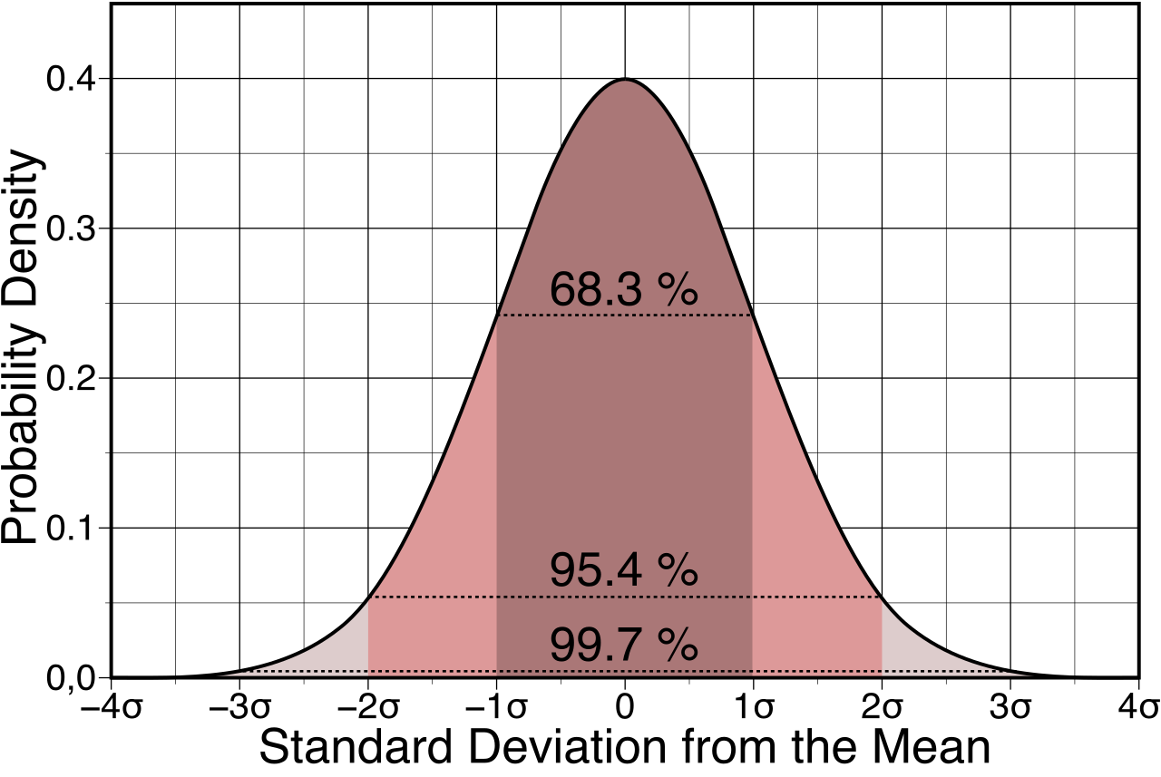
To understand the normal distribution, we must strip it down to its most basic physical and probabilistic properties.
The Rule of Total Probability Because a normal distribution represents every possible outcome in a sample space, the total area under any normal distribution curve is exactly 1 (or 100%).
Every normal distribution is governed entirely by just two parameters. The shape and location of a normal distribution are entirely determined by the population mean (μ) and the population standard deviation (σ).
The Mean: The Anchor of Location
The population mean determines the center location of a normal distribution curve along the horizontal axis. If you shift the mean of a test up by 10 points (perhaps by offering a curve), the entire bell shifts rigidly to the right.
In a perfectly normal distribution, there is no skew pulling the data in one direction. Because of this perfect balance, the mean, the median, and the mode are exactly equal. The highest peak of the curve (the mode), the exact middle value of the dataset (the median), and the mathematical average (the mean) all occupy the exact same coordinate on the horizontal axis. Furthermore, a normal distribution curve is perfectly symmetric around the population mean. If you were to fold the graph along the vertical line x=μ, the left and right halves would perfectly align.
The Standard Deviation: The Ruler of Spread
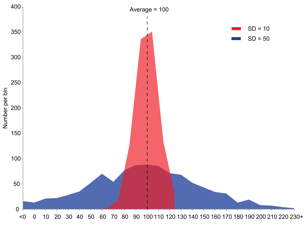
While the mean dictates where the curve sits, the population standard deviation determines the width and height of a normal distribution curve.
Because the total area must strictly remain 1, changing the spread forces the curve to alter its height:
- An increase in the standard deviation causes a normal distribution curve to become wider and flatter. The data is highly variable, so the probability is smeared over a broader range.
- A decrease in the standard deviation causes a normal distribution curve to become narrower and taller. The data is highly consistent, clustering tightly around the mean and forcing the peak upward to maintain that area of 1.
The Asymptotic Tails and Inflection Points
If you follow the curve away from the mean in either direction, it gradually drops toward the x-axis. A critical property is that the tails of a normal distribution curve approach the horizontal axis asymptotically. No matter how far you travel into the extremes—whether looking at a student with a virtually impossible test score or a person of astronomical height—the tails of a normal distribution curve never touch the horizontal axis. There is always a vanishingly small, non-zero probability of an extreme event occurring.
If you trace the curvature of the bell descending from its peak, you will notice it starts like an upside-down bowl (concave down) and eventually flares out to approach the axis (concave up). The exact transition where this curvature flips is profound: the points of inflection on a normal distribution curve occur exactly one standard deviation away from the mean.
Before you can apply normal probability rules to a dataset, you must confirm the data actually fits the model. In your classroom, if you generate a histogram of your students' midterm grades, you are looking for specific visual cues. Data sets with histograms that are roughly symmetric and unimodal can often be modeled by a normal distribution.
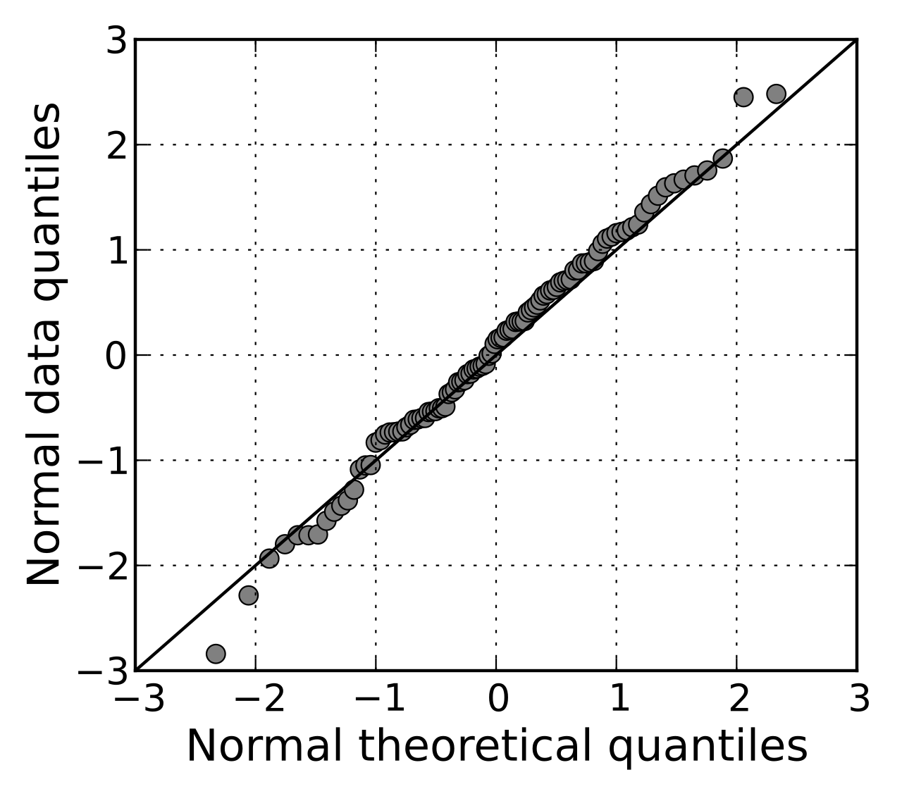
However, histograms can be subject to binning bias depending on how you group the data. For a more rigorous check, statisticians use a normal probability plot (also known as a Q-Q plot). A normal probability plot is a graphical technique used to assess whether a data set follows a normal distribution.
- In a normal probability plot, data that perfectly follows a normal distribution will visually form a straight diagonal line.
- If the plot shows distinct curves, "S-shapes," or heavy deviations from the line, the data is skewed or has heavy tails, and using normal distribution tools will yield invalid conclusions.
When working with normal distributions on the fly—such as quickly estimating what percentage of your class passed an exam—you do not always need a graphing calculator. You rely on the Empirical Rule, which is also widely known as the 68-95-99.7 rule.
This rule fractures the area under the bell curve into specific standard deviation milestones:
- According to the Empirical Rule, approximately 68% of data in a normal distribution falls within one standard deviation of the mean (μ±1σ).
- Approximately 95% of data in a normal distribution falls within two standard deviations of the mean (μ±2σ).
- Approximately 99.7% of data in a normal distribution falls within three standard deviations of the mean (μ±3σ).
Slicing the Curve into Regions
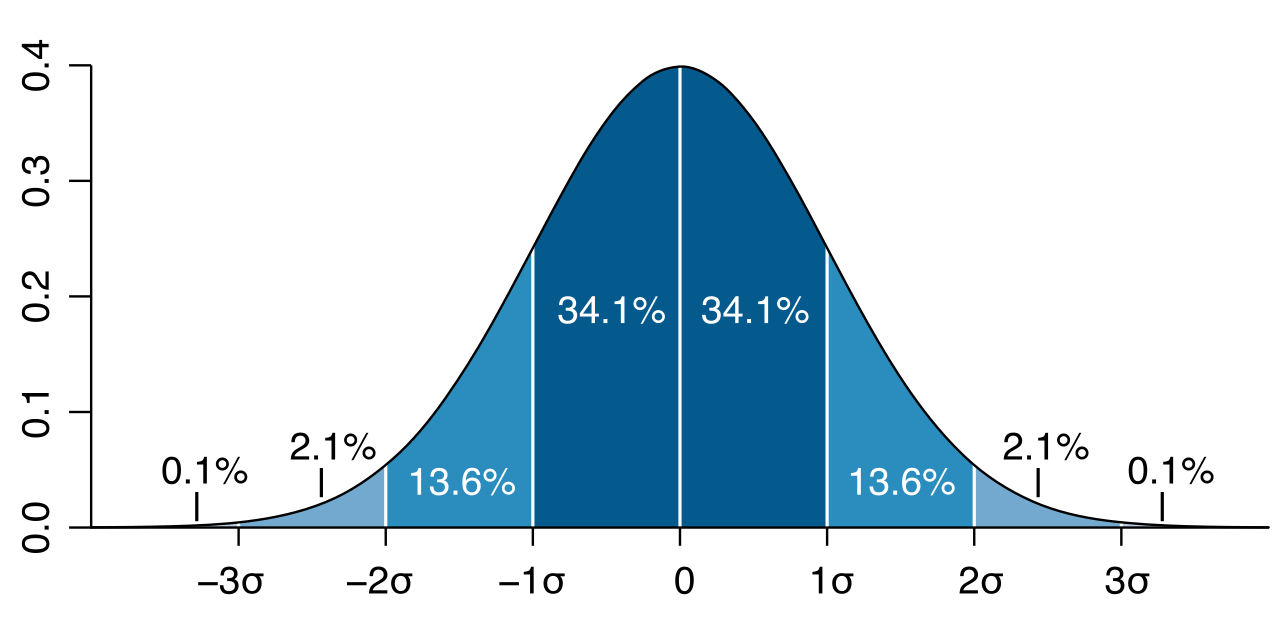
Because the curve is perfectly symmetric, we can divide these massive chunks into precise, highly testable segments. For the Praxis (5165): Mathematics exam, you must memorize the exact percentages of these individual slices.
Starting from the mean and walking to the right (positive direction):
- The First Slice: Half of 68% is 34%. Therefore, approximately 34% of data in a normal distribution lies between the mean and one standard deviation above the mean.
- The Second Slice: To find the slice between 1σ and 2σ, we take half of 95% (47.5%) and subtract the 34% we've already accounted for. This means approximately 13.5% of data in a normal distribution lies between one and two standard deviations above the mean.
- The Third Slice: Half of 99.7% is 49.85%. Subtracting the 47.5% accounted for by the first two slices reveals that approximately 2.35% of data in a normal distribution lies between two and three standard deviations above the mean.
- The Extremes: Since half the curve holds 50% of the data, the remaining tail beyond three standard deviations is 50%−49.85%=0.15%. Thus, approximately 0.15% of data in a normal distribution lies more than three standard deviations above the mean.
Because of symmetry, these exact same percentages apply to the negative standard deviations below the mean.
| Region | Distance from Mean | Approximate Area (%) |
|---|---|---|
| Mean to +1σ | 0 to +1 | 34% |
| +1σ to +2σ | +1 to +2 | 13.5% |
| +2σ to +3σ | +2 to +3 | 2.35% |
| Beyond +3σ | >+3 | 0.15% |
Imagine you have two students. Student A scored an 85 on a notoriously difficult Calculus exam, while Student B scored an 85 on an easier Geometry exam. A raw score of 85 tells you nothing about relative performance. We need a way to standardize these scores.
Enter the z-score. A z-score measures the number of standard deviations a particular data value is located from the population mean. It strips away the original units (points, inches, or dollars—such as comparing a $50,000 starting salary in Ohio to a $70,000 starting salary in New York) and translates them into a universal metric of relative standing.
Z-Score Formula The formula for a z-score is the difference between the data point and the population mean divided by the standard deviation. z=σx−μ
Analyzing z-scores gives us immediate intuition about a data point's location:
- A z-score of zero indicates that the data value is exactly equal to the population mean.
- A positive z-score indicates that a data value is strictly greater than the population mean.
- A negative z-score indicates that a data value is strictly less than the population mean.
The Standard Normal Distribution
When you convert an entire dataset into z-scores, you execute a mathematical transformation. Any normal distribution can be transformed into the standard normal distribution by converting all original data values into z-scores.
The standard normal distribution is a specific normal distribution with a mean of zero (μ=0) and a standard deviation of one (σ=1). It is the "master key" of statistics. When using the normalcdf function on a graphing calculator without specifying μ and σ, the calculator defaults to this exact standard normal curve.
The ultimate purpose of the normal distribution is to make predictions and establish probabilities based on areas under the curve.
Area as Probability
The area under a normal curve between two specific values represents the probability that a randomly selected observation falls between those two values.
If you calculate the area between z=−1 and z=1.5, you are finding the exact probability that a randomly chosen student from the population achieved a score in that specific range. While the Empirical Rule provides clean estimates for whole integer standard deviations, this principle holds for any two values, requiring integration (or, practically, your calculator's distribution tools) to find exact non-integer areas.
Area as Percentile Rank
When evaluating standardized test scores, parents and students rarely care about the raw mathematical area; they care about how they compare to peers.
The area under a normal curve to the left of a specific value represents the percentile rank of that specific value in the population. If a student's SAT score has an area to the left of 0.84, they are in the 84th percentile. They scored higher than 84% of the population. By understanding that a z-score of +1 perfectly traps 50% (left half) plus 34% (mean to +1σ) of the area, you can intuitively see why a z-score of +1 exactly equals the 84th percentile.
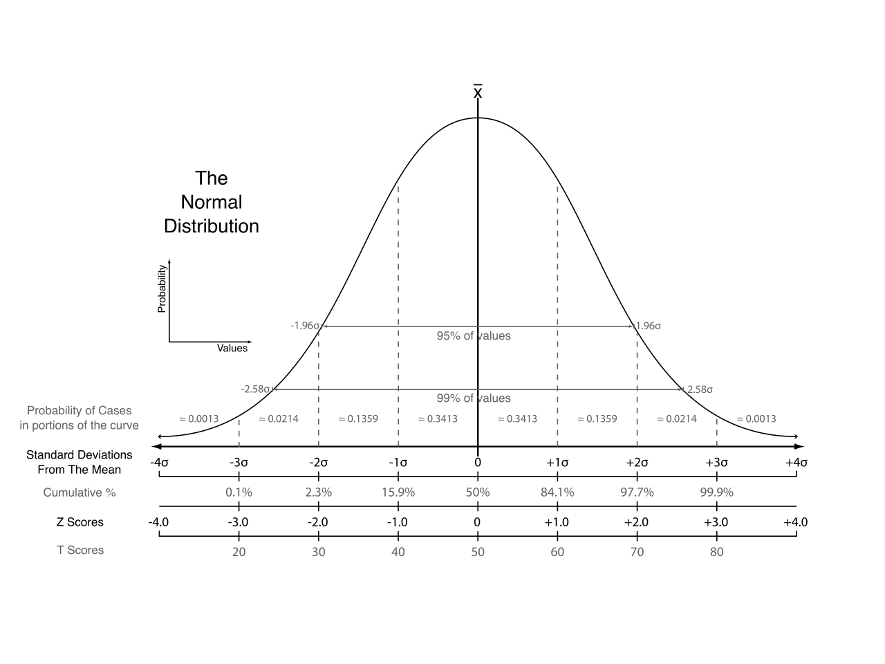
As a teacher preparing for the Praxis (5165): Mathematics exam, carrying this visual intuition into the testing center is your greatest asset. When faced with a complex scenario-based item, draw the bell curve, label the mean in the center, mark the standard deviations, and shade the area in question. The formulas will naturally follow the structure of the curve.