Stem-and-Leaf Plots and Boxplots
Not sure you’re ready?
Take the ~3-minute readiness diagnostic and see where you stand.
When confronted with a raw, unordered list of seventy-five exam scores or a spreadsheet of daily temperatures, the human brain sees only a wall of meaningless digits. We instinctively crave structure. Yet, when we compress that data into a simple average, we strip away the rich texture of the original dataset—the clusters of excellence, the isolated struggles, the overall spread. The fundamental challenge of data analysis is finding a way to summarize information without completely destroying its essence. To solve this, the brilliant statistician John Tukey popularized elegant visual tools in the 1970s designed specifically to bridge the gap between raw numbers and meaningful visual patterns. Two of his most enduring contributions allow us to see both the forest and the trees of a dataset: the stem-and-leaf plot and the boxplot.
When we group data into a traditional bar chart, the individual numbers are swallowed up by the bars. We know a bar represents "ten students who scored in the 80s," but we do not know if they all scored exactly 80 or if they were evenly spread up to 89.
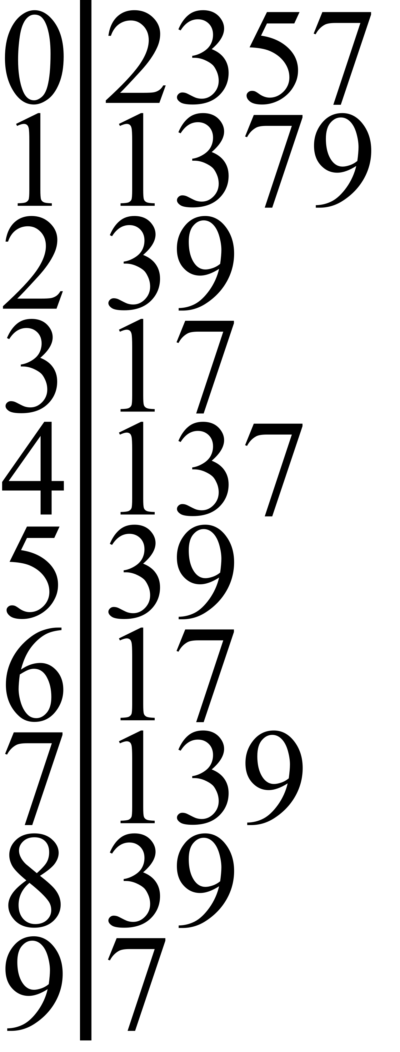
A stem-and-leaf plot is a table that displays quantitative data by splitting each numerical value into two distinct parts: a stem and a leaf. Because it builds its visual structure out of the numbers themselves, a stem-and-leaf plot preserves the exact individual data points from the original dataset. You sacrifice zero information.
Anatomy of the Plot
To construct or read this plot, you must understand how numbers are cleaved:
- The Stem: In a stem-and-leaf plot, the stem represents the leading digit or digits of a numerical data value.
- The Leaf: In a stem-and-leaf plot, the leaf represents the final, trailing digit of a numerical data value.
Imagine a dataset of quiz scores: 68, 72, 75, 81, 81, 84, 90, 93, and 100.
| Stem | Leaf |
|---|---|
| 6 | 8 |
| 7 | 2 5 |
| 8 | 1 1 4 |
| 9 | 0 3 |
| 10 | 0 |
Notice the mechanics at play here. In a stem-and-leaf plot, the leaves are listed in ascending numerical order outward from the central stem. For the 80s, the leaves read 1 1 4. Each individual leaf in a stem-and-leaf plot represents exactly one data point in the dataset. The fact that the leaf 1 appears twice means two separate students scored an 81.
Furthermore, you will notice the score of 100 has a stem of 10 and a leaf of 0. The stem expands to accommodate the leading digits, but the leaf is always strictly the final, single trailing digit.
The Critical Role of the Key
Because numbers can represent anything from millions of dollars to microscopic decimals, reconstructing a specific data point from a stem-and-leaf plot requires combining the stem with one corresponding leaf according to the plot's key.
Important: A stem-and-leaf plot requires a key to explain the specific place value of the stem and the leaf.
Without a key, a stem of 8 and a leaf of 4 could mean 84. But if the data represents human body temperatures in Fahrenheit, the key might dictate that 9 | 8 means 9.8. If the data represents house prices, 32 | 5 might mean $325,000. The key acts as your decoder ring.
The Hidden Histogram
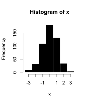
Tukey designed this plot not just to organize numbers, but to reveal their density. If you print a stem-and-leaf plot on a piece of paper, lay it flat on your desk, and observe its silhouette, something remarkable happens. When a stem-and-leaf plot is rotated 90 degrees counterclockwise, the plot's shape visually resembles a histogram. The lengths of the leaf rows act exactly like the bars of a histogram, instantly showing you where the data piles up and where it thins out, all while preserving the raw numbers within those "bars."
While the stem-and-leaf plot is miraculous for small-to-medium datasets, it becomes unwieldy when you have ten thousand data points. For massive datasets, we must move from exact preservation to intelligent summarization.
Enter the boxplot, which is also commonly referred to as a box-and-whisker plot.
A boxplot is a graphical representation of a dataset based entirely on a highly efficient five-number summary. Rather than showing every number, it cuts the dataset into four distinct zones of equal population.
The Five-Number Summary
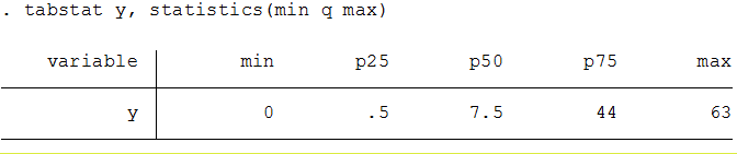
To understand the boxplot, you must first understand the five pillars that hold it up. A five-number summary consists of the minimum, first quartile, median, third quartile, and maximum values of a dataset.
Let us map these summaries to their statistical percentiles. Imagine lining up exactly one hundred students from lowest score to highest score:
- Minimum: The lowest value in the dataset.
- First Quartile (Q1): The first quartile represents the 25th percentile of an ordered dataset. (The score of the 25th student in line).
- Median (Q2): The median represents the 50th percentile of an ordered dataset. (The score of the middle student).
- Third Quartile (Q3): The third quartile represents the 75th percentile of an ordered dataset. (The score of the 75th student).
- Maximum: The highest value in the dataset.
Drawing the Box and Whiskers
A boxplot translates this five-number summary into a geometric map of data density.
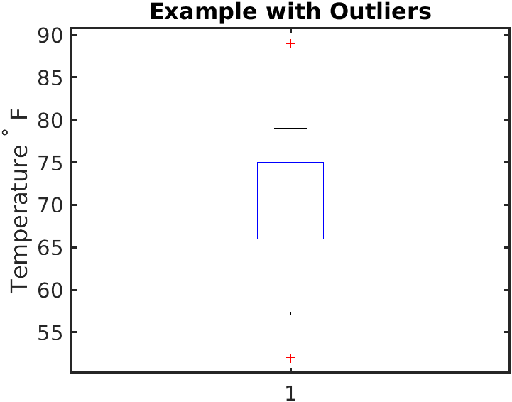
The Box: In a boxplot, a rectangular box is drawn spanning from the first quartile to the third quartile. Because it spans from the 25th percentile to the 75th percentile, the central box in a boxplot contains the middle 50 percent of the dataset's values. This is the "core" of your data, ignoring the extremes.
The physical length of this box tells us something crucial. The length of the rectangular box in a boxplot represents the interquartile range of the dataset. Mathematically, the interquartile range is calculated by subtracting the first quartile value from the third quartile value (IQR=Q3−Q1). Inside this box, we place a divider: in a boxplot, a vertical line drawn inside the rectangular box marks the median value of the dataset.
The Whiskers: From the edges of this central box, we draw lines reaching out to the extremes. In a boxplot, lines called whiskers extend outward from the central box to the minimum and maximum values.
The Law of Quarters
The magic of the boxplot lies in how it chunks the population of your data. No matter how wide or narrow the physical spaces look on paper, the population within them is fixed:
- The segment from the minimum value to the first quartile in a boxplot contains approximately 25 percent of the dataset's values.
- The segment from the first quartile to the median in a boxplot contains approximately 25 percent of the dataset's values.
- The segment from the median to the third quartile in a boxplot contains approximately 25 percent of the dataset's values.
- The segment from the third quartile to the maximum value in a boxplot contains approximately 25 percent of the dataset's values.
If one of these segments is drawn very short on the page, it does not mean there is less data there. It means the data in that 25% chunk is highly concentrated and tightly packed together. If a segment is stretched out incredibly long, it means that 25% of the data is widely dispersed.
Managing the Outliers
Sometimes, a dataset contains an extreme anomaly—a student who scored a 12 on a test where everyone else scored between 70 and 100. If we blindly draw the whisker all the way down to 12, the entire plot will be visually stretched, distorting our view of the normal students.
To solve this, some boxplots use individual dots or asterisks plotted beyond the whiskers to represent outlier data points. But if the whisker no longer goes to the absolute minimum, where does it stop? When a boxplot includes outlier dots, the whiskers extend only to the lowest and highest data points that are not mathematically considered outliers. This allows the box and whiskers to accurately reflect the typical behavior of the population, while still explicitly acknowledging the rare anomalies floating out in space.
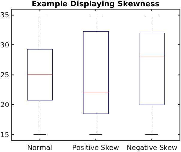
Boxplots are not just static summaries; they are diagnostic tools for identifying the shape and symmetry of a distribution. By comparing the visual length of the segments, we can detect statistical skewness without having to look at a single raw number.
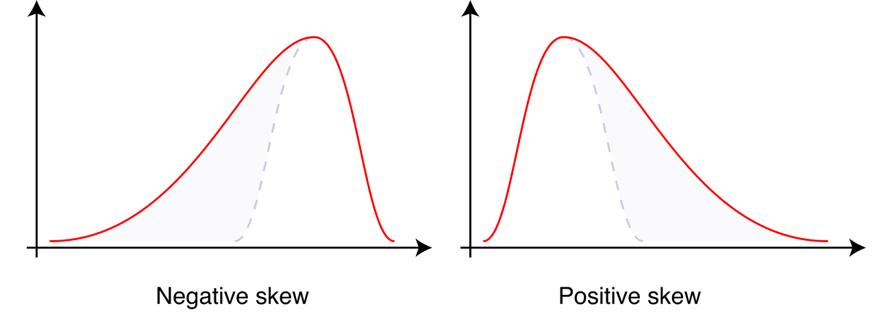
Internal Skew (The Median Line): Remember that the median line divides the central 50% of the data into two 25% chunks. In a perfectly symmetrical dataset, the median sits exactly in the dead center of the box. However, a skewed data distribution is visually indicated in a boxplot when the median line is noticeably closer to one end of the central box than the other.
- If the median is pushed far to the left (closer to Q1), it means the lower 25% of the core data is tightly bunched together, while the upper 25% of the core data is spread out.
External Skew (The Whiskers): We apply the exact same logic to the tails of the dataset. An asymmetrical whisker length in a boxplot indicates that the data distribution is skewed.
- If the right whisker is vastly longer than the left whisker, the data has a "right skew" (or positive skew). The upper 25% of the values are trailing off over a wide range, pulling the statistical mean away from the median.
By mastering these two elegant tools—the stem-and-leaf plot for preserving granular truth, and the boxplot for diagnosing massive-scale structure—you empower yourself to look at any dataset and instantly comprehend its underlying reality. You move from staring blindly at numbers to truly reading the story they tell.