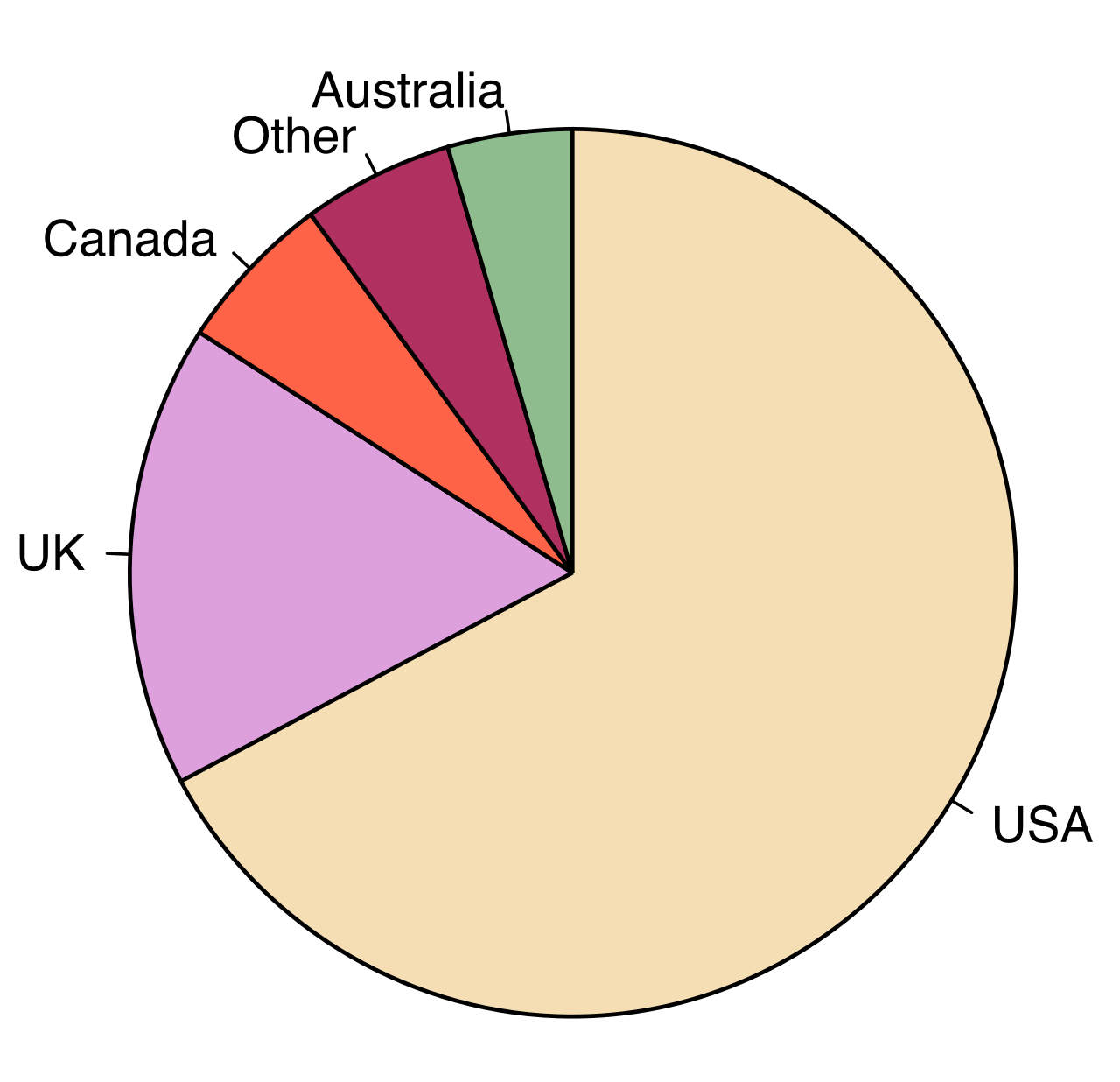
Imagine you are given a single, finite expanse of two-dimensional space and tasked with mapping an abstract dataset onto it. A circle graph does precisely this by translating numerical proportions into geometric reality. It takes a sprawling ledger of data—a school district's budget, the diverse demographics of a student body, or the varied ecosystems of a continent—and distills it into a single, elegant geometric form. By mapping quantities to the enclosed area of a circle, these graphs allow our visual cortex to grasp complex part-to-whole relationships in an instant, transforming abstract figures into tangible slices of a unified whole.
A typical circle graph, or pie chart, mapping numerical proportions of a dataset into distinct geometric sectors to visually represent part-to-whole relationships.
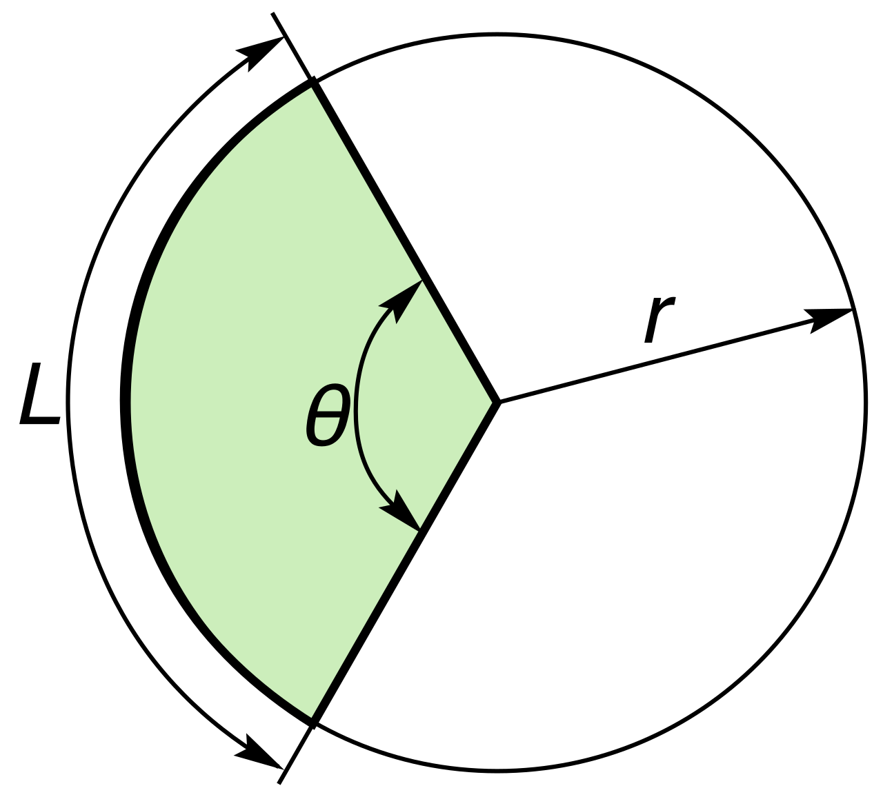
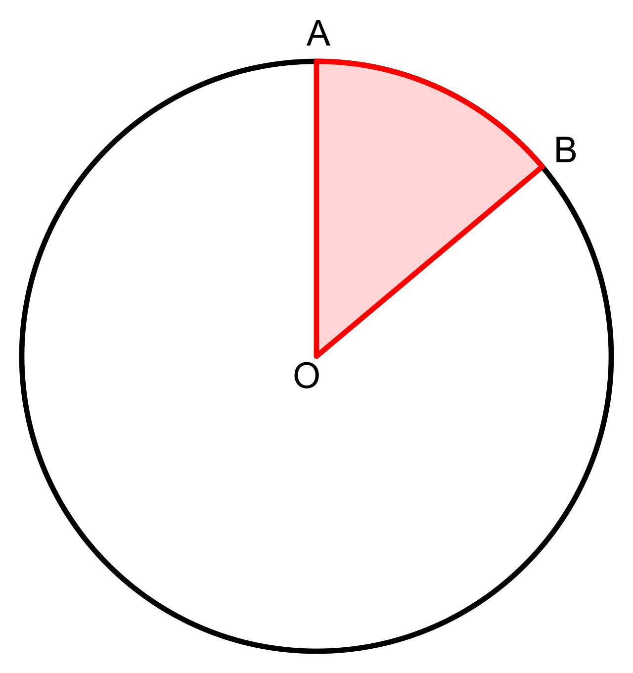
To understand how to read and interpret these visuals for the Praxis Core Mathematics exam, we must first understand their governing physical and mathematical laws. A circle graph represents data as sectors of a circle. We often call these sectors "slices," but geometrically, a sector is the space enclosed by two radii and the arc they intercept.
A geometric sector is bounded by two radii originating from the center and the circular arc connecting them along the circle's edge.
The fundamental rule of a circle graph is the rule of conservation: the graph represents everything in a given population. The entire circle in a circle graph represents 100 percent of the dataset. It is the "whole" in the part-to-whole relationship. Consequently, each sector in a circle graph represents a specific category's proportion of the whole dataset.
Because the circle represents the entirety of the data, the parts must flawlessly reconstruct the whole. Therefore, the sum of all percentage values in a correctly constructed circle graph is exactly 100 percent. If you are analyzing a graph of a university's student body by major, and the percentages add up to 98% or 102%, the graph is fundamentally flawed. In the pristine logic of mathematics, the whole is exactly the sum of its parts.
This brings us to the visual brilliance of the tool: the area of each sector in a circle graph is proportional to the quantity the sector represents relative to the total dataset. Your brain intuitively understands area. If you see a slice that takes up more space, you immediately know that category contains more data points.
We can anchor this proportionality in concrete visual benchmarks:
A sector representing 50 percent of a dataset occupies exactly half of the circle graph. If a school's funding is exactly half derived from local taxes, the local tax sector will split the circle perfectly down the diameter.
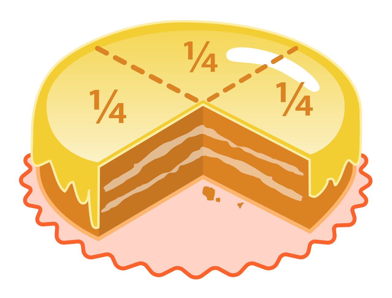
A sector representing 25 percent of a dataset occupies exactly one-quarter of the circle graph. This will look like a perfect right angle carved out of the circle, similar to a standard clock face from 12:00 to 3:00.
A visual benchmark representing 25 percent of a whole, which forms a perfect right angle and occupies exactly one-quarter of the circular area.
A circle graph gives you percentages, but on the Praxis exam, you are rarely asked to simply point to a percentage. You are asked to calculate real quantities—how many students, how many dollars, how many hours. To do this, you must translate the visual percentage into a workable mathematical operator: a decimal or a fraction.
The word "percent" literally translates from Latin as "per one hundred." Once you internalize that definition, conversions are effortless.
The Decimal Translation
To convert a circle graph percentage to a decimal, divide the percentage value by 100.
Imagine a sector representing 35% of a dataset. To make this number useful for calculation, simply perform the division:
35÷100=0.35
The Fraction Translation
Alternatively, you may prefer (or the test may require) working with fractions. To convert a circle graph percentage to a fraction, place the percentage value over a denominator of 100.
Taking that same 35% sector, you place 35 over 100:
10035
This fraction can then be simplified by dividing the numerator and denominator by their greatest common factor (which is 5), yielding 207.
Whether you use a decimal or a fraction, you are simply expressing the sector's proportion in a format that allows you to interact mathematically with the total dataset.
The most common task you will face is determining the absolute size of a specific slice. You are given the total size of the dataset and the percentage of a sector, and you must find out how many real-world units that sector holds.
To find the numerical value of a category, multiply the category's percentage as a decimal by the total dataset amount.
The Part-to-Whole Formula (Decimal)Numerical Value=Total Dataset×Percentage (as a decimal)
Suppose a high school has a total enrollment of 1,200 students, and a circle graph shows that 30% of the students are freshmen. How many freshmen are there?
Convert the percentage to a decimal: 30÷100=0.30.
Multiply by the total dataset: 1,200×0.30=360.
There are 360 freshmen.
You can achieve the exact same result using fractions. To find the numerical value of a category using fractions, multiply the category's fraction by the total dataset amount.
The Part-to-Whole Formula (Fraction)Numerical Value=Total Dataset×Percentage (as a fraction)
Using the same school:
Convert 30% to a fraction: 10030, which simplifies to 103.
Multiply by the total: 1,200×103=103,600=360.
This brings us to a beautiful self-checking mechanism built into the universe of circle graphs. Because the parts must sum to the whole, the sum of the numerical amounts of all individual categories in a circle graph equals the total dataset amount. If you were to calculate the raw number of freshmen, sophomores, juniors, and seniors, and add those four numbers together, you must arrive back at exactly 1,200. If you get 1,198, you have made an arithmetic error. This is a powerful safety net on an exam.
Sometimes the Praxis will test your algebraic agility by giving you the size of the part and asking you to find the whole.
Imagine you are told that a library spent \$4,500 on new fiction books last year. You look at the library's budget circle graph and see that "Fiction" constitutes 15% of their total book budget. What is the total budget?
You might initially feel stuck because the total is missing. But let us look at our part-to-whole formula:
Part=Total×Decimal
We know the Part (\$4,500), and we know the Decimal (0.15). We just need to isolate the Total. Through basic algebra, we divide both sides by the decimal.
To determine the total dataset amount from a known category amount and its percentage, divide the category amount by the percentage expressed as a decimal.
The Reverse FormulaTotal Dataset=Percentage (as a decimal)Category Amount
Let us execute the calculation:
Total Budget=0.154,500
When you divide by a decimal less than one, the number grows.
4,500÷0.15=30,000
The total book budget is \$30,000. You have successfully reverse-engineered the entire system from a single fragment of data.
Often, the sheer power of a circle graph lies not in calculating absolute numbers, but in understanding how different categories relate to one another.
Comparing the percentages of two sectors in a circle graph establishes the ratio of those specific categories to each other. This is a profound shortcut. You do not need to know the total dataset amount to know how two slices relate. The ratio of their percentages is identical to the ratio of their actual numerical values.
Let us say a circle graph shows a town's energy grid. Solar power makes up 40% of the grid, while Wind power makes up 10%.
Without knowing how many megawatts of electricity the town uses, you can immediately deduce the relationship between Solar and Wind. You simply compare their percentages:
Ratio=40% to 10%Ratio=4 to 1
Solar provides exactly four times as much energy as Wind. If a Praxis question asks, "How many times greater is the revenue from Product A ( 45% ) than Product B ( 15% )?", you do not need to calculate the raw revenue. Simply recognize that 45 is three times 15. The ratio is 3:1. The visual representation preserves these ratios perfectly.
We have talked about fractions, decimals, and percentages. But a circle is a geometric object, and geometry operates in degrees.
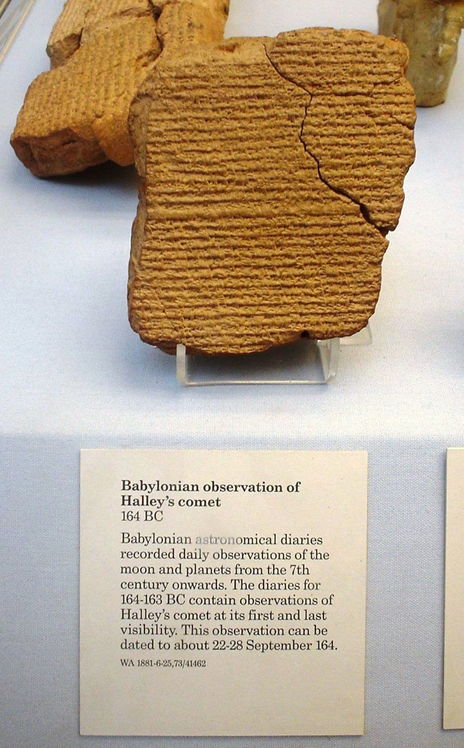
Just as the entire circle represents 100%, the entire circle in a circle graph contains exactly 360 degrees. Why 360? We inherited this highly divisible number from ancient Babylonian astronomers who tracked the roughly 360 days of the solar year. Because 360 is divisible by 2,3,4,5,6,8,9,10,12,15, and many others, it makes slicing circles mathematically quite clean.
The mathematical convention of dividing a full circle into 360 degrees was inherited from ancient Babylonian astronomy, as recorded on artifacts like this clay tablet.
The angle formed at the exact center of the circle for any given slice is called the central angle. Because the area of a sector is proportional to the dataset, its central angle must be proportionally derived from the 360∘ total.
A central angle sits at the circle's exact center, dictating the width of the arc and mapping the percentage of data to the precise area of the sector.
The central angle of a sector in degrees is calculated by multiplying the category's percentage as a decimal by 360.
The Central Angle FormulaCentral Angle=360∘×Percentage (as a decimal)
Let us test this on our visual benchmarks:
A sector representing 50% of the data: 360∘×0.50=180∘. A 180∘ angle is a perfectly straight line cutting across the circle. As we know, it occupies exactly half.
A sector representing 25% of the data: 360∘×0.25=90∘. A 90∘ angle is a right angle. As we know, it occupies exactly one-quarter.
What if a category represents 15% of the dataset?
Central Angle=360∘×0.15=54∘.
If you were to draft this circle graph using a protractor, you would draw an angle of exactly 54 degrees.
Summary Translation Table
To be fluent in circle graphs is to be fluent in translations. You must be able to move fluidly between the visual percentage, the decimal, the fraction, the central angle, and the physical amount. Observe how they all describe the exact same proportional slice of reality:
Category Percentage
Decimal Equivalent
Fraction (Simplified)
Central Angle
Numerical Value (if Total = \$1,000)
50%
0.50
21
180∘
\$500
25%
0.25
41
90∘
\$250
20%
0.20
51
72∘
\$200
5%
0.05
201
18∘
\$50
100% (Total)
1.00
11
360∘
\$1,000
Notice the symmetry and the unbreakable laws of the chart. If you add up the percentages, you get 100%. If you add up the decimals, you get 1.00. If you add up the angles, you get exactly 360∘. And if you sum the raw values of the parts, you recreate the total whole of \$1,000.
When you sit down to interpret a circle graph, do not just look at it as a picture. Look at it as an interlocking system of equations. Whether you are finding the missing total from a single slice, comparing the ratio of two distinct sectors, or verifying that the sum of the parts equals the whole dataset, you are simply manipulating the fundamental law of proportionality. Master these principles, and no circle graph on the Praxis exam will ever be able to hide its data from you.