Map Skills and Spatial Patterns
Not sure you’re ready?
Take the ~3-minute readiness diagnostic and see where you stand.
Imagine trying to flatten a grapefruit rind onto a tabletop without tearing it. It is physically impossible. This geometric inevitability sits at the core of spatial analysis: all map projections introduce distortion to the spherical Earth when represented on a two-dimensional plane. As a social studies educator, you are not merely teaching students to memorize state capitals; you are teaching them to decode the structural biases, spatial relationships, and layered data that define human history and behavior. Every map is a mathematical compromise, and understanding those compromises is the foundation of geographic literacy.
To pass the Praxis 5081 and, more importantly, to teach your future students how to critically read the world, you must understand how we translate physical realities into spatial data. We will deconstruct the anatomy of maps, the psychology of space, and the digital systems that drive modern geographic inquiry.
Because the Earth is a sphere, map projections inevitably distort shape, area, distance, or direction. You cannot preserve them all. Cartographers must choose which mathematical truth to sacrifice based on the map's intended purpose.
The Classic Compromises
When you look at a wall map in a classroom, you are looking at a specific set of choices.
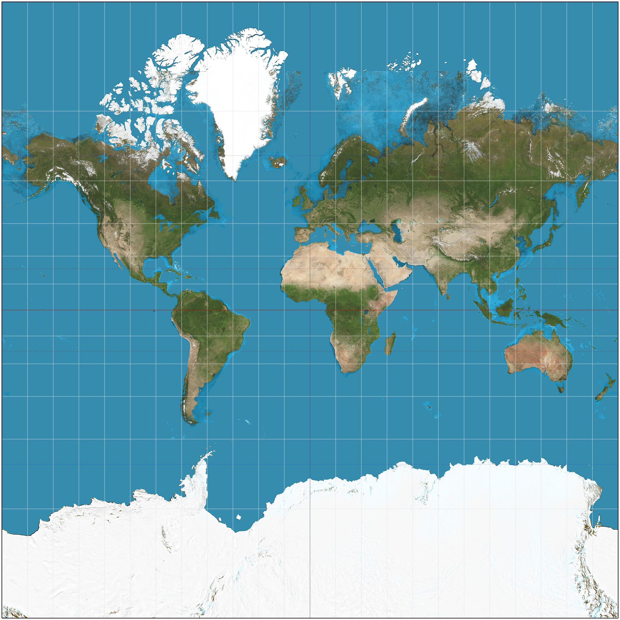
- The Mercator Projection: Designed for oceanic navigation in the 16th century, the Mercator projection preserves accurate compass direction. A straight line on a Mercator map is a true bearing. However, the mathematical cost is severe: the Mercator projection severely distorts the relative size of landmasses near the poles. This is why Greenland appears massive—larger than Africa—when in reality, Africa is roughly 14 times larger.
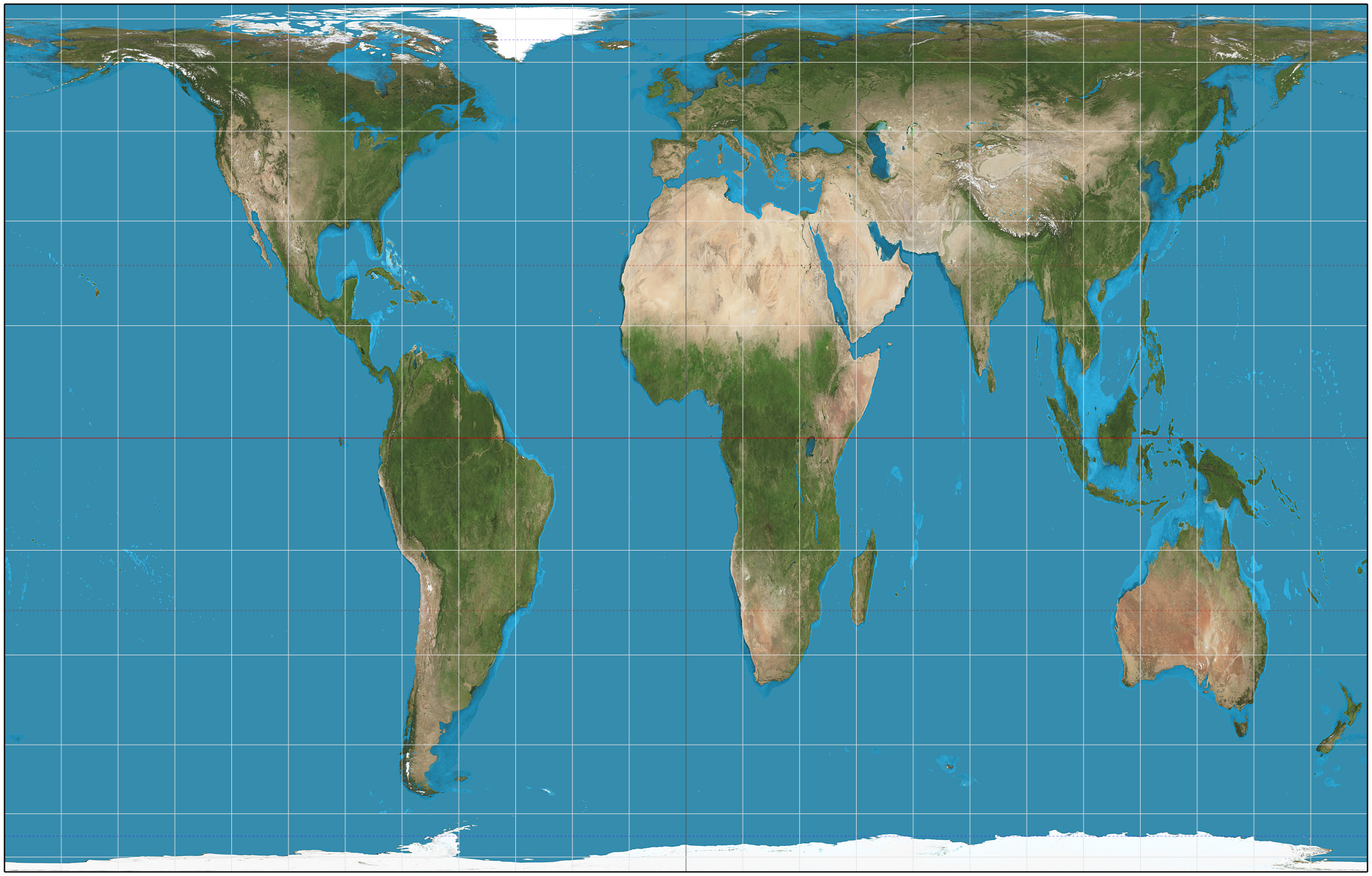
- The Gall-Peters Projection: As a reaction to the Mercator's inflation of northern latitudes, the Gall-Peters projection preserves the accurate relative area of landmasses. If a continent is twice as large as another in reality, it is twice as large on this map. The trade-off? The Gall-Peters projection distorts the geometric shape of landmasses, making them look stretched or elongated.
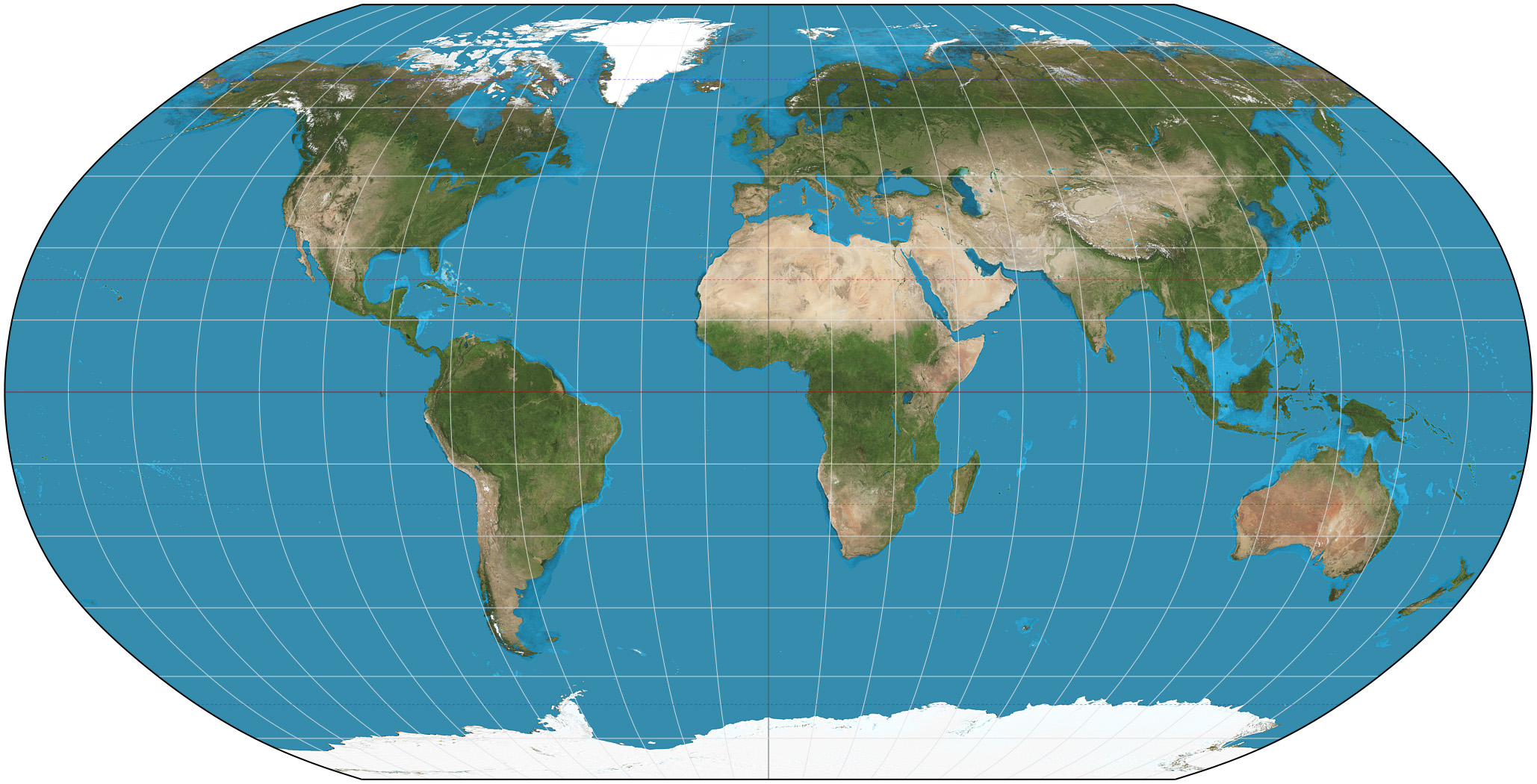
- The Robinson Projection: Instead of striving for perfection in one area, the Robinson projection minimizes extreme spatial distortions by compromising on perfect shape preservation and compromising on perfect area preservation. It is visually pleasing because it spreads the distortion across the map, rounding the edges to mimic a globe.
- The Winkel Tripel Projection: Taking compromise a step further, the Winkel Tripel projection minimizes distortion in area, direction, and distance simultaneously. This mathematically complex balance makes it the standard projection used by the National Geographic Society.
Geometric Projections
Beyond the classic global maps, projections are often built by wrapping geometric shapes around the globe.
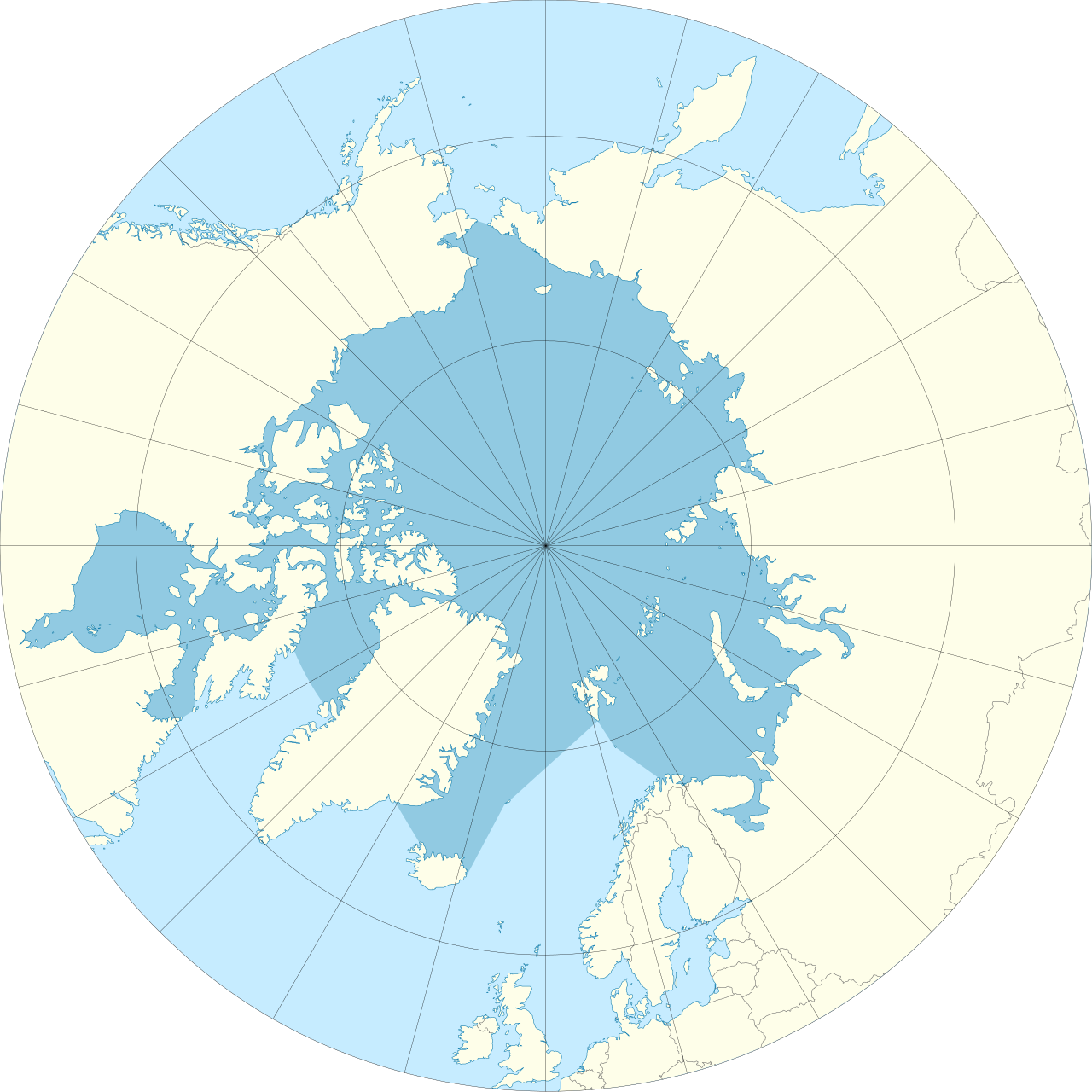
- Azimuthal Projections: Picture placing a flat piece of paper directly onto the North Pole. Azimuthal projections display the Earth from a single central point. Crucially, azimuthal projections represent accurate distances from the central point of the map to any other point. These are essential for mapping polar routes or calculating radio transmission ranges.
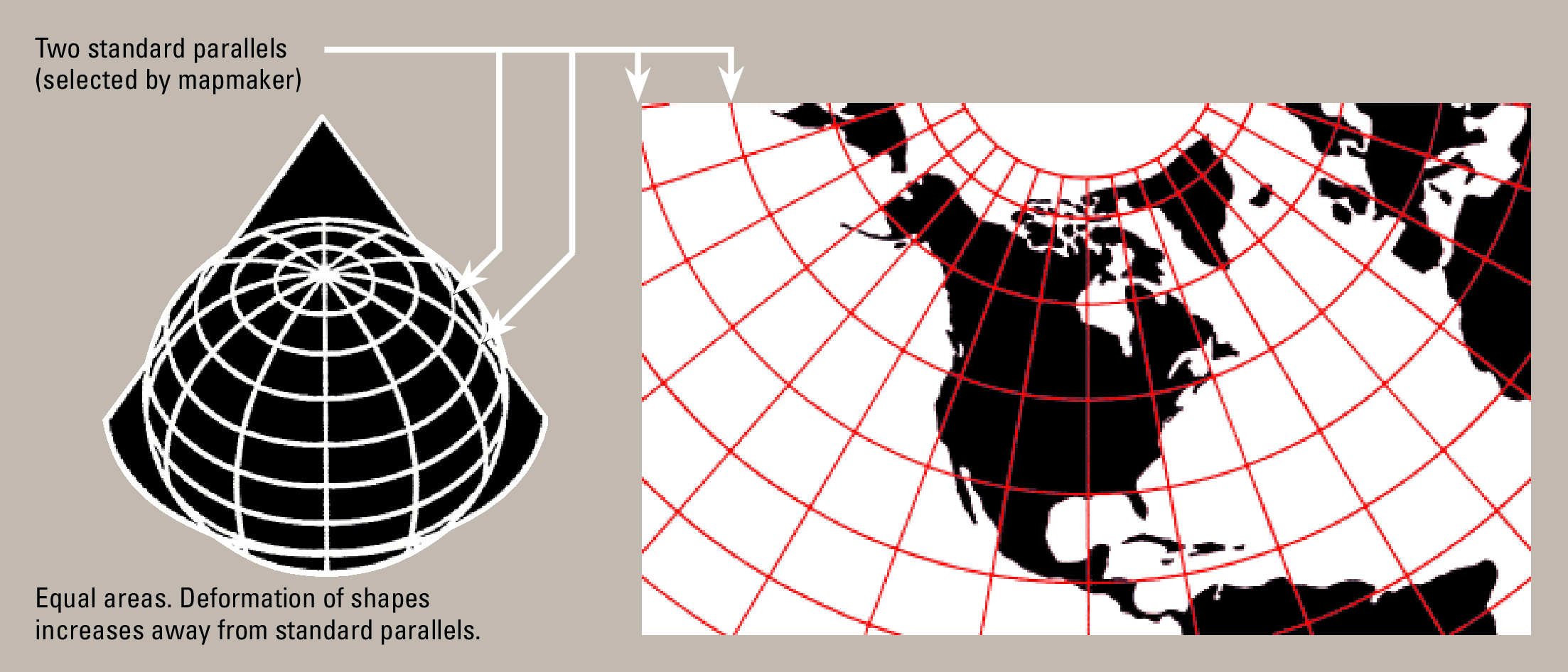
- Conic Projections: Imagine placing a paper cone over the Earth like a party hat. Conic projections project the surface of the Earth onto a cone. When unrolled, these maps present curved lines of latitude. Because the cone touches the globe most perfectly between the equator and the poles, conic projections provide the highest accuracy at the mid-latitudes, making them the ideal choice for mapping the continental United States.
Maps fundamentally serve two purposes: to show us where things are, or to show us how things are. We divide them into reference maps and thematic maps.
Reference Maps
Reference maps display the boundaries and names of geographic areas without focusing on specific data sets. They are your navigational baselines.
- Political maps display human-created boundaries, such as countries, states, and cities.
- Physical maps display natural geographic features of the Earth, such as mountain ranges, rivers, and deserts.
Thematic Maps
If reference maps are the canvas, thematic maps are the paint. Thematic maps display specific types of data related to a geographic area. They tell a statistical story.
| Map Type | How It Works | Real-World Classroom Example |
|---|---|---|
| Choropleth Map | Uses different colors or shading to represent the statistical value of a specific variable across predefined areas. | An Electoral College map showing states in varying shades of red or blue based on voting margins. |
| Dot Density Map | Uses uniform dots to represent a specific quantity of a given geographic feature. | A map of a city where one dot equals 100 residents. Dot density maps visually communicate the spatial concentration of a phenomenon. |
| Proportional Symbol Map | Uses symbols of different sizes to represent the magnitude of a specific variable. | A map of the Pacific Ring of Fire where larger circles represent higher-magnitude earthquakes. |
| Isoline Map | Connects points of equal value with continuous lines. | A weather map showing continuous lines of equal barometric pressure (isobars) or equal temperature (isotherms). |
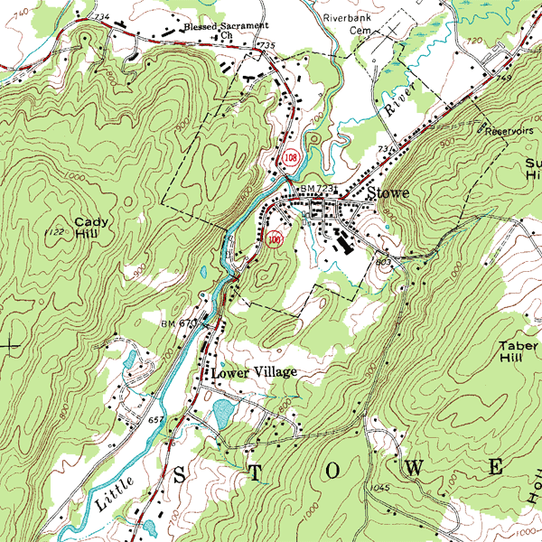
| Topographic Map | A specific type of isoline map that use contour lines to represent changes in land elevation. | Used by hikers to understand the steepness of a mountain—closer lines mean steeper terrain. |
| Cartogram | Distorts the physical size of geographic regions to reflect the statistical value of a specific variable. | A map of global wealth where the United States and Europe are swollen to massive sizes, while impoverished nations are shrunken down. |
Once we project data onto a map, we analyze the spatial patterns, which describe the arrangement of geographic features across the surface of the Earth.
Analyzing Distribution
When analyzing how populations or businesses settle, we look at two distinct but related concepts:
- Density: This is a strict mathematical measurement. Density measures the frequency of a specific feature occurring within a defined geographic area (e.g., 500 people per square mile).
- Dispersion: This looks at the arrangement. Dispersion describes the extent to which geographic features are spread out across an area.
When you look at dispersion, you will encounter two primary patterns. A clustered spatial pattern exists when geographic features are grouped closely together (think of dense urban centers or businesses clustering near a transit hub). Conversely, a dispersed spatial pattern exists when geographic features are spread far apart (think of farmhouses scattered across the rural Midwest).

The Friction of Distance
Why do humans cluster or disperse? It fundamentally comes down to energy and cost.
The friction of distance refers to the cost and effort required to overcome the physical space between two locations. Before railroads, the friction of distance across the Rocky Mountains was immense. Today, airplanes have vastly reduced it.
This friction naturally creates distance decay, an economic and geographic principle which states that interaction between two locations declines as the physical distance between those locations increases. A student is highly likely to walk to a coffee shop one block away, but highly unlikely to walk to one five miles away. Distance acts as a decaying factor on human interaction.
The Paradox of Map Scale
One of the most counterintuitive concepts for students (and a highly tested Praxis topic) is map scale.
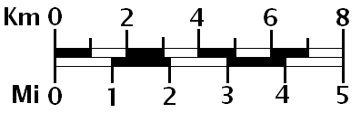
Map scale is the mathematical relationship between the distance on a map and the corresponding distance on the ground. It is usually expressed as a ratio or fraction, such as 1:10,000. To understand map scale, think like a math teacher looking at fractions. Which is larger: 1/10,000 or 1/1,000,000? The first fraction is much larger. Therefore:
- A large-scale map shows a small geographic area in great detail (e.g., a map of a single neighborhood). The mathematical fraction is large.
- A small-scale map shows a large geographic area with minimal detail (e.g., a world map). The mathematical fraction is small.
Crucial Distinction: Do not confuse map scale with geographic scale. Geographic scale ranges from local to global levels of analysis. A teacher discussing a zoning law in a single town is using a local geographic scale; a teacher discussing global carbon emissions is using a global geographic scale.
Modern geography is no longer about drawing maps by hand; it is a high-tech science of data management. Where does this data come from, and how do we use it?
The United States Census Bureau
The foundation of American human geography is demographic data. The United States Constitution mandates a national census every ten years (Article I, Section 2) to apportion seats in the House of Representatives.
To execute this, the United States Census Bureau collects demographic and geographic data about the American population. This includes age, income, race, housing status, and more. Geographers use census data to analyze spatial demographic shifts over time, such as the Sun Belt migration or the gentrification of urban neighborhoods.
The Digital Revolution: GPS, Remote Sensing, and GIS
To analyze this data, modern geographers rely on a triad of spatial technologies:
- Global Positioning Systems (GPS): GPS uses a network of satellites to determine exact mathematical locations on the surface of the Earth. It provides the absolute, precise coordinates (latitude and longitude) of a subject.
- Remote Sensing: While GPS gives you a location point, remote sensing gives you the big picture. Remote sensing involves gathering data about the Earth from an elevated distance using satellites or aircraft. Rather than relying on people on the ground, remote sensing monitors environmental changes such as deforestation or urban sprawl from above, capturing high-resolution imagery and infrared data.
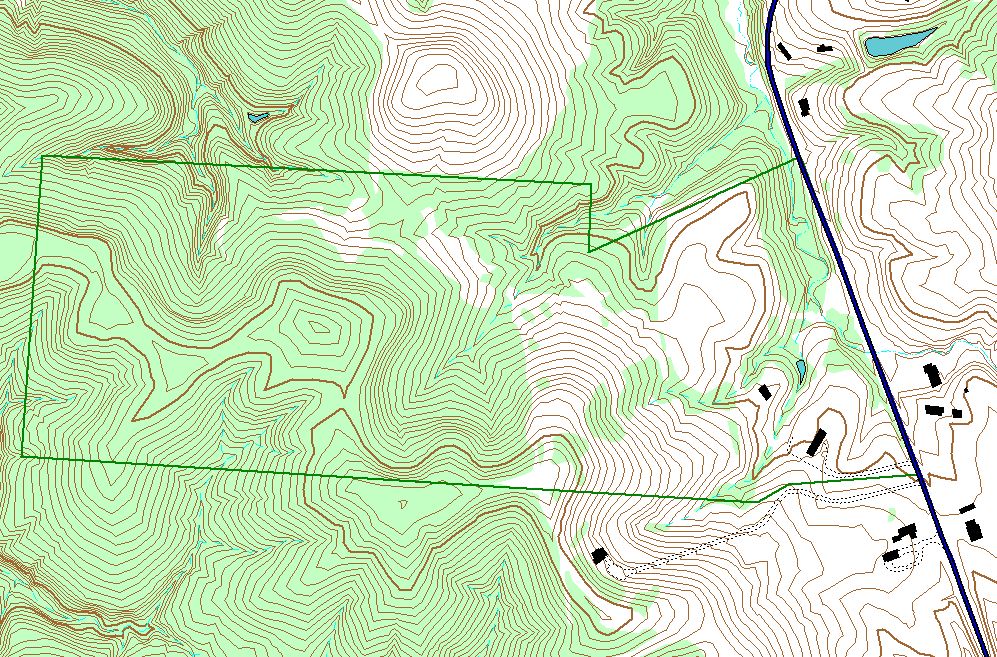
- Geographic Information Systems (GIS): GIS is the analytical brain of modern geography. Geographic Information Systems manage spatially referenced data. More importantly, Geographic Information Systems layer multiple types of spatial data to identify complex geographic relationships.
Imagine you are a city planner deciding where to build a new high school. Using GIS, you would load a digital map and stack several transparent layers on top of it: a layer showing the road network, a layer showing current population density, a layer of topological flood zones, and a layer of median household incomes. By layering this data, the perfect, safe, and accessible location reveals itself.
The TIGER Database
To make GIS work for human geography in the U.S., you need a framework that translates physical streets and boundaries into digital code. Enter TIGER, which stands for Topologically Integrated Geographic Encoding and Referencing.
TIGER is a digital database of geographic features—it digitizes every street, railroad, river, and zip code boundary in the country. Because the government needs this mapping code to accurately conduct the decennial census, the United States Census Bureau produces the Topologically Integrated Geographic Encoding and Referencing database. Without TIGER, the sophisticated GIS systems that route your online deliveries, organize voting districts, and map census data simply could not exist.
By mastering these concepts—how we project the Earth, how we visualize data through thematic maps, how human behavior creates spatial patterns, and how technology digitizes the landscape—you possess the essential framework for teaching geography. You are now equipped to help students see maps not as static pictures, but as dynamic, argument-driven models of the human experience.