Comparing Data Distributions
Not sure you’re ready?
Take the ~3-minute readiness diagnostic and see where you stand.
Imagine pouring thousands of grains of sand onto a flat surface. The trajectory of any single grain is wildly unpredictable, yet collectively, they inevitably build a mound of a highly predictable, specific shape. A data distribution operates on the exact same principle. When we collect raw numerical observations, we are faced with a chaotic list of digits. But fundamentally, a data distribution represents all possible values of a variable, and critically, a data distribution displays the frequencies of the possible values of a variable. By analyzing these frequencies, we uncover the hidden architecture of the information.
For the middle school mathematics educator, statistical reasoning is not merely a computation of formulas; it is the science of making sense of variation. To genuinely evaluate student test scores, neighborhood income levels, or scientific measurements, we must compare the centers and spreads of multiple data sets while rigorously accounting for the distortions caused by outliers.
In the classroom, data without context is meaningless. A complete statistical summary must go beyond mere arithmetic. A statistical summary must explicitly reference the specific real-world context of the numerical data. Furthermore, a complete statistical summary explicitly states the units of measurement for the data points (such as "centimeters" or "dollars"), and a complete statistical summary identifies the total number of observations in the data set. Without stating what was measured, how it was measured, and how many items were measured, the statistical analysis floating on a whiteboard is an empty abstraction.
To understand data, we must look at it. The choice of visualization depends fundamentally on the size of the data set.
Dot plots display individual data points to show the exact shape of a relatively small data set. Because every single observation is represented by a dot, no granularity is lost. However, if you are analyzing the standardized test scores of 5,000 students across a district, a dot plot becomes a useless smear of ink. For this, we use histograms. Histograms group numerical data into distinct intervals (or bins) to display the shape of larger data sets.
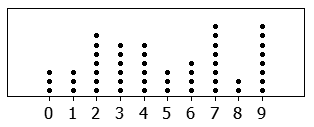
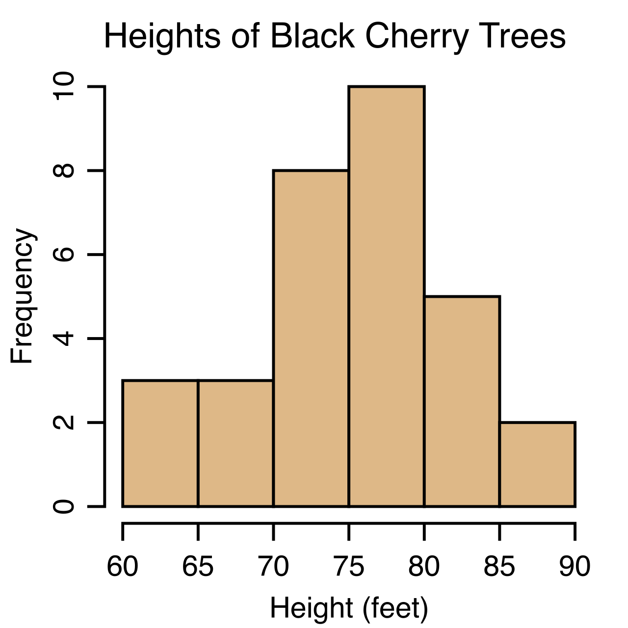
When analyzing these graphs, we look for distinct topographical features:
- A cluster in a graphical data distribution indicates a narrow range of numerical values containing a high concentration of data points.
- A gap in a graphical data distribution indicates a range of numerical values containing zero data points.
If we wish to compare two distributions—say, the reading speeds of sixth graders versus seventh graders—we must obey strict visual rules. Comparing two graphical distributions visually requires verifying that the horizontal axes use the exact same scale. If the axes are shifted or stretched differently, our eyes will deceive us. Similarly, comparing two histograms visually requires verifying that both graphs use the exact same bin width.
The shape of a distribution is its defining characteristic. Crucially, the shape of a data distribution determines the most appropriate measure of center, and simultaneously, the shape of a data distribution determines the most appropriate measure of spread.
- Symmetrical data distributions have a roughly equal mirror image on both sides of the center.
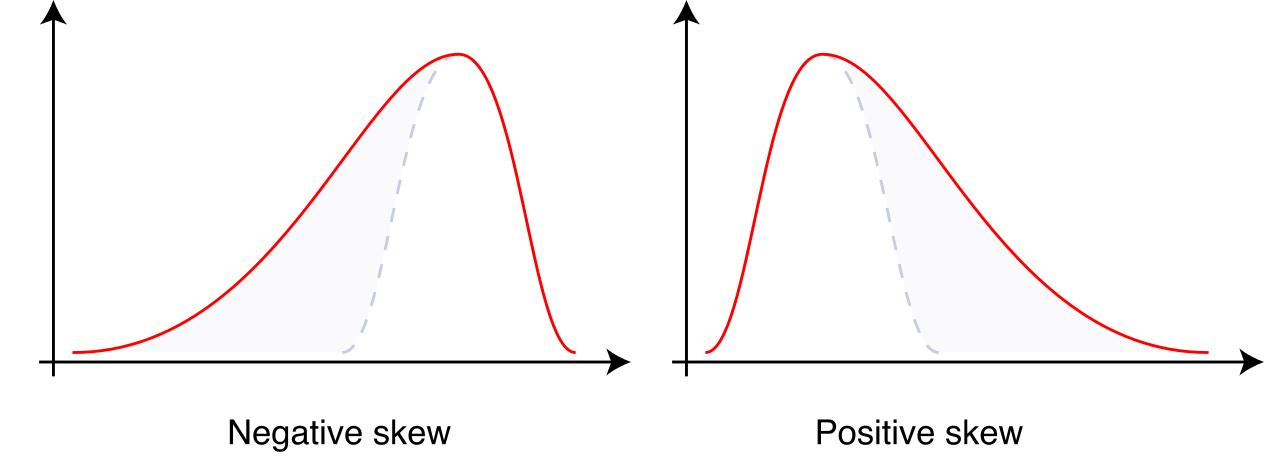
- Skewed data distributions are asymmetric. A data distribution is skewed to the right when the right tail is noticeably longer than the left tail (often caused by exceptionally high values stretching the tail to the right). Conversely, a data distribution is skewed to the left when the left tail is noticeably longer than the right tail.
- A bimodal distribution contains exactly two distinct peaks in the frequency of values, often suggesting that two distinct subgroups are mixed within the single data set.
- A uniform distribution lacks distinct peaks in the frequency of values. In fact, a uniform distribution has approximately the same frequency for all possible values of the variable (imagine a flat, rectangular block of data, such as the outcomes of rolling a fair die thousands of times).
Comparing the centers of two contextualized data sets reveals which group typically has higher or lower numerical values. However, choosing which center to calculate requires understanding the physical physics of the mathematics.
The mean (the arithmetic average) balances the total weight of the data. Because it incorporates the magnitude of every single value, the mean is the preferred measure of center for roughly symmetrical data distributions without outliers.
The median is positional; it represents exactly the 50th percentile of a data distribution. Half the values are below it, and half are above it. Because it relies only on rank order, the median is the preferred measure of center for skewed data distributions, and the median is the preferred measure of center for distributions containing outliers.
The Phenomenon of Resistance
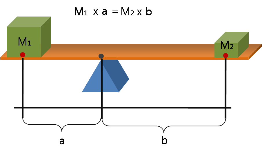
Why do we abandon the mean when outliers are present? Because the mean is not a resistant measure of center. Imagine a seesaw balancing perfectly. If a massive weight (an outlier) is placed on the far right end, the fulcrum must slide dramatically to the right to keep the board from tipping. Mathematically, an outlier significantly pulls the mathematical mean toward the direction of the outlier.
Consequently:
- Removing an extremely low outlier from a data set will strictly increase the mean of the remaining data.
- Removing an extremely high outlier from a data set will strictly decrease the mean of the remaining data.
By contrast, the median is a resistant measure of center. If the wealthiest person in a room suddenly becomes ten times wealthier, the middle person in the room remains exactly the same. Thus, an outlier has minimal effect on the numerical value of the median.
It is also vital to understand that measures of center operate independently of other properties. Two entirely different data sets can have the exact same median. (For example, {1,5,100} and {4,5,6} both share a median of 5).
Where the center tells us what is typical, the spread tells us how reliable that typicality is. Comparing the spreads of two contextualized data sets reveals which group exhibits more consistency in the recorded values. A group with a massive spread is highly unpredictable; a group with a narrow spread is highly consistent. Just as two data sets can share a median, two data sets with the exact same median can have entirely different measures of spread.
Measures for Symmetrical Data
For roughly symmetrical distributions, we use measures of spread that are calculated based on the distance of every point from the mean.
- Standard deviation is an appropriate measure of spread for roughly symmetrical data distributions. It calculates the typical distance points fall from the mean using squared values.
- Mean absolute deviation (MAD) is an appropriate measure of spread for roughly symmetrical data distributions.
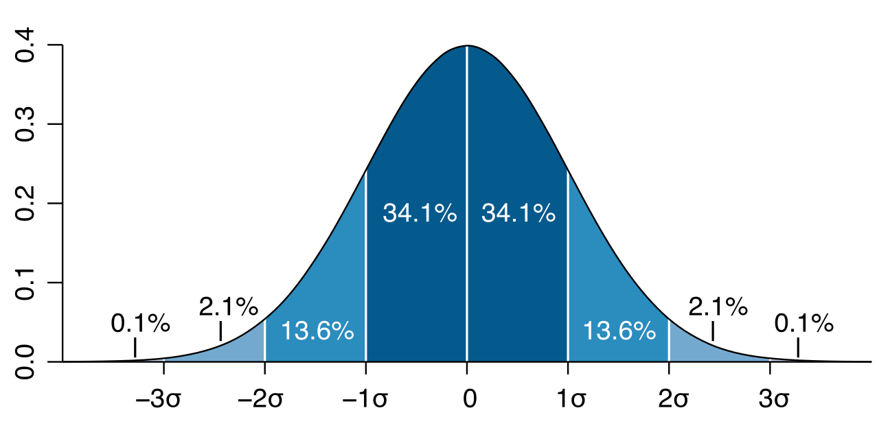
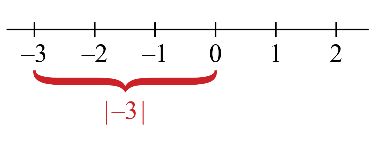
Why "absolute" deviation? Here is a beautiful, unbreakable rule of mathematics: the sum of all individual deviations from the mean in any data set always equals zero. The positive deviations completely cancel out the negative deviations. To measure the actual scatter without the numbers collapsing to zero, we take the absolute value of those distances. Comparing the mean absolute deviations of two data sets determines which data set has values closer to the mean on average. Naturally, a larger mean absolute deviation indicates greater variability within the associated data set.
We can also use MAD to evaluate the visual overlap of two symmetrical distributions. The difference between the means of two data sets can be expressed as a multiple of the mean absolute deviation. Expressing the difference between two data set means as a multiple of the mean absolute deviation quantifies the degree of visual overlap between the distributions. If the difference between two means is 3 times the MAD, the distributions are highly distinct with very little visual overlap.
Measures for Skewed Data
Because Standard Deviation and MAD use the mean, they inherit the mean's flaws: Standard deviation is highly sensitive to outliers, and Mean absolute deviation is highly sensitive to outliers. Furthermore, the range (maximum minus minimum) is highly sensitive to outliers. In all three cases, an outlier increases the calculated standard deviation, increases the calculated mean absolute deviation, and increases the calculated range of a data set.
Therefore, for skewed data or data with outliers, we must rely on position. The interquartile range (IQR) is the preferred measure of spread for skewed data distributions, and the interquartile range is the preferred measure of spread for distributions containing outliers.
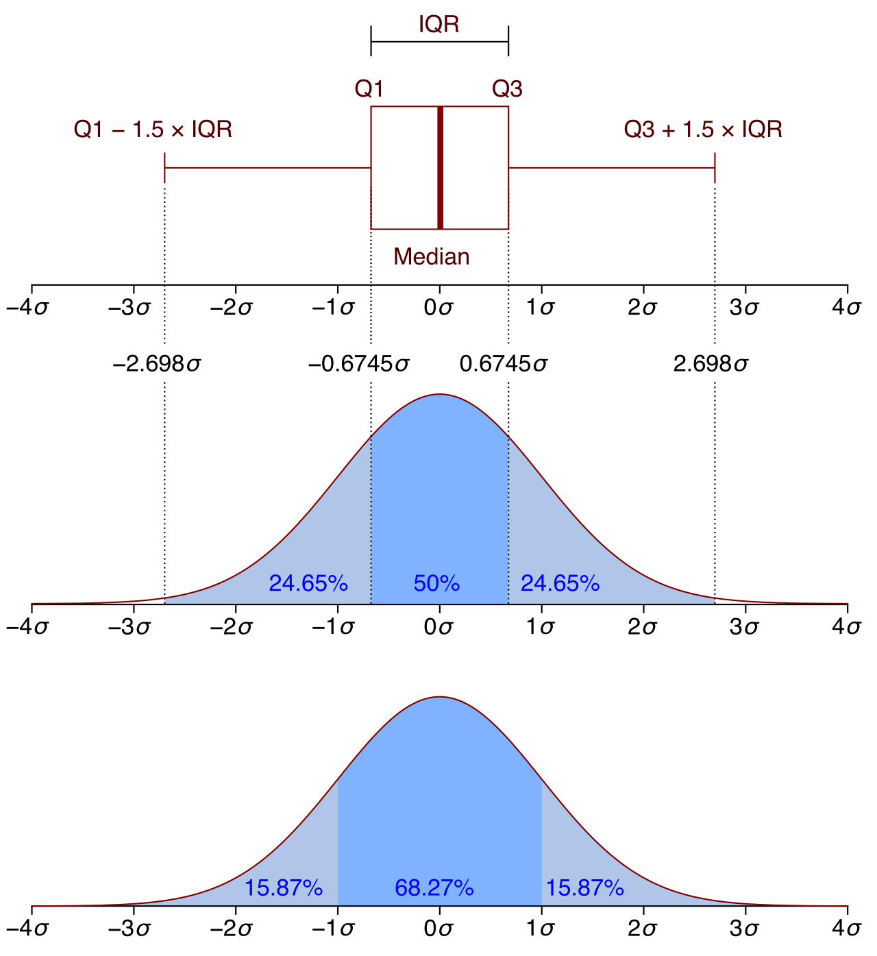
The IQR measures the spread of the middle bulk of the data. Just as the median is the 50th percentile, the first quartile (Q1) represents exactly the 25th percentile of a data distribution, and the third quartile (Q3) represents exactly the 75th percentile of a data distribution. By subtracting Q1 from Q3, we find the IQR. Therefore, the interquartile range represents exactly the middle 50 percent of the data points in a distribution.
A smaller interquartile range indicates that the middle fifty percent of the data is more tightly clustered. Because it ignores the extreme 25% on both ends, the interquartile range is a resistant measure of spread, meaning an outlier has minimal effect on the numerical value of the interquartile range.
Note on independence: Just as centers and spreads can detach, two entirely different data sets can have the exact same interquartile range, and two data sets with the exact same interquartile range can have entirely different medians.
The elegant counterpart to the IQR is the box plot. A box plot visually displays the five-number summary of a single data set. The five-number summary consists of the minimum, first quartile, median, third quartile, and maximum.
When analyzing box plots, visual lengths translate directly into mathematical values:
- The length of the box in a box plot visually represents the interquartile range of the data set.
- The distance between the ends of the whiskers in a standard box plot visualizes the overall range of the data set.
- Because the median is a distinct vertical line inside the box, box plots allow for direct visual comparison of the medians of two different data sets stacked above the same number line.
Up to this point, we have treated an "outlier" as an intuitively extreme value. But mathematics demands rigor. We do not guess if a value is an outlier; we calculate it.
An outlier is formally identified using the "1.5 × IQR rule," creating a mathematical fence on either side of the box plot.
Lower Outlier Boundary: An outlier is frequently defined mathematically as a value strictly less than the first quartile minus 1.5 times the interquartile range (<Q1−1.5×IQR).
Upper Outlier Boundary: An outlier is frequently defined mathematically as a value strictly greater than the third quartile plus 1.5 times the interquartile range (>Q3+1.5×IQR).
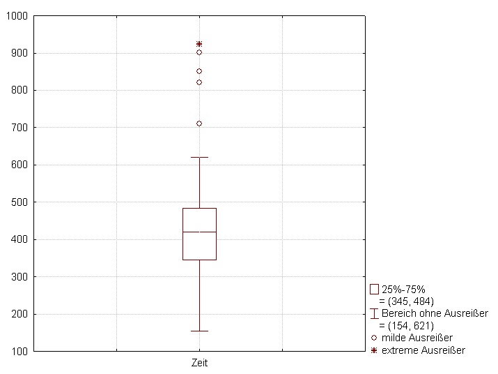
Any individual observation falling outside these calculated fences is flagged as a true outlier, allowing you, the educator, to decide if that data point is a genuine anomaly to be investigated or an error to be removed.
Mastering these tools—knowing when to deploy the mean versus the median, the MAD versus the IQR, and how to verify graphs and summaries—empowers you to cut through numerical noise and read the true story the data is trying to tell.