Bivariate Data and Scatterplots
Not sure you’re ready?
Take the ~3-minute readiness diagnostic and see where you stand.
Imagine a high school hallway at 7:30 AM. One student walks in holding a massive 24-ounce iced coffee; another walks in yawning, empty-handed. We might instinctively wonder: is there a measurable relationship between hours slept the night before and ounces of caffeine consumed the next morning? Or consider a broader administrative question: is a student’s grade level associated with their choice to enroll in an Advanced Placement course?
To answer these questions, we must transcend single-variable statistics. We are no longer merely asking, "What is the average sleep time?" or "How many students take AP classes?" We are asking how one characteristic moves in tandem with, or diverges from, another. This is the domain of bivariate data. As a mathematics educator, your goal is to equip students with the analytical lenses to see these hidden structures—whether they manifest as intersecting frequencies in a table or as a constellation of points plotted on a coordinate plane.
When our variables are categorical—meaning they place individuals into groups or categories, like "Grade Level" or "Transportation Method"—we map their intersections using a matrix. A two-way frequency table displays the frequencies of two categorical variables collected from the same set of subjects.
Let us look at a hypothetical subset of 100 high school students, observing two variables: Grade Level (Junior vs. Senior) and Part-Time Job Status (Employed vs. Not Employed).
| Employed | Not Employed | Total | |
|---|---|---|---|
| Junior | 15 | 35 | 50 |
| Senior | 40 | 10 | 50 |
| Total | 55 | 45 | 100 |
This simple table is a structural marvel when you break down its anatomy.
Joint and Marginal Frequencies
Look at the inner grid—the 15, 35, 40, and 10. The entries located in the inner body cells of a two-way frequency table are called joint frequencies. These numbers are highly specific. Joint frequencies represent the number of subjects that share a specific characteristic from each of the two categorical variables. For instance, the joint frequency of 40 represents the exact number of subjects who are simultaneously Seniors and Employed.
Now look at the outer edges. The sums of the individual rows and individual columns in a two-way frequency table are called marginal frequencies. The 50 Juniors, 50 Seniors, 55 Employed students, and 45 Not Employed students are our margins. They strip away the bivariate nature and simply tell us the totals for a single category.
Finally, anchored in the bottom right is the 100. The grand total in a two-way frequency table is the sum of all joint frequencies (or the sum of the row marginal frequencies, or the sum of the column marginal frequencies). It represents our entire sample space.
Raw frequencies (counts) are often inadequate for comparison, especially if group sizes differ. We must translate counts into proportions.
A relative frequency is the ratio of a specific frequency to the grand total.
- A joint relative frequency is calculated by dividing a joint frequency by the grand total. (e.g., 15/100=0.15 or 15% of all students are Employed Juniors).
- A marginal relative frequency is calculated by dividing a marginal frequency by the grand total. (e.g., 55/100=0.55 or 55% of all students are Employed).
But the true diagnostic power of a two-way table is unlocked when we change our denominator.
A conditional relative frequency is calculated by dividing a joint frequency by a marginal frequency.
This is a profound conceptual shift for students. When we calculate a conditional relative frequency, we are temporarily ignoring the grand total and zooming in on a single row or column. Conditional relative frequencies show the distribution of one categorical variable among a specific subgroup of another categorical variable.
Ask your students: What percentage of Juniors are employed? We restrict our universe solely to the 50 Juniors (the marginal frequency). We take the 15 employed Juniors (the joint frequency) and divide by 50. 15/50=0.30 or 30%.
Now ask: What percentage of Seniors are employed? 40/50=0.80 or 80%.
Association Versus Independence
Why did we do this? To uncover relationships.
An association exists between two categorical variables if the conditional relative frequencies differ significantly across categories. In our example, being employed heavily depends on whether you are a Junior (30%) or a Senior (80%). The stark difference between 30% and 80% reveals a strong association between grade level and employment status.
Conversely, independence between two categorical variables means that the conditional relative frequencies are approximately equal across categories. If we found that 40% of Juniors were employed and 41% of Seniors were employed, knowing a student's grade level would give us no useful predictive information about their employment status. The variables would be operating independently of one another.
When we transition from categorical data to quantitative data—measurements that have numerical value and magnitude—we swap our tables for a Cartesian canvas.
A scatterplot displays quantitative bivariate data as individual points plotted on a Cartesian coordinate plane. Each dot represents a single subject measured on two distinct variables.
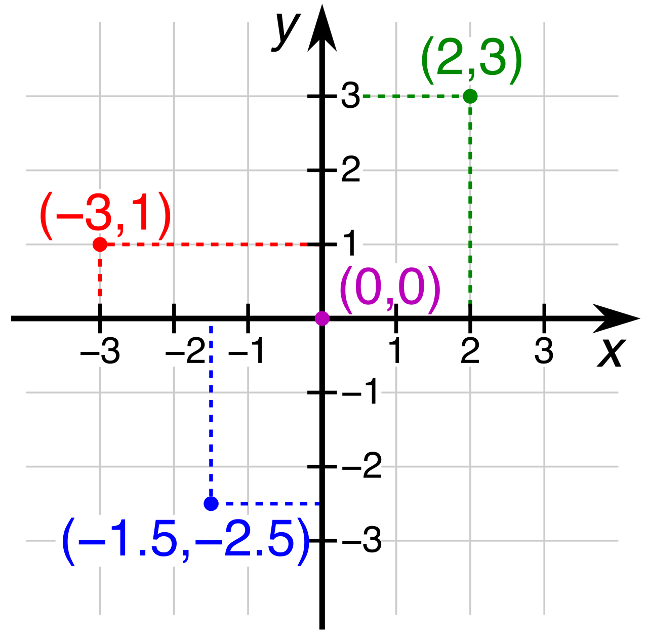
When constructing a scatterplot, axis placement matters:
- The explanatory variable is typically plotted on the horizontal axis of a scatterplot. This is the variable we suspect is doing the "explaining" or predicting (often thought of as the independent variable).
- The response variable is typically plotted on the vertical axis of a scatterplot. This is the outcome we are measuring (often thought of as the dependent variable).
If we plot a student's weekly hours studying against their test scores, "hours studying" is the explanatory variable (horizontal x-axis), and "test score" is the response variable (vertical y-axis).
Reading the Constellation: Direction, Form, and Strength
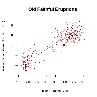
When we look at a scatterplot, we are searching for the macro-structure among the dots. We describe this structure using three parameters: direction, form, and strength.
-
Direction
- A positive association in a scatterplot occurs when the response variable increases as the explanatory variable increases. The cloud of points trends upward from left to right.
- A negative association in a scatterplot occurs when the response variable decreases as the explanatory variable increases. The cloud of points trends downward from left to right (e.g., as hours spent playing video games increases, test scores might decrease).
-
Form
- The form of an association in a scatterplot can be described as linear or nonlinear.
- A linear association is indicated when the plotted points in a scatterplot cluster around a straight line.
- A nonlinear association is indicated when the plotted points in a scatterplot cluster around a curve (such as a parabola or an exponential curve). Nature frequently yields nonlinear relationships, such as the trajectory of a thrown baseball or the rapid replication of bacteria.
-
Strength
- The strength of an association in a scatterplot is determined by how closely the plotted points follow a specific mathematical form. If the points form a tight, unmistakable line, the linear association is strong. If they look like a blast from a shotgun with only a vague directional trend, the association is weak.
Anomalies: Outliers and Clusters
Sometimes, points refuse to conform.
- An outlier in a scatterplot is a data point that falls substantially outside the overall pattern of the other data points. It is an anomaly—perhaps a student who studied for 0 hours but scored a 99%, defying the dominant positive trend.
- A cluster in a scatterplot is a distinct grouping of data points that are located close together. Identifying a cluster often indicates the presence of an unmeasured third variable (e.g., realizing that a cluster of high test scores belongs specifically to students who attended a review session).
Visual estimation is an excellent starting point, but mathematics demands precision. We need to quantify what our eyes are seeing.
Correlation measures the strength and direction of a relationship between two quantitative variables. To measure a specifically linear relationship, we rely on a single, powerful metric: r.
The correlation coefficient measures the strength and direction of a linear relationship between two quantitative variables.
The mathematics of r are elegantly constrained: the correlation coefficient is always a value between negative one and positive one inclusive (−1≤r≤1).
The value of r tells us a precise story about the scatterplot:
- A correlation coefficient of exactly positive one indicates a perfect positive linear relationship. Every single data point falls perfectly on an upward-sloping straight line.
- A correlation coefficient of exactly negative one indicates a perfect negative linear relationship. Every point falls perfectly on a downward-sloping straight line.
- A correlation coefficient of zero indicates that there is no linear relationship between the two quantitative variables. The points appear entirely random with respect to a straight line (though a strong nonlinear relationship could still theoretically exist, r cannot detect it).
As r moves away from 0 and approaches either 1 or −1, the points hug the imaginary line of best fit more tightly.

The Ultimate Caveat: Causation
We reach the most vital principle of bivariate statistics—a principle you will repeat to your students until it is permanently etched into their minds.
A strong association between two variables in a scatterplot does not prove that one variable causes changes in the other.
We might find a correlation coefficient of r=0.95 between a city's ice cream sales (in $) and the number of swimming pool accidents. The association is overwhelmingly strong and positive. But closing ice cream shops will not save swimmers.
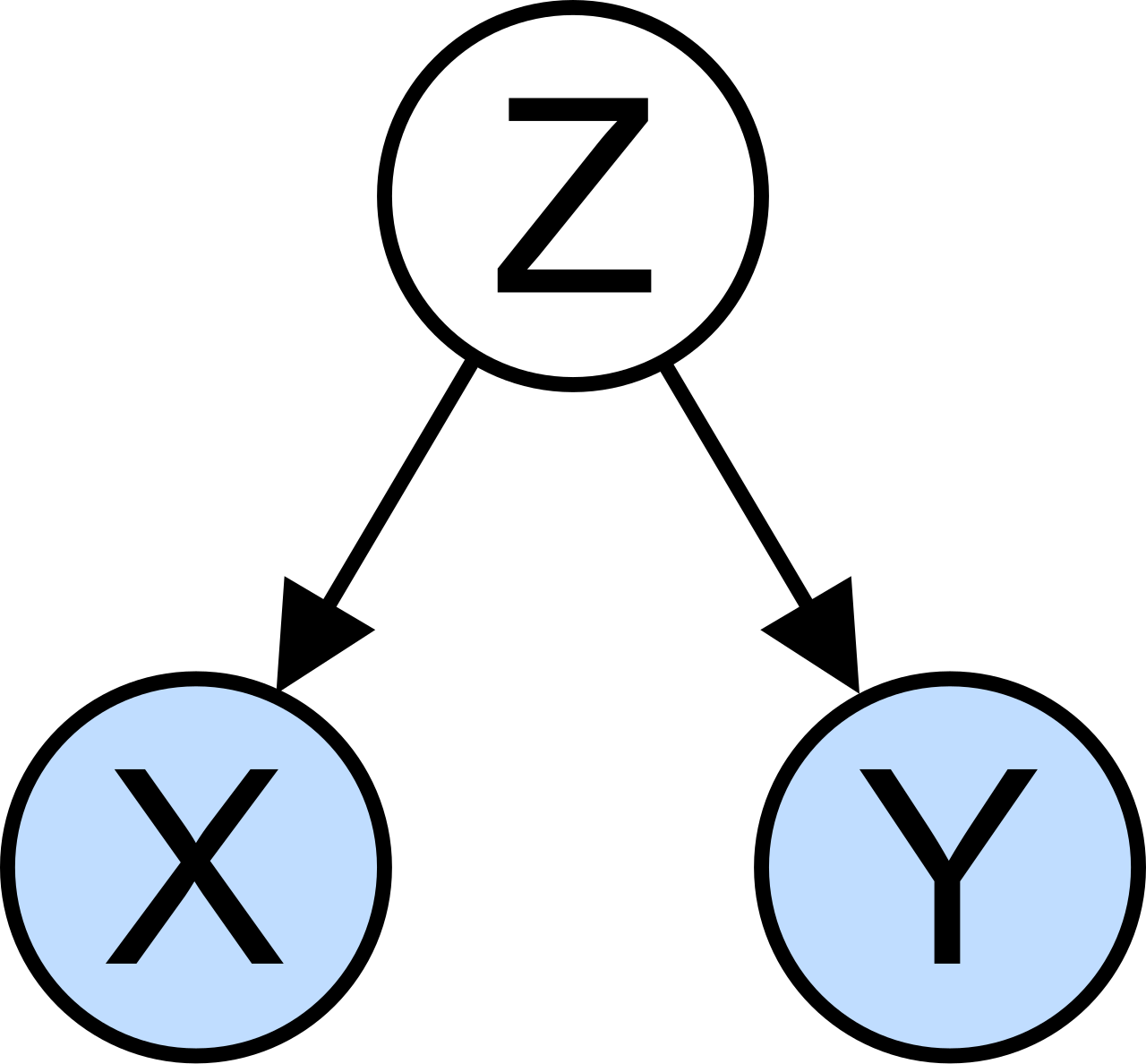
Causation indicates that an event or change in one variable directly produces a corresponding change in another variable. In our ice cream example, causation is entirely absent. Both variables are responding to an invisible third factor—the soaring summer temperature.
When we teach bivariate data, we are teaching students to be detectives. Whether they are calculating a conditional relative frequency in a two-way table or interpreting an r-value of −0.82 on a scatterplot, they are looking for evidence of relationships. But the math only provides the map; it is up to the critical thinker to correctly interpret the territory.