Summarizing Single-Variable Data
Not sure you’re ready?
Take the ~3-minute readiness diagnostic and see where you stand.
A stack of 150 state assessment scores sits on a desk. As a raw column of numbers, it is effectively noise—an overwhelming wall of data that the human mind cannot simultaneously process. To make sense of it, we are forced to compress the information. But in mathematics, compression is always a trade-off. The statistical tools we choose to summarize our single-variable data dictate exactly what truths we reveal about our students’ performance and what nuances we permanently obscure. As educators preparing for the mathematics classroom, your goal is not merely to calculate a solitary number. Your objective is to characterize an entire distribution: to find its center, measure its spread, describe its shape, and rigorously define its anomalies.
Before we calculate a single metric, we must look at the shape of our data. How we draw the picture determines the story we see.
The Dot Plot: Absolute Fidelity
If you have a quiz from a single class of 25 students, your best tool is often the simplest. A dot plot represents each value in a numerical data set as a single dot above a number line.
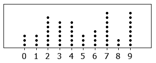
Because every single student's score gets its own coordinate, dot plots explicitly preserve the exact numerical values of a small data set. If three students scored an 85, there are three distinct dots stacked above the 85. It is the most honest graph we have, but it fails to scale. If you try to plot 3,000 district test scores this way, the graph becomes a towering, unreadable monolith.
Histograms: The Macroscopic View
When we shift from a single classroom to an entire school, we must sacrifice absolute fidelity for a macroscopic view. A histogram visually represents continuous numerical data grouped into contiguous intervals.
These contiguous intervals used to group data in a histogram are called bins or classes. To maintain mathematical integrity and prevent visual distortion, the bins in a histogram must be equal in width.
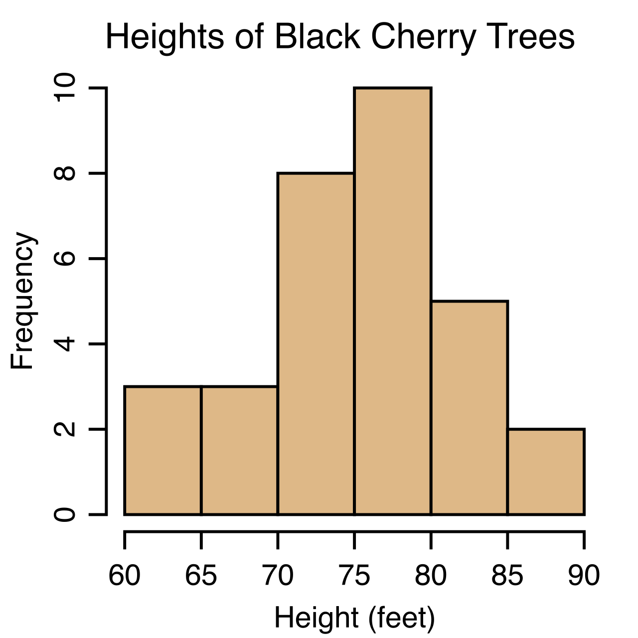
- Frequency Histogram: The height of a histogram bar represents the frequency of data values falling within that specific bin. If 40 students scored between 70 and 80, the bar spanning that interval rises to 40.
- Relative Frequency Histogram: Instead of raw counts, a relative frequency histogram displays the proportion or percentage of data values in each bin. Because it accounts for the entirety of the dataset, the sum of the relative frequencies of all bins in a relative frequency histogram equals exactly one (or 100%).
The Trade-off of Bins Because we group scores into ranges, histograms do not preserve the exact individual data values of a data set. If a bin covers 80–90, you know how many students are in that range, but you do not know if they all scored an 81 or an 89. Furthermore, changing the bin width of a histogram can alter the perceived shape of the data distribution. A bin width of 2 points might reveal a jagged, chaotic distribution, while a bin width of 20 points might smooth that exact same data into a perfect bell curve.
Boxplots: The Executive Summary
Sometimes, we want to completely strip away the bins and dots and view only the structural skeleton of the data. A boxplot is a graphical representation of the five-number summary of a numerical dataset.
The five-number summary consists of the minimum, first quartile, median, third quartile, and maximum.
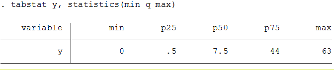
Here is how the geometry of the boxplot maps to your data:
- The first quartile (Q1) is the median of the lower half of an ordered data set.
- The third quartile (Q3) is the median of the upper half of an ordered data set.
- The central box of a boxplot spans from the first quartile to the third quartile, visually capturing the middle 50% of your students.
- A vertical line drawn inside the central box of a boxplot represents the median of the dataset.
How we draw the "whiskers" extending from this box depends on whether we are acknowledging outliers:
- In a standard boxplot, the whiskers extend from the quartiles to the absolute minimum and maximum values of the dataset, regardless of how extreme they are.
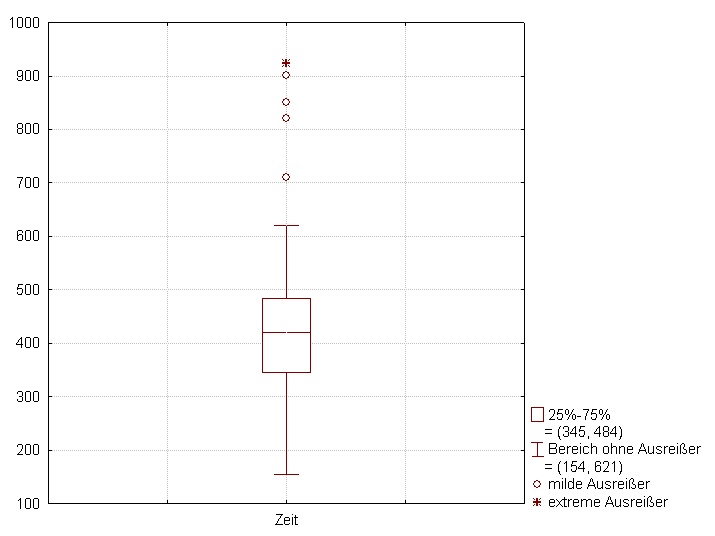
- A modified boxplot, however, plots suspected outliers as individual disconnected points beyond the whiskers. In this version, the whiskers of a modified boxplot extend to the lowest and highest data values that are not classified as outliers.
A Warning for Teachers: A boxplot conceals gaps and multiple peaks that might exist within a data distribution. If your class is deeply polarized—half the students scored 95s and the other half scored 45s—the boxplot will average this out and draw a large, spanning box through the 70s. You would look at the boxplot and assume a normal, spread-out class, entirely missing the bimodal reality of your classroom.
When administrators ask, "How did your students do?", they are usually asking for a measure of center. But "center" is an ambiguous concept that requires precise mathematical definitions.
The Mean: The Balancing Point
The mean is the arithmetic average calculated by dividing the sum of all data values by the total number of values.
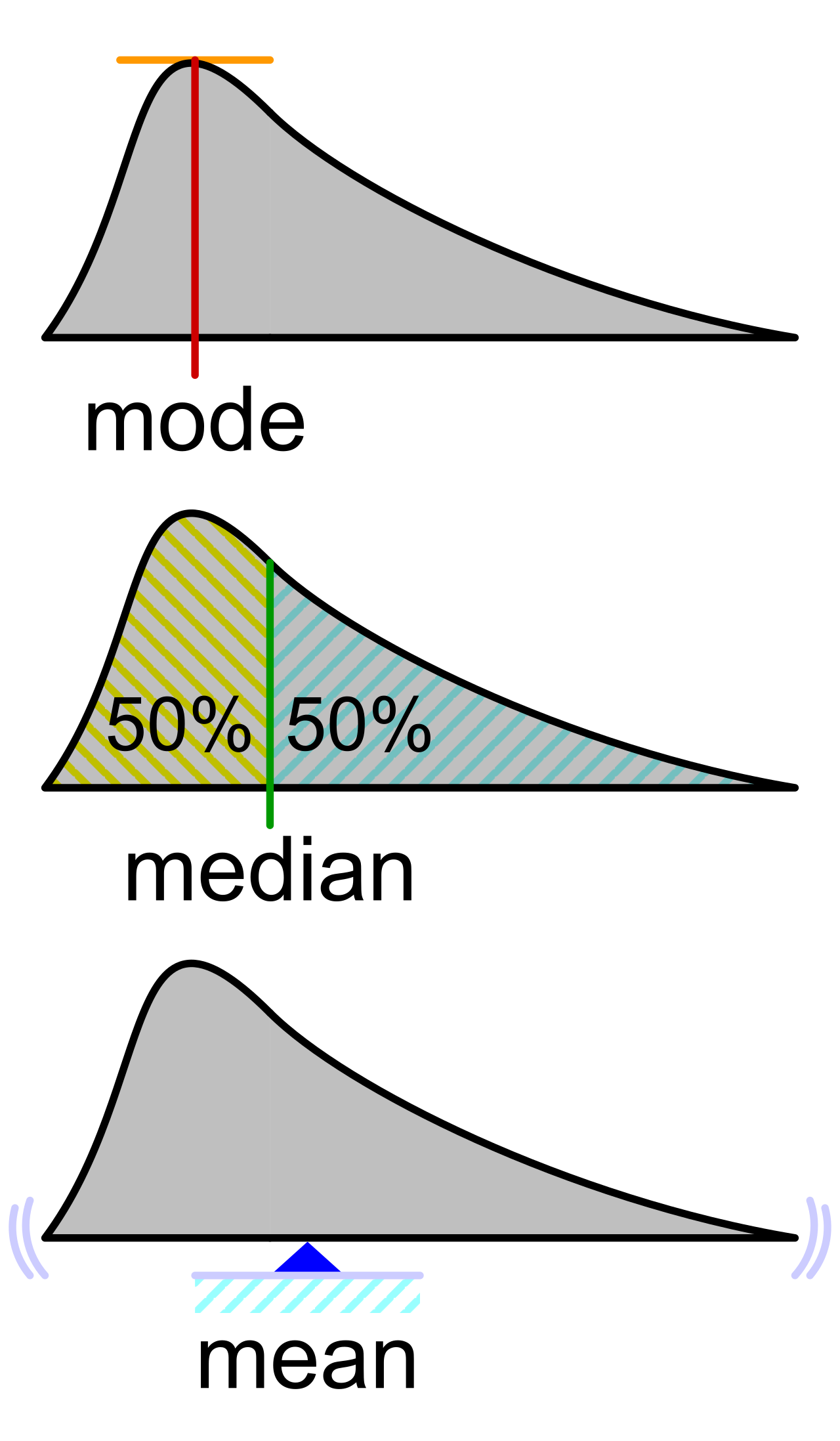
Think of the mean as the physical center of gravity of your dot plot. If the number line were a seesaw, the mean is the exact fulcrum point where the seesaw perfectly balances. Because every single point exerts a physical "weight" on this fulcrum, the mean is highly sensitive to extreme values or outliers in a dataset. One student scoring a 12 on an exam where everyone else scored an 85 will drag the mean downward, skewing the perception of the class's overall performance.
The Median: The True Middle
If the mean is the center of gravity, the median is the center of inventory. The median is the exact middle value of a dataset when the numerical values are arranged in ascending order.
If you have 25 students, the median is the 13th student's score. But what if you have an even number of data points, like 24 students? For a dataset with an even number of values, the median is calculated as the arithmetic mean of the two middlemost values.
Because it only cares about physical placement in the order, the median is a robust statistic that resists being heavily influenced by extreme values or outliers. That single score of 12 does not pull the median down; it just occupies the lowest spot in line.
The Mode: The Peak
The mode is the value or values that appear most frequently in a given dataset. Unlike the mean or median, which always yield a single structural value, a dataset can have zero modes, one mode, or multiple modes. If every student gets a different score, there is no mode. If two scores are equally popular, the data is bimodal.
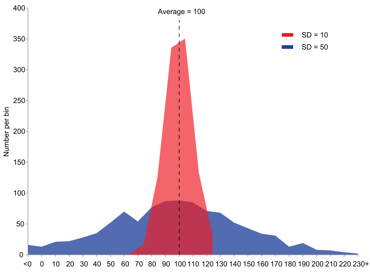
Center tells us where the data lives, but spread tells us how the data behaves. A class where every student scores an 80 is vastly different from a class where half score 60 and half score 100, yet their means are identical.
Range and Interquartile Range (IQR)
The simplest measure of spread is the absolute boundaries. The range is a measure of spread calculated as the difference between the maximum value and the minimum value in a dataset. Because it relies solely on the two most extreme points, it is incredibly fragile.
For a more reliable metric, we look to the boxplot's geometry. The interquartile range measures the spread of the middle fifty percent of a dataset. Because it deliberately ignores the top 25% and bottom 25% of the data, the interquartile range is calculated by subtracting the first quartile from the third quartile (Q3−Q1). By isolating the middle, the interquartile range is resistant to extreme outliers.
Variance and Standard Deviation
If we want to know how far, on average, a typical student's score deviates from the class mean, we use standard deviation. Standard deviation measures the typical or average distance of individual data values from the mean.
Calculating this requires us to distinguish between whether we are looking at the entire universe of data (a population) or just a snapshot (a sample).
Population Variance and Standard Deviation: If your classroom is the entire population of interest:
- Population variance is the arithmetic average of the squared differences from the population mean. We square the differences so negative distances don't cancel out positive distances.
- Population standard deviation is calculated as the principal square root of the population variance, bringing our units back from "squared test scores" to "test scores."
Sample Variance and Standard Deviation: If your classroom is being used as a sample to estimate the behavior of the entire district, we must apply a mathematical correction to avoid underestimating the spread.
- Sample variance is calculated by dividing the sum of squared deviations from the sample mean by one less than the sample size (n−1).
- Sample standard deviation is calculated as the principal square root of the sample variance.
Because standard deviation acts like a rubber band stretching from the mean to each data point, the standard deviation is highly sensitive to the presence of outliers. One score of 12 on a test will cause the standard deviation to explode.
Conversely, the standard deviation of a dataset is exactly zero if and only if all values in the dataset are identical. If there is no variation, there is zero deviation.
When we synthesize center and spread, we arrive at the shape of the data. The relationship between the mean and median tells you the direction the data is leaning.
Symmetry vs. Skew
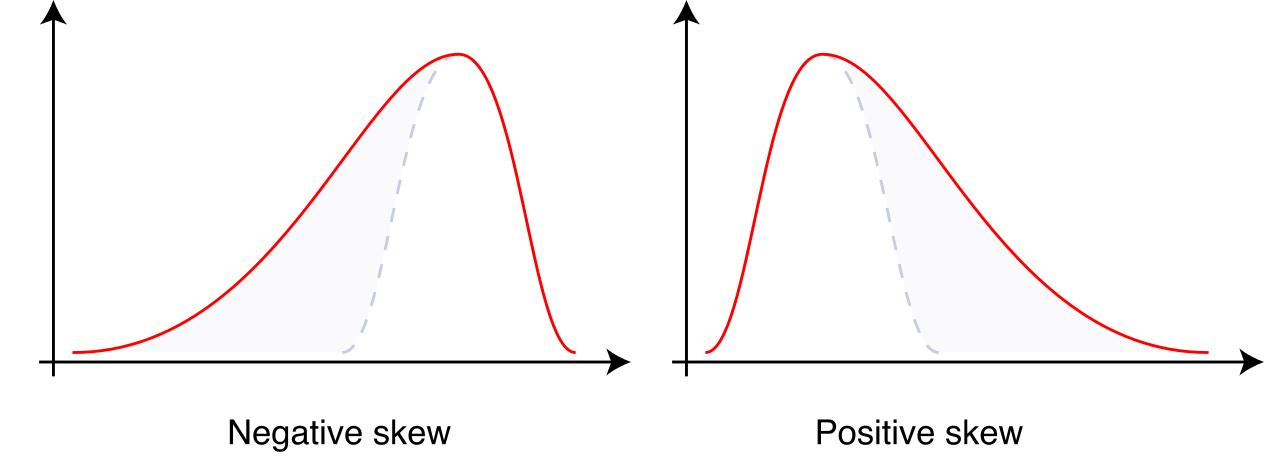
- Symmetry: A perfectly symmetric distribution has its mean and median located at exactly the same central value. The left side of the histogram is a mirror image of the right.
- Right-Skewed: Imagine a test that is incredibly difficult. Most students score low, but a few brilliant students score very high. In a right-skewed distribution, the longer tail extends toward the higher positive values on the number line. Because the mean is sensitive to those high outliers, in a substantially right-skewed distribution, the mean is typically pulled to be greater than the median.
- Left-Skewed: Imagine an easy test where most students score well, but a few students failed spectacularly. In a left-skewed distribution, the longer tail extends toward the lower values on the number line. Those low scores pull the balance point leftward, meaning in a substantially left-skewed distribution, the mean is typically pulled to be less than the median.
| Shape | Tail Direction | Center Relationship | Typical Classroom Scenario |
|---|---|---|---|
| Symmetric | Equal tails | Mean = Median | Well-balanced, standardized exam |
| Right-Skewed | Points Right (+) | Mean > Median | Extremely difficult exam (most fail, few ace) |
| Left-Skewed | Points Left (-) | Mean < Median | Very easy exam (most ace, few fail) |
Defining and Removing Outliers
We casually talk about "extreme" scores, but mathematics requires precision. An outlier is a data point that differs significantly in magnitude from the majority of the data in a given dataset.
To systematically identify them, we rely on the boundaries set by the IQR. We create invisible fences beyond our boxplot. Anything outside those fences is an outlier.
- The 1.5 IQR rule identifies lower outliers as values strictly less than the first quartile minus 1.5 times the interquartile range (<Q1−1.5×IQR).
- The 1.5 IQR rule identifies upper outliers as values strictly greater than the third quartile plus 1.5 times the interquartile range (>Q3+1.5×IQR).
What happens when you identify an anomaly—say, a student who slept through the exam and scored a 0—and decide to remove it from your gradebook? Because the mean is highly sensitive and the median is robust, removing a high outlier from a right-skewed dataset decreases the mean more drastically than it decreases the median.
Furthermore, because standard deviation measures the average distance from the center, extreme values contribute massively to the standard deviation. Therefore, removing an extreme outlier from a dataset will decrease the standard deviation, shrinking the "typical distance" and tightening the perceived clustering of your class's performance.
By mastering these representations and metrics, you cease to be a passive observer of raw scores. You gain the ability to interrogate the data, uncover hidden realities in your classroom, and adapt your teaching to the structural truths revealed by the numbers.