Outliers in Data Sets
Not sure you’re ready?
Take the ~3-minute readiness diagnostic and see where you stand.
Imagine measuring the average income of ten people sitting in a neighborhood diner. They are teachers, mechanics, and nurses, all earning between $40,000 and $70,000 a year. Suddenly, a multi-billionaire walks through the door and takes a seat. If you blindly calculate the average income of the room now, the math will declare that every single person in the diner is a multi-millionaire. The numbers themselves are perfectly accurate, but they profoundly mislead us if we fail to account for the billionaire.
_(cropped).jpg)
This scenario perfectly illustrates the fundamental challenge of the outlier. By definition, an outlier is a data point that differs significantly from other observations in a data set. Understanding how these exceptional values warp our mathematical models is not merely an exercise in academic computation; it is the essential key to finding the truth in a sea of numbers. In statistical analysis, we must learn not only how to spot these anomalies, but how to measure and predict their immense gravitational pull on our conclusions.
Before we calculate an outlier, we must learn how to see it. Human beings are exceptional pattern-recognition engines, and statisticians have designed our visual displays to make anomalies instantly obvious to the naked eye. Depending on the type of graph you are analyzing, an outlier will unmask itself in a specific way.
Scatter Plots
A scatter plot plots individual data points across an X and Y axis, allowing us to see correlations. In a scatter plot, an outlier appears as a point situated far away from the main cluster of data points. If the data generally forms a tight line sloping upward, the outlier is the solitary dot floating entirely off course, refusing to follow the dominant trend.
Histograms
A histogram groups continuous data into "bins" or ranges, showing the frequency of data within those ranges as vertical bars. Because histograms are built to show the shape of a distribution, anomalies become incredibly apparent. In a histogram, an outlier appears as an isolated bar separated from the main distribution by an empty gap. That stretch of dead space—the empty gap on the x-axis—is the visual footprint of an extreme value.
Box Plots
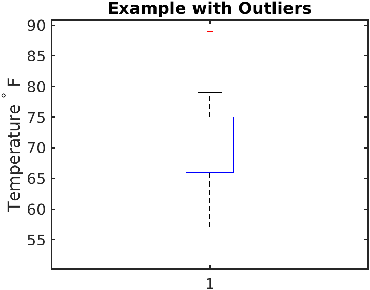
A box plot (or box-and-whisker plot) is specifically designed to handle the visual mechanics of outliers with precision. It displays the data's quartiles and range. However, it does not draw its "whiskers" all the way out to the most extreme anomalies. Instead, in a box plot, an outlier is typically represented as an individual dot or asterisk extending beyond the whiskers. When you see a trail of asterisks sitting far outside the whisker's limit, you are looking directly at mathematically verified outliers.
Visual intuition is incredibly useful, but science requires a standard. How far away must a data point be before it is officially classified as an outlier?
In 1977, the brilliant statistician John Tukey introduced the 1.5 times the interquartile range rule for identifying outliers. Tukey realized that statistics needed a robust, universally applicable threshold that didn't rely on the subjective "eyeball test." Today, the interquartile range method is a standard mathematical procedure used to identify outliers.
To use Tukey's method, we rely on the Interquartile Range (IQR), which is simply the width of the middle 50% of the data. Mathematically, it is the Third Quartile (Q3) minus the First Quartile (Q1).
The IQR Formula: IQR=Q3−Q1
Once you have the IQR, you build a mathematical "fence" around your data. Anything that falls outside this fence is declared an outlier.
- The Lower Fence: A data point is considered a lower outlier if the data point is less than the first quartile minus 1.5 times the interquartile range.
- The Upper Fence: A data point is considered an upper outlier if the data point is greater than the third quartile plus 1.5 times the interquartile range.
Tukey's Outlier Boundaries: Lower Outlier <Q1−1.5(IQR) Upper Outlier >Q3+1.5(IQR)
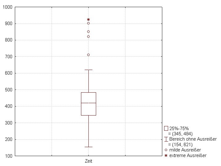
If an exam score, an income value, or a temperature measurement falls past these boundaries, it is mathematically anomalous.
When we analyze a data set, we usually want to find the "center." We want a single number that represents the whole. We have two primary tools for this: the mean and the median. Outliers interact with these two measures in wildly different ways.
The Mean: Highly Sensitive
The mathematical mean (the average) calculates the center of mass of the data. Because the mean includes the exact numerical value of every single observation in its calculation, the mean of a data set is highly sensitive to the presence of outliers.
Think of the mean as a physical balancing point on a seesaw. If you place a massive weight very far out on one side of the seesaw, the balancing point must shift dramatically to keep the system from tipping.
- An exceptionally large outlier increases the mean of a data set.
- An exceptionally small outlier decreases the mean of a data set.
In short, the presence of an outlier pulls the mathematical mean in the direction of the outlier value. Returning to our diner analogy, the billionaire pulls the average income so far to the right that the resulting mean no longer represents anyone in the room.
The Median: Highly Resistant
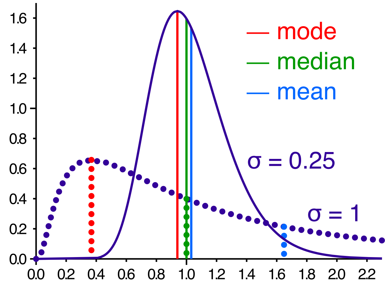
The median, conversely, is simply the middle value when the data is lined up in order from least to greatest. Because it relies entirely on position rather than numerical weight, the median of a data set is highly resistant to the mathematical effects of outliers.
If we add a billionaire to our diner, the physical middle person in the line shifts by exactly one spot. The median's value changes only slightly, to the income of the next working-class person in line. In fact, the median of a data set frequently remains completely unchanged when an extreme outlier is added to the data set. The median does not care if the highest value is $100,000 or $100,000,000,000. It is completely blind to the magnitude of the extremes.
For this reason, statisticians rely on a fundamental rule: The median provides a more representative measure of central tendency than the mean for data sets containing extreme outliers.
| Measure | Interaction with Outliers | Best Used When... |
|---|---|---|
| Mean | Sensitive. Pulled strongly toward extreme values. | Data is symmetric and free of extreme outliers. |
| Median | Resistant. Rarely impacted by magnitude of extremes. | Data is highly skewed or contains massive outliers. |
Just as outliers warp our sense of the "center" of the data, they utterly distort our measurement of the "spread." When we want to know how spread out a data set is, we generally look at the range and the standard deviation. Both of these measures are profoundly impacted by anomalies.
The Range
The range is the simplest measure of spread: the absolute distance between the maximum value and the minimum value.
Range Formula: Range=Maximum−Minimum
Because it is calculated using only the most extreme values, the range of a data set is extremely sensitive to outliers.
- An outlier that establishes a new maximum value increases the calculated range of the data set.
- An outlier that establishes a new minimum value increases the calculated range of the data set.
If a class scores between 80 and 95 on a test, the range is 15. If one student sleeps through the exam and scores a 0 (an extreme lower outlier), the new range becomes 95. The outlier creates the illusion that the entire class's performance is wildly spread out, when in reality, the bulk of the class was tightly grouped.
The Standard Deviation
Standard deviation measures the typical distance that data points fall from the mean. Recall that standard deviation is calculated by taking the distance of every single point from the mean, squaring those distances, and finding an average.
Because we square the distances, a point that is extremely far away from the mean carries an enormous, disproportionate weight in the calculation. Squaring a small distance keeps it small, but squaring a massive distance results in a staggering number. Consequently, adding an outlier to a data set increases the standard deviation of that data set. It introduces a massive amount of "mathematical variance" into the formula.
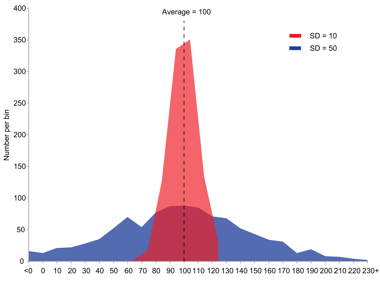
Conversely, cleaning your data by removing an outlier from a data set decreases the standard deviation of that data set, snapping the measurement back to a tighter, more accurate reflection of the main cluster.
When approaching data on the Praxis exam, treat outliers as powerful magnets that distort the space around them. Remember Tukey’s fences (1.5×IQR) to identify them mathematically. Look for the floating dots on scatter plots and the asterisks on box plots to identify them visually. Most importantly, remember that outliers violently pull the mean, inflate the range, and explode the standard deviation—while the median stubbornly holds its ground, providing the clearest lens into the true center of your data.