Scatterplots and Linear Relationships
Not sure you’re ready?
Take the ~3-minute readiness diagnostic and see where you stand.
The physical universe is not a collection of isolated, independent facts; it is an intricate web of relationships. When we wish to understand how one measurable property affects another—how the amount of fertilizer applied to a field changes the yield of wheat, or how the hours a student spends studying influence their exam scores—we require a visual tool that exposes the hidden mechanics connecting these phenomena. A scatterplot is precisely that tool. At its core, a scatterplot is a two-dimensional graph consisting of plotted points on a coordinate plane. By freezing data in a two-dimensional space, scatterplots allow us to perceive patterns that our brains would never detect in a mere spreadsheet of numbers.
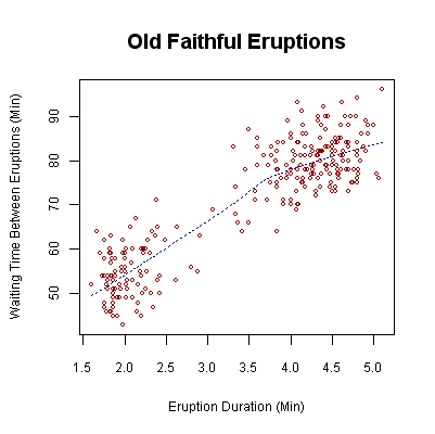
To understand a scatterplot, we must first understand the stage on which it is built. A scatterplot displays the relationship between two numerical variables. It is crucial to note the word numerical. Scatterplots are primarily designed to map continuous numeric data rather than categorical data. You can plot temperature against pressure, or height against weight, because these are continuous scales. You cannot use a scatterplot to map a categorical variable like "favorite color" against "type of pet," because colors and pets do not possess an inherent numerical scale.
This two-dimensional coordinate system is built upon two intersecting axes, each serving a distinct conceptual role:
- The Horizontal Axis: This baseline foundation represents the independent variable. By mathematical convention, the horizontal axis is called the x-axis. We usually place the variable we are manipulating, or the one we believe is causing a change, on this axis. Because it is meant to explain the behavior we observe, the independent variable is often referred to as the explanatory variable.
- The Vertical Axis: Rising upward from the baseline, the vertical axis represents the dependent variable. Predictably, the vertical axis is called the y-axis. The values on this axis "depend" on the x-values. Because this variable responds to changes in the explanatory variable, the dependent variable is often referred to as the response variable.
The Setup: Imagine observing a fleet of cars. If we want to see how a car's weight affects its fuel efficiency, the weight (which exists independently of our measurement) goes on the horizontal x-axis (the explanatory variable). The fuel efficiency, which responds to the burden of that weight, goes on the vertical y-axis (the response variable).
When you look at a scatterplot, you are looking at a constellation of distinct, individual events. Each single point on a scatterplot represents one observation consisting of two paired numerical values.
The position of a point on a scatterplot is determined by an ordered pair of coordinates, typically written as (x,y). This ordered pair is a highly specific set of geometric instructions:
- The first number in an ordered pair indicates the distance along the horizontal axis.
- The second number in an ordered pair indicates the distance along the vertical axis.
If a point is floating in the upper right quadrant of the graph, it didn't arrive there by magic. Plotting a point on a scatterplot requires locating the data point's x-value on the horizontal axis, and then, from that specific location, elevating to the height of the corresponding y-value on the vertical axis.
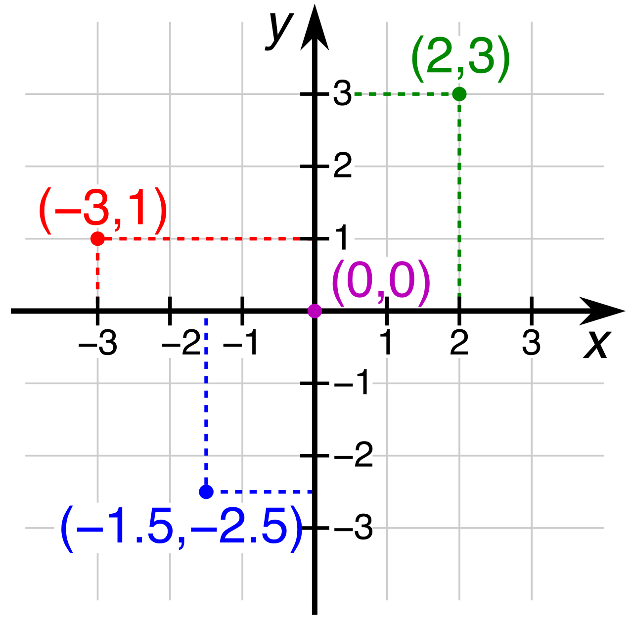
Think of plotting a point as giving walking directions in a perfectly gridded city: you walk a certain number of blocks East (along the horizontal axis) and then a certain number of blocks North (elevating along the vertical axis). Where you stop and plant your flag is the single observation that captures both variables simultaneously.
Once the points are plotted, we step back and look at the "cloud" of data. We are searching for an overarching structure. In many of the most important phenomena in nature and statistics, we look for a linear relationship.
A linear relationship exists when the points on a scatterplot roughly form a straight line. The data points won't align perfectly—reality is far too messy for that—but their general grouping will mimic a linear trajectory. Our primary goal is to determine the direction of this relationship.
The Upward Climb: Positive Linear Relationships
A positive linear relationship occurs when the dependent variable increases as the independent variable increases.
Visually, the data points in a positive linear relationship generally trend upward from left to right across the scatterplot. Imagine tracking the age of a sapling on the x-axis and its height on the y-axis. As time moves forward (rightward), the tree grows taller (upward). The points step up the graph like a loosely formed staircase.
The Downward Slide: Negative Linear Relationships
Conversely, a negative linear relationship occurs when the dependent variable decreases as the independent variable increases.
In this scenario, the data points in a negative linear relationship generally trend downward from left to right across the scatterplot. Returning to our car example: as the weight of the vehicle (x-axis) increases, its fuel efficiency in miles per gallon (y-axis) inevitably drops. The cloud of points visually descends as your eyes move from the left side of the graph to the right.
The Static Cloud: No Relationship
What happens when the variables have absolutely nothing to do with one another? If you plotted the last digit of a person's phone number against their shoe size, you would not see a staircase, neither ascending nor descending.
A scatterplot indicates no relationship when the data points are randomly distributed across the coordinate plane. It looks like a blast of static on an old television screen. A lack of a discernible directional pattern in a scatterplot indicates zero correlation between the variables. Moving along the x-axis gives you absolutely no predictive power regarding what will happen on the y-axis.
| Visual Pattern | Direction of Trend | Variable Interaction | Correlation Type |
|---|---|---|---|
| Points slope upward (left to right) | Ascending | As X increases, Y increases | Positive Linear |
| Points slope downward (left to right) | Descending | As X increases, Y decreases | Negative Linear |
| Points scattered randomly everywhere | None | Changes in X do not predict Y | Zero Correlation |
When we identify a linear relationship, we often want to summarize that relationship using a single geometric tool. We do this by drawing a trend line.
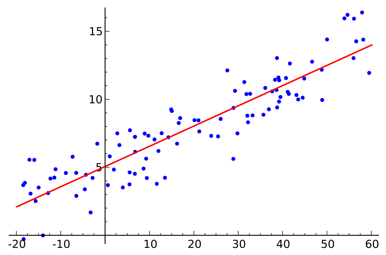
A trend line is a straight line drawn through the center of the data points on a scatterplot to model the underlying relationship. You can think of it as the "mathematical spine" of the data cloud. Because it attempts to represent the truest average path of the points, minimizing the distance between the line itself and all the scattered points, a trend line is frequently called a line of best fit.
Slopes Reveal the Secret
The trend line directly links visual geometry to algebraic rules.
- Because a positive correlation points upward, the mathematical slope of a trend line in a positive linear relationship is a positive number.
- Because a negative correlation points downward, the mathematical slope of a trend line in a negative linear relationship is a negative number.
Measuring the Gravitational Pull: Strong vs. Weak
Not all linear relationships are created equal. Sometimes, the data points cling tightly to the underlying trend line, behaving with immense predictability. Other times, the data is highly variable, swirling loosely around the general trend. We describe this variance as the strength of the relationship.
- Strong Relationships: A tight clustering of points around an imaginary straight line signifies a strong linear relationship. If you measure the boiling point of water at various strictly controlled atmospheric pressures, the resulting scatterplot will feature points so tightly packed they practically draw the line of best fit for you.
- Weak Relationships: A loose scattering of points around an imaginary straight line signifies a weak linear relationship. The general trend is still visible—perhaps sloping upward—but the points are spread wide. Predicting a student's final grade based solely on their attendance record might show a weak positive relationship; the upward trend is undeniable, but the heavy scatter indicates that many other factors (like study habits or prior knowledge) are pushing the y-values away from the trend line.
Nature rarely obeys our mathematical models perfectly, and occasionally, it produces a glaring exception.
As you analyze a scatterplot, you may spot a point that utterly defies the behavior of its peers. An outlier in a scatterplot is a specific data point located abnormally far away from the general cluster of points.
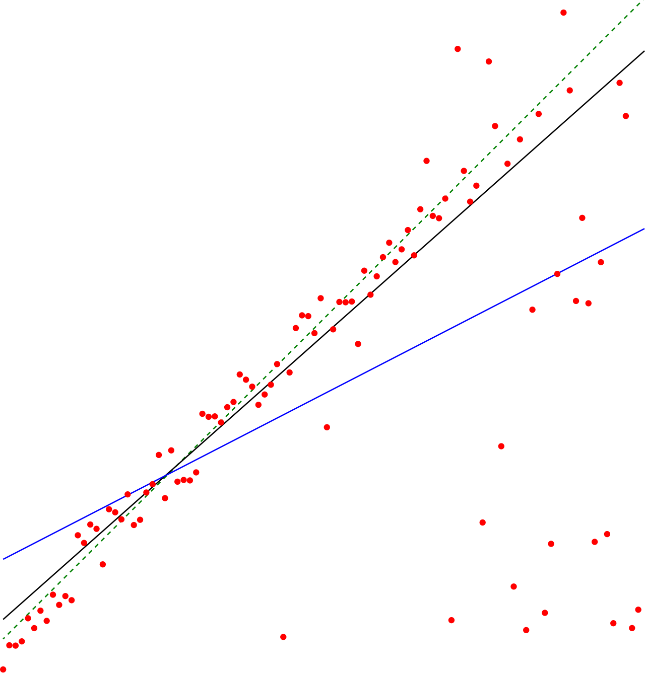
If we plot human age (x-axis) against running speed (y-axis), we will likely see a general cluster of data. But if we plot the data of an 85-year-old Olympic sprinter, that specific data point will sit drastically higher on the y-axis than the rest of the individuals in that age bracket.
Outliers are crucial. In a novice's eyes, an outlier is a nuisance that ruins a perfectly good line of best fit. To a scientist or statistician, an outlier is often an invitation to discovery. Was there an error in measurement? Or is there a hidden variable at play that we haven't considered?
Study Tip for the Praxis Core: When evaluating a scatterplot on the exam, physically trace the center of the "cloud" of dots with your finger. If your finger moves up and to the right, the relationship is positive, and the trend line's slope is positive. If your finger moves down and to the right, the relationship is negative, and the slope is negative. If your finger just scribbles in circles, there is no relationship. Always remember to check the axes to identify which variable is doing the explaining (the independent x-axis) and which is responding (the dependent y-axis).