Linear Models and Data Predictions
Not sure you’re ready?
Take the ~3-minute readiness diagnostic and see where you stand.
If you stand in a field on a summer night and count the chirps of a snowy tree cricket, you are gathering raw data. If you simultaneously read a thermometer, you have captured two distinct measurements representing a specific moment in time. Plot dozens of these paired numbers on a graph over the course of a month, and a profound pattern emerges from the seemingly random scatter of ink. The points climb upward together. You are no longer just looking at isolated numbers; you are observing a mathematical relationship between two quantitative variables. By drawing a single straight line through the center of this visual swarm, we capture the essence of nature’s behavior and equip ourselves to make powerful predictions about the unobserved.
To understand how two phenomena interact, we must map them visually. A scatter plot graphically displays the relationship between two quantitative variables. It is a mathematical canvas where real-world observations are transformed into coordinates.
When constructing a scatter plot, the placement of variables is strictly governed by their relationship:
- The independent variable (the driver, or the input) is always plotted on the horizontal x-axis.
- The dependent variable (the outcome, or the output) is plotted on the vertical y-axis.
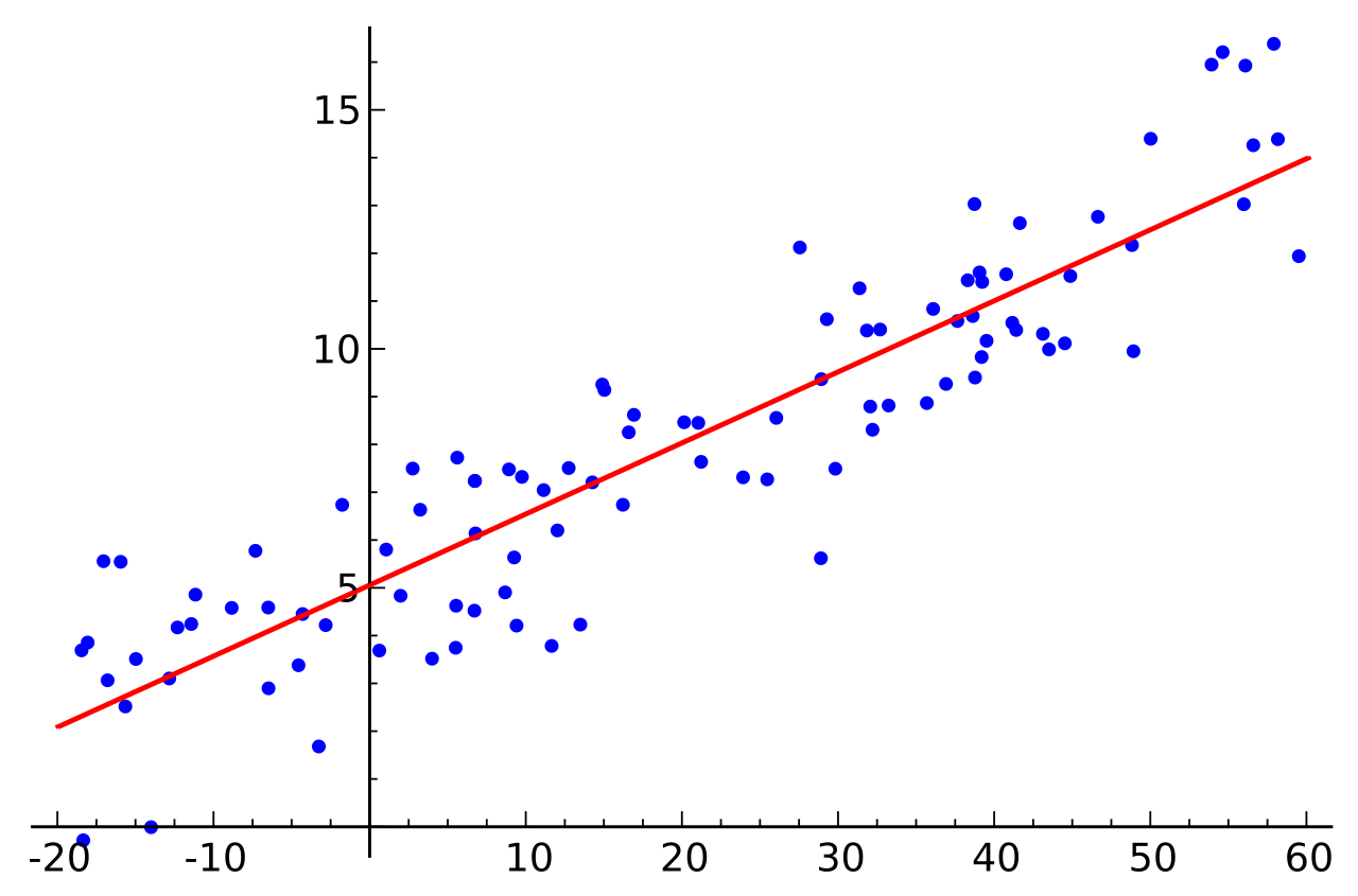
If the dots form a recognizable, linear cloud, we can model their behavior by constructing a line of best fit. This is a straight line drawn directly through the center of a data set on a scatter plot. It ignores the minor, chaotic fluctuations of individual data points and instead models the linear trend of the given data set as a whole. Crucially, finding this line of best fit allows for the numerical prediction of dependent variable values based on given independent variable values.
Every straight line in the Cartesian plane can be described by an elegant algebraic rule. The equation for a linear model is commonly expressed in the slope-intercept form:
The Linear Model Equation y=mx+b
To interpret the equation of a line of best fit in context, you must understand what m and b represent in the physical world.
The Slope (m)
In the linear equation y=mx+b, the variable m represents the slope of the line. Geometrically, it is the steepness. Conceptually, it is a rate of change. The slope of a linear model describes the predicted change in the dependent variable for each one-unit increase in the independent variable.
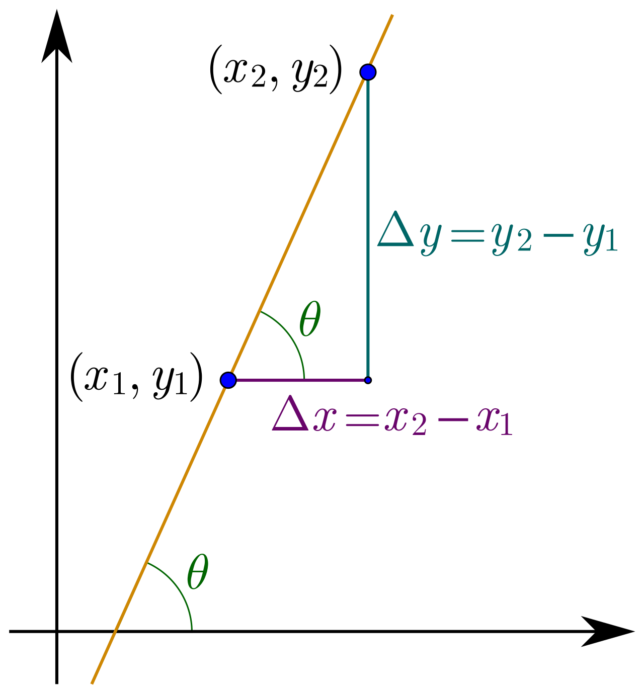
- A positive slope signifies a positive correlation between the independent variable and the dependent variable. As one increases, the other increases.
- A negative slope signifies a negative correlation between the independent variable and the dependent variable. As one increases, the other decreases.

The Y-Intercept (b)
In the linear equation, the variable b represents the y-intercept of the line. Mathematically, the y-intercept of a linear model represents the predicted value of the dependent variable when the independent variable is exactly zero.
However, you must be cautious: the mathematical intercept does not always translate to a physical reality. The y-intercept of a linear model lacks practical real-world meaning if an independent variable value of zero is physically impossible.
For example, if we create a linear model predicting human weight based on height, a height of zero inches is a physical impossibility. The y-intercept in this model might be a negative number, which is biological nonsense. In such cases, the y-intercept is merely a theoretical anchor point that keeps the rest of the line positioned correctly.
Once we have our equation, we wield it to look into the unknown. A prediction is calculated by substituting a specific numerical value into the independent variable position (x) of a linear equation and solving for the outcome.
To distinguish between an actual observation we made in the real world and a theoretical prediction generated by our model, statisticians use a specific notation: The symbol y^ (pronounced "y-hat") denotes the mathematically predicted value of a dependent variable in statistical modeling.
When making predictions, the origin of your x-value dictates the reliability of your y^ prediction. We classify predictions into two categories:
1. Interpolation
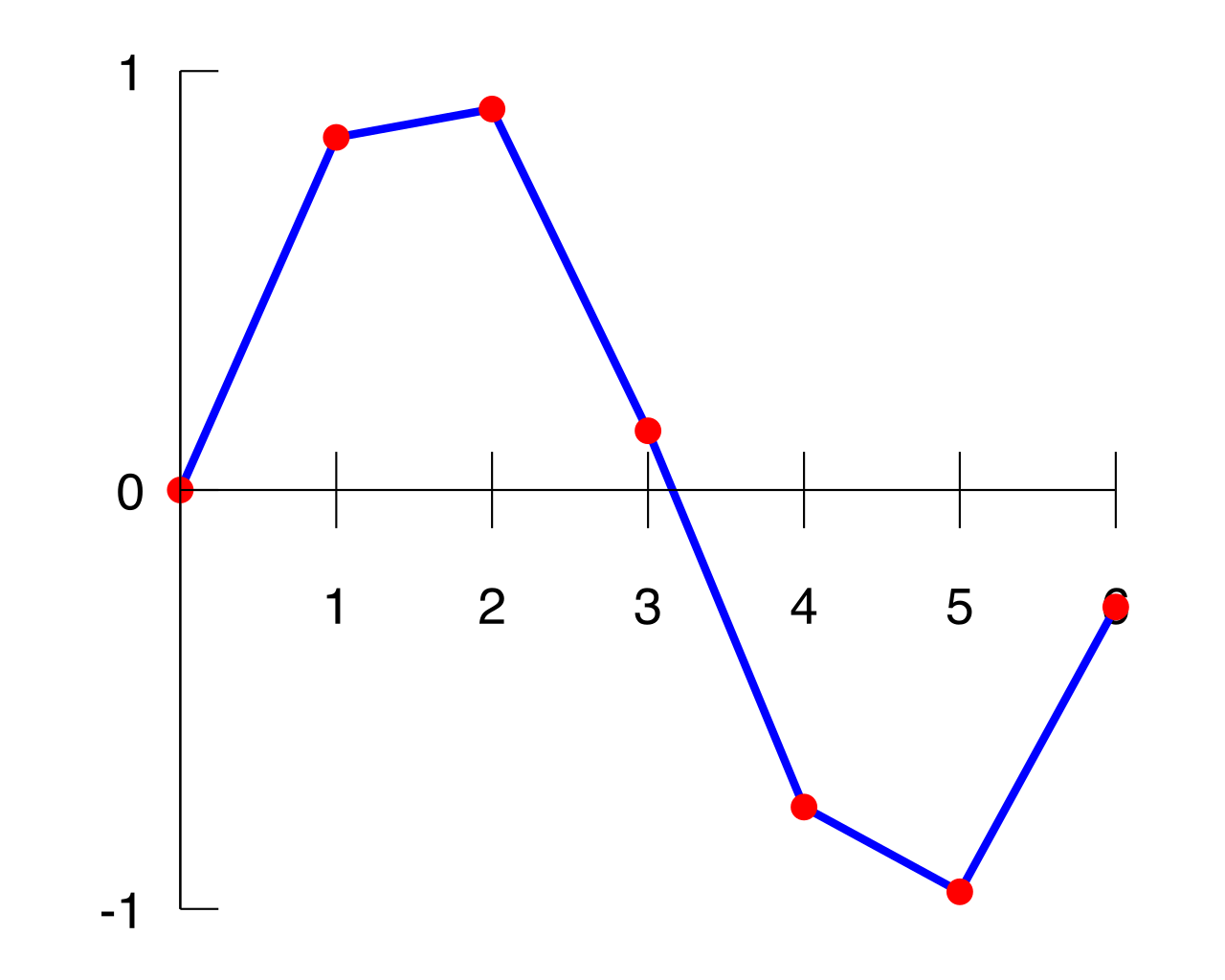
Interpolation occurs when a prediction is made for an independent variable value located within the domain of the original observed data. If you measured cricket chirps at temperatures between 60∘F and 80∘F, predicting the chirp rate at 72∘F is interpolation. These predictions are generally highly reliable because they fall safely inside the boundaries of known behavior.
2. Extrapolation
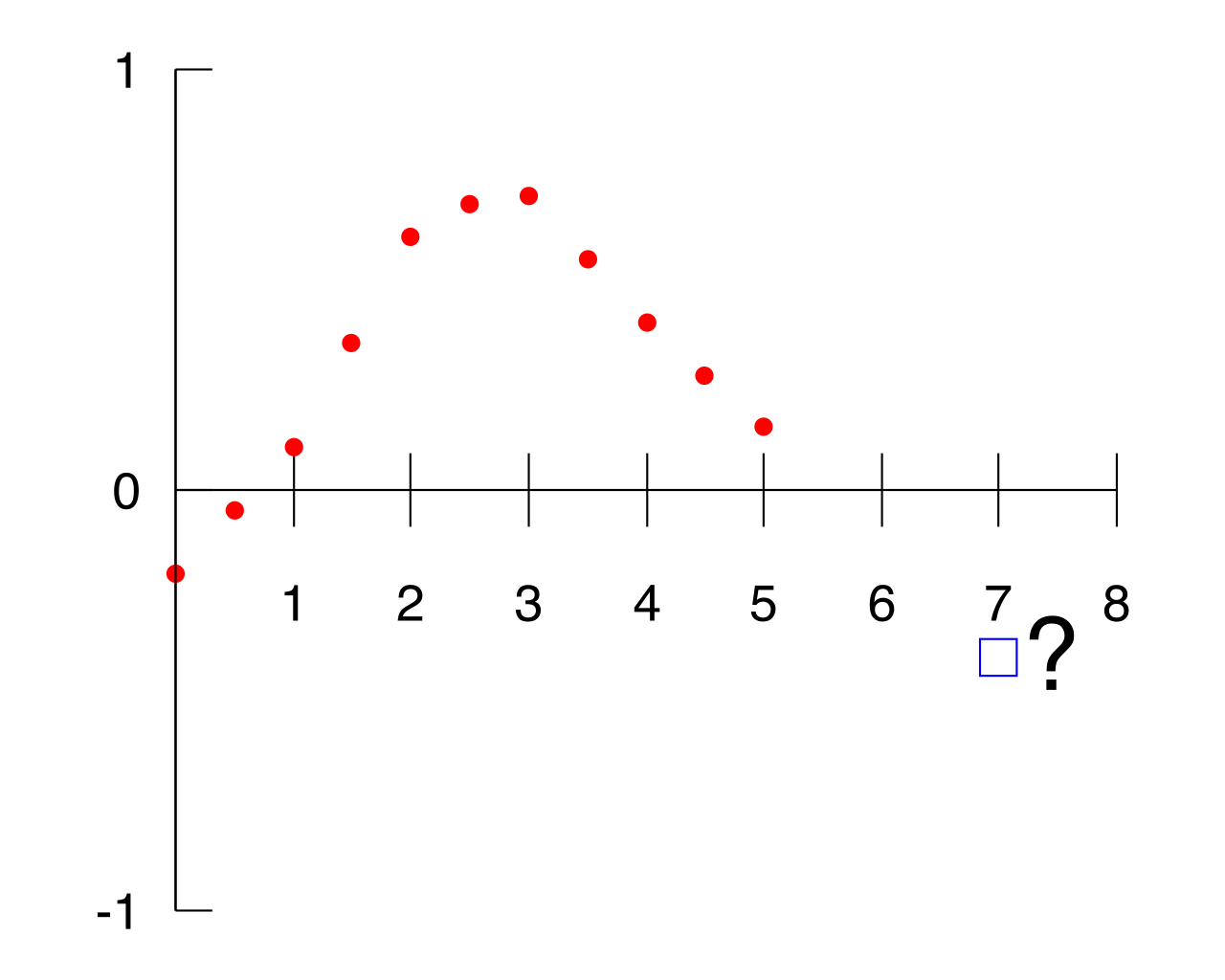
Extrapolation occurs when a prediction is made for an independent variable value located entirely outside the domain of the original observed data.
Warning: Extrapolated predictions carry a high risk of inaccuracy because the linear trend might not continue beyond the observed data range.
If we use our cricket model to predict chirps at 15∘F, the math will dutifully output a number. Biology, however, dictates that the cricket is frozen solid. Extrapolation blindly assumes the universe never changes its rules; reality often proves otherwise.
Nature is remarkably structured, but it is rarely perfectly smooth. Real-world data points seldom land flawlessly on the line of best fit. There is almost always a discrepancy between what our model predicts (y^) and what reality delivers (y).
This discrepancy is called a residual. A residual is the mathematical difference between an actual observed data value and the value predicted by the line of best fit.
You can find this discrepancy using a simple calculation: a residual is calculated by subtracting the predicted y-value from the actual observed y-value.
Residual Formula Residual=y−y^ (Actual Value minus Predicted Value)
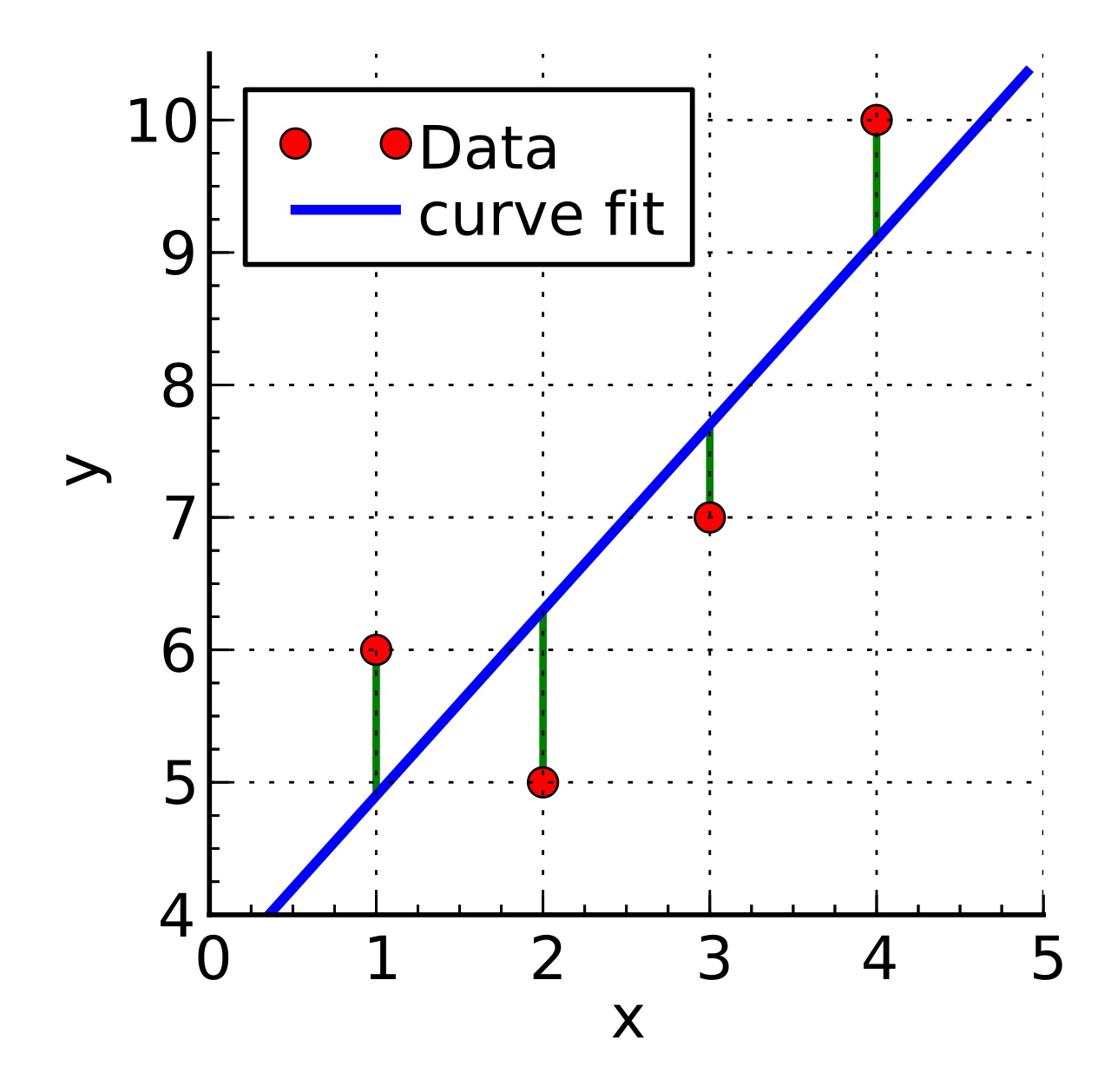
By calculating the residual, we can determine exactly where a data point exists in relation to our theoretical model:
| Residual Sign | Mathematical Meaning | Geometric Meaning on the Scatter Plot |
|---|---|---|
| Positive Residual | The actual value was greater than predicted (y>y^). | A positive residual means the actual observed data point sits vertically above the line of best fit. |
| Negative Residual | The actual value was less than predicted (y<y^). | A negative residual means the actual observed data point sits vertically below the line of best fit. |
| Zero Residual | The actual value perfectly matches the prediction (y=y^). | A residual of zero means the actual observed data point sits exactly on the line of best fit. |
Studying linear models is not an exercise in plotting perfect lines through perfect phenomena; it is an exercise in finding the signal hidden within the noise. The line gives us the rule, and the residuals show us the beautiful, chaotic exceptions of the real world. Mastery of this concept for your exam requires seamlessly pivoting back and forth between the algebraic equations on the page and the geometric scatter plot they represent.