Interpreting Texts with Visual Representations
Not sure you’re ready?
Take the ~3-minute readiness diagnostic and see where you stand.
A modern classroom is a continuous stream of written narratives and empirical data. When a reading specialist receives a paragraph describing a student’s fluency struggles alongside a scatter plot mapping their words-per-minute over a six-month period, they cannot simply read the text and glance at the picture. To construct a valid intervention, the educator must read both the prose and the plot simultaneously, recognizing precisely where the narrative explains the data, where the data supports the narrative, and where the two might conflict. The Praxis 5713 exam includes questions requiring the interpretation of texts paired with visual representations because this cognitive bridge is fundamental to professional teaching. Specifically, the Integration of Knowledge and Ideas category measures the ability to analyze visual media alongside written passages, ensuring that future educators can accurately weigh and synthesize multidimensional evidence.
Just as a mechanic selects a specific wrench for a specific bolt, authors select specific graphics to perform specific explanatory tasks. To synthesize information from diverse media formats, you must instantly recognize the structural purpose of the visual tool in front of you.
When you encounter numerical or conceptual data on the exam, it will typically be organized into one of the following formats:
-
Data table: A data table organizes complex numerical or textual information into systematic rows and columns. Think of a teacher's gradebook; it is unmatched for presenting exact values, though it requires the reader to do the mental heavy lifting to spot trends.
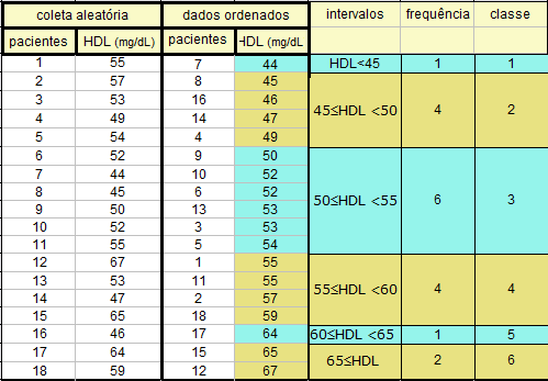
A data table organizes raw metrics into systematic rows and columns, providing exact values but requiring the reader to synthesize trends manually. Source: Origin histograma raw data by Abrito1953, CC BY-SA 3.0. -
Bar chart: A bar chart compares discrete quantities across distinct categories. If a school board wants to compare the average math scores of the 3rd, 4th, and 5th grades side-by-side, they use a bar chart because the categories are separate and distinct.
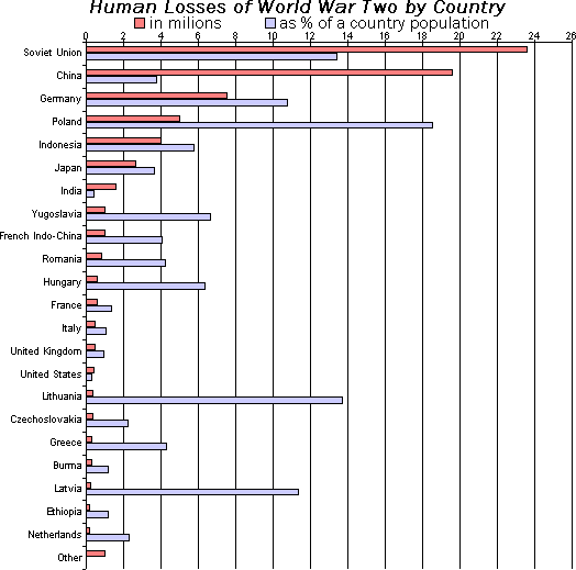
A horizontal bar chart comparing discrete, distinct categories. The length of each bar represents a specific numerical quantity for that category. -
Line graph: By contrast, a line graph displays continuous data to demonstrate trends over a specific time period. You would use this to map a single student’s daily attendance over a 180-day school year, as the continuous line implies an ongoing, chronological relationship.
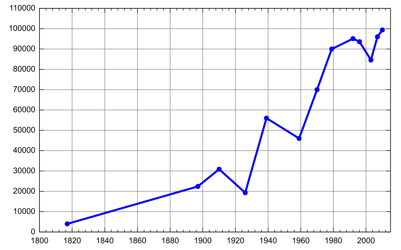
A line graph demonstrating a continuous trend over time, mapping chronological relationships across a single horizontal axis. Source: Pushkin population history by This drawing was created by Artem Topchiy (user Art-top ). Other drawings see here, CC BY-SA 3.0. -
Pie chart: A pie chart illustrates the proportional distribution of constituent parts within a whole dataset. It instantly communicates fractions of a total, such as how an annual school budget is divided among salaries, facilities, and materials.
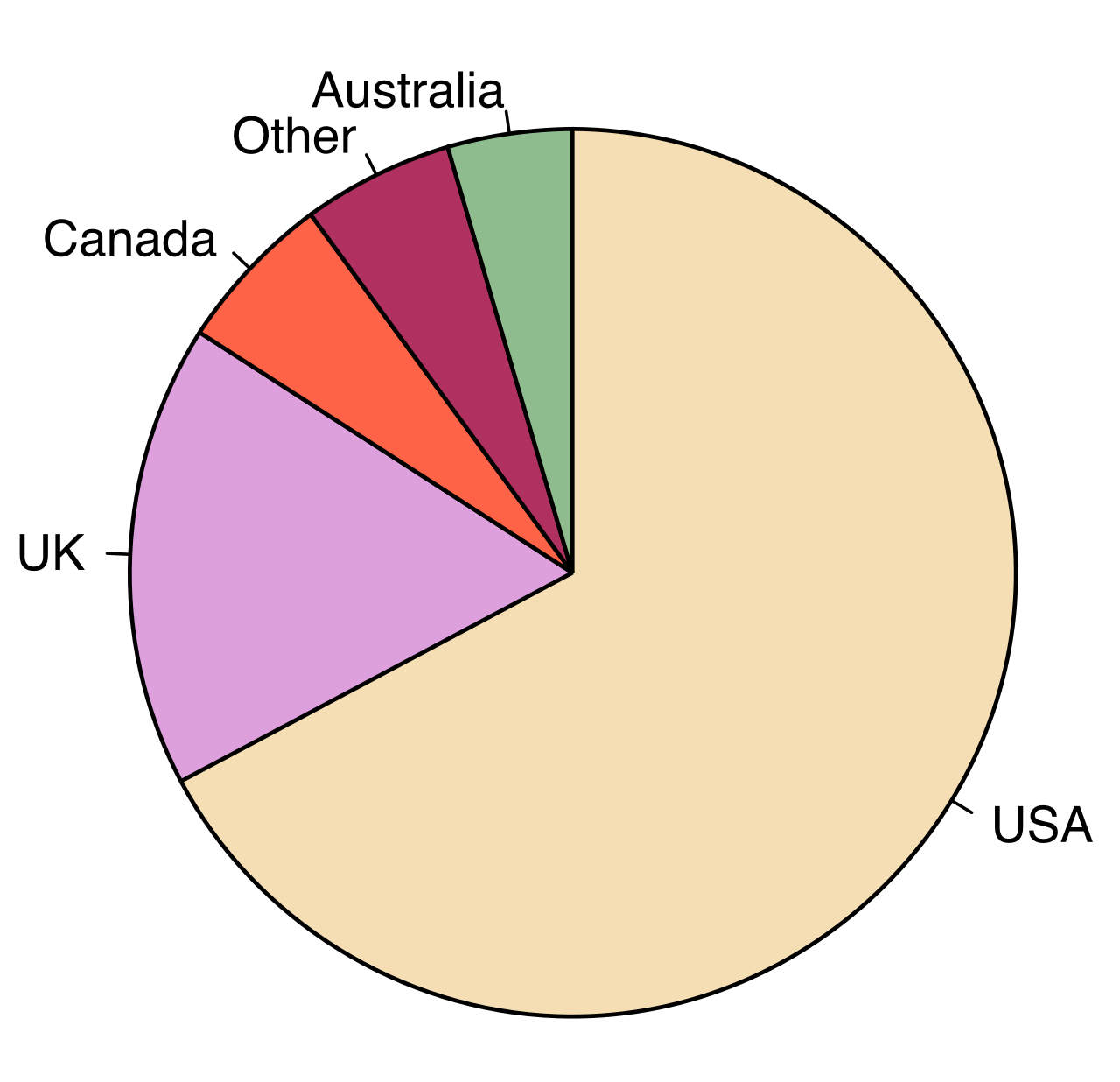
A pie chart illustrating proportional distribution, where each slice visually communicates a fraction of the total dataset. Source: English dialects1997 by M. W. Toews, CC BY-SA 4.0. -
Scatter plot: A scatter plot reveals the presence or absence of a correlation between two different variables. Each dot represents a single entity's scores on two different metrics—for example, plotting 50 students based on "hours spent reading per week" versus "vocabulary test score."
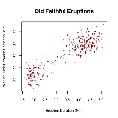
A scatter plot revealing correlations between two different variables. Each point represents an individual entity plotted against two separate metrics. -
Informational diagram: An informational diagram provides a visual representation of a physical structure or an abstract process. A flow-chart mapping the legal steps of a Special Education (IEP) evaluation is an informational diagram.
-
Thematic data map: A thematic data map uses geographical boundaries to display spatial data or regional statistical trends, such as shading a map of the United States to show varying levels of per-pupil funding by state.
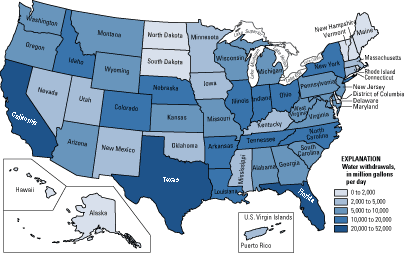
A thematic data map, or choropleth map, uses geographical boundaries and shading to display regional statistical variations and trends. -
Infographic: An infographic integrates minimal text with visual data representations to communicate complex statistics rapidly. These are highly curated, often persuasive pieces of media that combine icons, charts, and bullet points.
Before analyzing what a chart means, you must rigidly define how it is measuring its subject. One of the most common mistakes a reader makes is diving into the data before reading the map of the data.
Every graphic has an anatomy. The title of a visual graphic states the main subject depicted in the data. Below or beside the graphic, you will frequently find a graphic caption; a graphic caption provides explanatory context or source attribution for an accompanying visual representation. Always read the caption. It tells you who gathered the data and when, which is critical for evaluating the credibility of the pairing.
If the graphic is a chart or graph, look immediately at the axes and the keys.
- Graph axes labels define the specific variables and units of measurement being quantified.
- The x-axis on a standard two-dimensional graph represents the independent variable. This is the metric that stands alone and isn't changed by the other variable—most commonly, time or a controlled category.
- The y-axis on a standard two-dimensional graph represents the dependent variable. This is the outcome you are measuring, the effect that theoretically "depends" on the x-axis.
- A legend decodes the specific symbols, colors, or shading patterns used within a data graphic.
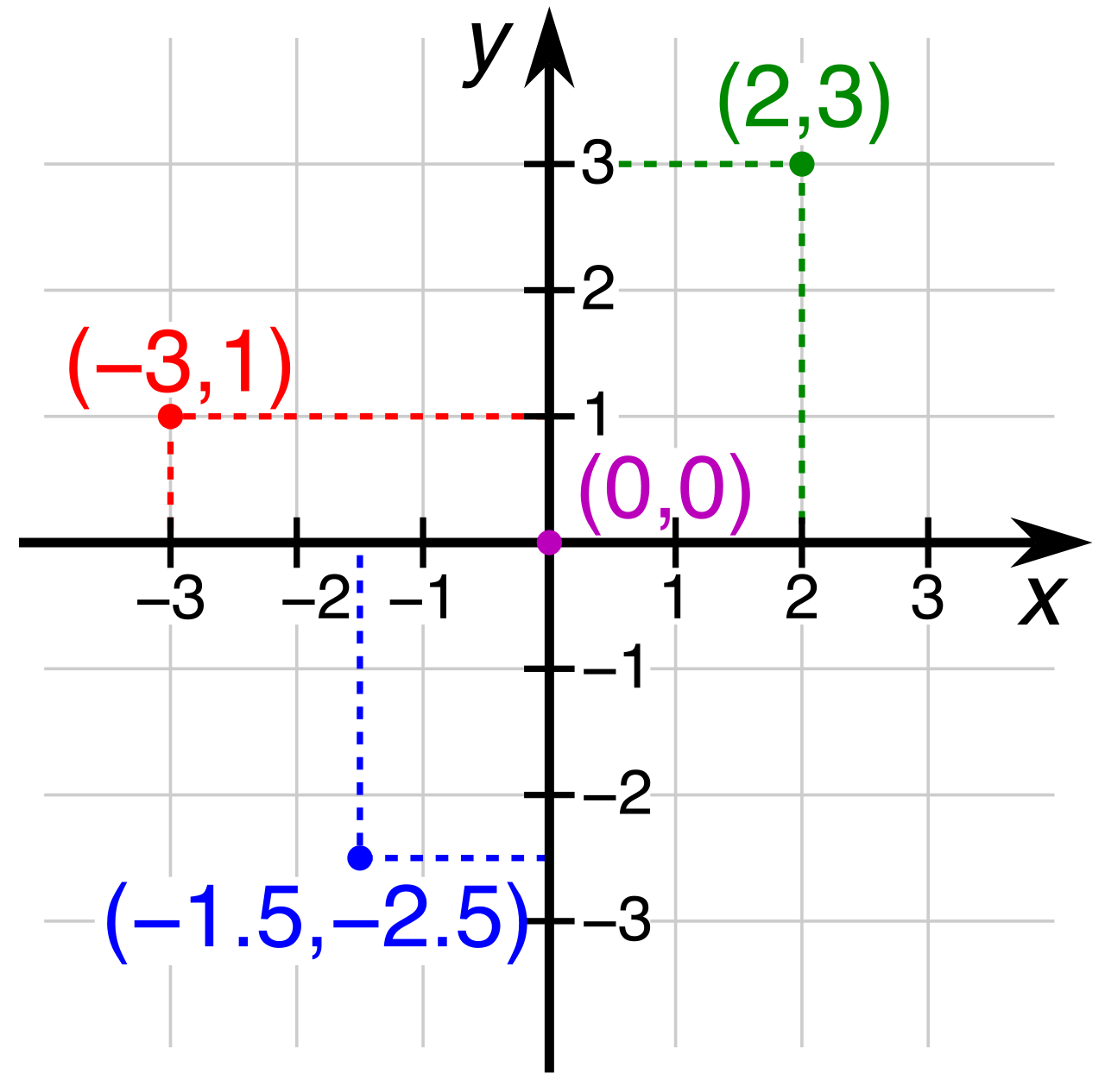
Crucial Exam Strategy: Test-takers must verify the numerical increments on graph axes to interpret data magnitudes accurately. A line shooting up at a steep 45-degree angle looks dramatic, but if the y-axis numerical increments are changing by mere fractions of a percent (e.g., 1.1 to 1.2 to 1.3), the real-world change is negligible.
Synthesizing diverse media formats requires merging details from a written passage with data from an accompanying graphic. This means holding the author's written argument in one hand and the empirical data in the other, and determining exactly how they interact.
When evaluating paired text and graphics, evaluating paired text and graphics requires identifying overlapping factual points across both media formats. Once you locate the overlap, you must determine the nature of the relationship. It will generally fall into one of three categories:
- Validation: A graphic can provide specific numerical data points to validate a general claim made in an accompanying text. If a passage states, "Extracurricular funding has dropped precipitously over the last decade," a line graph showing a plunge from $50,000 to $12,000 over ten years provides the validating empirical proof.
- Refutation: Conversely, a graphic can present objective evidence contradicting a subjective viewpoint expressed in an accompanying text. If an editorial passage claims "class sizes are spiraling out of control," but the accompanying bar chart shows average class sizes have remained stable at 22 students for five years, the data refutes the prose.
- Supplementation: A graphic can offer supplementary contextual information completely unmentioned in the written passage. A passage might detail the history of a literacy program, while the accompanying thematic map shows which specific counties have adopted it.
Because the exam assesses your ability to map text to data, questions assessing text and graphic integration often require matching a specific paragraph argument to a corresponding data trend. To do this correctly, an accurate interpretation of paired media requires verifying identical units of measurement across the text and graphic. If the passage discusses budget deficits in millions of dollars, but the y-axis of the chart is measured in thousands, an unobservant reader will miscalculate the scale of the issue by a factor of a thousand.
When examining scatter plots or line graphs, you are often looking for the relationship between the independent and dependent variables.
- A direct positive correlation occurs when two measured variables increase or decrease simultaneously. As variable A goes up, variable B goes up (e.g., as hours of professional development increase, teacher retention rates increase).
- An inverse negative correlation occurs when one measured variable increases while another measured variable decreases. As variable A goes up, variable B goes down (e.g., as chronic absenteeism increases, graduation rates decrease).
However, spotting a correlation is where your job begins, not where it ends. The most fundamental epistemological rule of reading data—and a frequent testing point on the Praxis—is that readers must explicitly distinguish between raw data presented in a chart and interpretive inferences drawn from that chart.
Raw data tells you what happened. Inferences attempt to explain why it happened. A chart can show that ice cream sales and standardized test scores both spike in June. That is raw data. If an author writes a passage claiming that eating ice cream makes students smarter, they have made a flawed interpretive inference. The data proves the correlation; it does not prove the causation (the real cause being that it is summer, and exams happen at the end of the school year).
When sitting for the Praxis, recognizing the truth is only half the battle; the other half is recognizing the elegantly disguised lies in the multiple-choice options.
Identifying accurate interpretations requires ensuring a chosen answer choice is entirely supported by the visual evidence, not merely plausible or partially supported. The test makers design "distractors" (incorrect answer choices) to prey on test-takers who read carelessly or bring outside assumptions into the exam room.
Watch out for these two classic traps:
-
The Scale Trap: Visual distractors in multiple-choice questions often misrepresent the scale of the provided chart. An answer choice might claim that a trend "doubled" because the visual bar is twice as tall as the one next to it, but if you look at the y-axis, the baseline might not start at zero. Always check the axis increments before agreeing with a statement about magnitude.
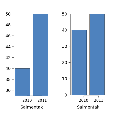
The scale trap in action: The truncated graph on the left visually exaggerates differences by omitting the zero baseline, while the full-scale graph on the right accurately represents the same data. Source: Misusestatistics 0001 by Joxemai, CC BY-SA 3.0. -
The Irrelevant Truth Trap: Visual distractors in multiple-choice questions often state a true fact from the graphic failing to answer the specific prompt. This is the most dangerous trap on the test. You will read a question asking how the chart supports the second paragraph of the text. Answer choice 'B' will be a perfectly accurate statement of data pulled directly from the chart. You will be tempted to select it. But if choice 'B' has absolutely nothing to do with the argument made in the second paragraph, it is the wrong answer.
By mastering the specific purposes of these visual tools, meticulously checking the anatomy of the graphics, and demanding rigorous, point-for-point alignment between the text and the chart, you protect yourself against these cognitive traps. In doing so, you prove you are ready to handle the complex, multimodal information that defines modern educational practice.