Interpreting Graphics and Sequence
Not sure you’re ready?
Take the ~3-minute readiness diagnostic and see where you stand.
A patient's electronic health record is a dense, high-stakes matrix of numbers, timelines, and strict procedural guidelines. If you misread the trajectory of a post-operative fever on a clinical chart, or scramble the steps of a sterile dressing change, the consequences are immediate and severe. Interpreting graphics and recognizing procedural sequences are not merely academic hurdles designed for an admissions exam; they are the fundamental language of clinical practice. To work in healthcare is to constantly decode visual data and execute ordered logic. We must learn to translate shapes, lines, and signal words into actionable reality.
Before we can interpret a graphic, we must understand the scaffolding that holds it together. Data does not exist in a vacuum; it requires structure to have meaning.
At the most fundamental level, a table organizes data into rows and columns to display specific data pairs. Think of a medication dosing chart. You look down a column for the patient's weight and across a row for the drug concentration. The intersection of a row and a column in a table contains a specific, isolated data point. It is a precise coordinate of information.
When we move from tables to graphs, we plot data onto a standard two-dimensional coordinate plane. This plane is governed by two perpendicular lines:
- The x-axis is the horizontal reference line on a standard two-dimensional coordinate plane.
- The y-axis is the vertical reference line on a standard two-dimensional coordinate plane.
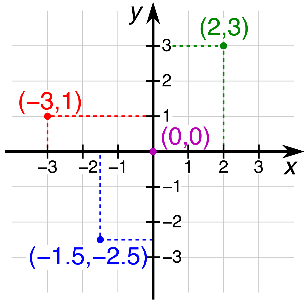
Key Rule of Extraction: Extracting numerical values from a line or bar graph requires matching a specific graphic data point to the corresponding numbers printed on the x-axis and the y-axis.
You cannot simply guess the value of a point in space; you must trace it horizontally to the y-axis and vertically to the x-axis. To ensure you are reading the correct information, you must check two crucial text elements. First, the title of a graph provides a summary description of the primary subject matter displayed in the visual data. Second, every axis label explicitly identifies the specific type of measurement or category represented along a given graph line (such as "Heart Rate in BPM" or "Time in Hours").
Different types of graphs are engineered to reveal different truths about a data set. Recognizing the type of graph immediately tells you what kind of relationship you are looking at.
The Line Graph: Tracking Change
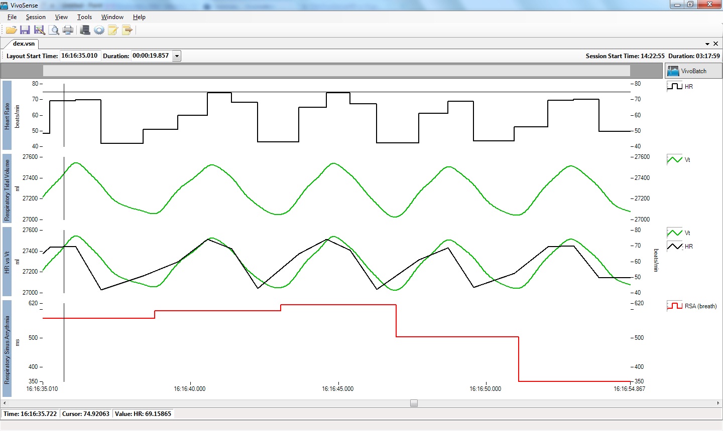
A line graph displays information as a series of data points connected by straight line segments. Because the line connects distinct moments, line graphs are primarily used to illustrate changes or numeric trends over a period of time.
- Clinical Application: When tracking a patient's oxygen saturation over a 48-hour shift, a line graph immediately reveals whether the patient is stabilizing or crashing. The slope of the line visually represents the rate of change.
The Bar Graph: Comparing Categories
A bar graph uses rectangular bars to compare quantities across different, distinct categories. Unlike a continuous line graph, the categories here are separate—such as different hospital wards, distinct blood types, or different age demographics.
- The length or height of a bar in a bar graph is directly proportional to the numerical value represented by that bar.
- Comparing values visually involves identifying which specific graphic element represents the largest or smallest quantity relative to the others. A quick glance at a bar graph instantly tells you which category dominates simply by finding the tallest rectangle.
The Circle Graph (Pie Chart): Parts of a Whole
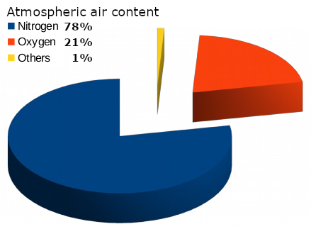
A circle graph represents data as slices of a circular whole to show proportional relationships.
- Another common name for a circle graph is a pie chart.
- The governing rule of this visual format is absolute: The entire circle in a pie chart always represents exactly one hundred percent of a complete data set.
- Clinical Application: If you are looking at a hospital's monthly budget or the macronutrient breakdown of a specialized diabetic diet, the pie chart forces you to see how each component draws from a finite total. If one slice gets bigger, the others must inherently shrink.
Sometimes data represents physical reality rather than pure numbers.
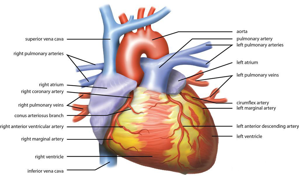
A diagram is a simplified visual drawing designed to show the appearance, structure, or workings of a specific object. When you study the chambers of the human heart, you are looking at a diagram. It strips away the messy reality of biological tissue to highlight the precise mechanical architecture.
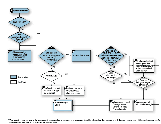
A critical subset of diagrams dictates action: Flowcharts are a specific type of diagram used to illustrate the sequential steps of a process. The Basic Life Support (BLS) algorithm for CPR is a flowchart. It uses distinct shapes and directional arrows to guide a rescuer through a binary decision tree ("Is the patient breathing normally? If yes, monitor. If no, begin compressions").
When navigating geography, whether it is a global region or a sprawling medical campus, maps rely on standardized tools:
- Map Legend / Map Key: A map legend provides necessary explanations for the specific symbols, patterns, and colors used on a map. (Note that a map key serves the exact same decoding function as a map legend. The terms are interchangeable.)
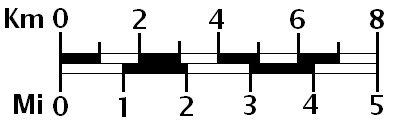
- Map Scale: Because a map is a miniature model of reality, a map scale represents the mathematical ratio between a measured distance on the map and the actual physical distance on the ground. (For example, 1 inch on the map might equal 10 miles in reality).
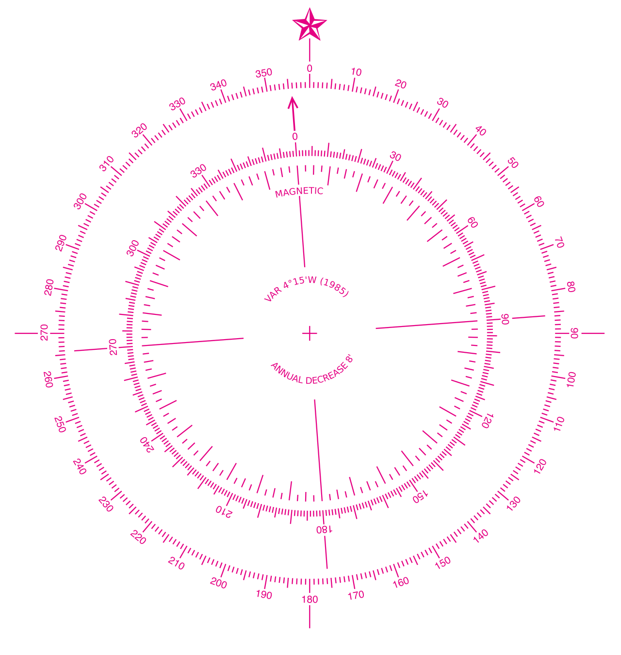
- Compass Rose: Orientation is dictated by a compass rose, which is a graphic directional element printed on a map displaying the cardinal directions. The standard cardinal directions used on a compass rose are North, South, East, and West.
In healthcare, doing the right thing at the wrong time can be just as fatal as doing the wrong thing entirely. Reading comprehension on the TEAS exam heavily tests your ability to reconstruct timelines and instructional steps from written text.
There are two primary ways text organizes time:
- Chronological order arranges events precisely according to the specific time those events originally occurred. This is the narrative of history. Recognizing chronological order in a reading passage requires paying attention to dates, times, and sequential transition words.
- Procedural order arranges distinct steps in the exact sequence required to successfully complete a specific task. This is the logic of a recipe or a clinical protocol.
Decoding Signal Words
Authors do not leave you to guess the order of events. They use signal words, which are transition phrases used in a text to explicitly indicate the relationship between different events or steps.
Understanding these transitions is like reading the directional arrows on a flowchart, but in prose form.
| Temporal Stage | Signal Words & Their Precise Meanings |
|---|---|
| The Beginning | The word 'first' is a signal word indicating the absolute beginning of a procedural sequence or chronological list.<br><br>Similarly, the word 'initially' is a sequence signal word marking the starting point of an event or a process. |
| The Middle / Relative Time | The phrase 'prior to' is a sequence signal word indicating that a specific event happened before another defined event. (e.g., "Wash hands prior to donning gloves.")<br><br>The word 'subsequently' is a sequence signal word meaning a specific event happens after a previously mentioned event.<br><br>The word 'meanwhile' is a signal word indicating that two distinct events are occurring at the exact same time. |
| The End | The word 'finally' is a sequence transition word denoting the last step in a chronological narrative or procedural set of instructions.<br><br>The word 'ultimately' is a signal word indicating the final outcome or the absolute last step in a defined sequence. |
When you read a passage on the TEAS 7 exam, actively highlight or mentally flag these signal words. If a passage states, "Initially, the patient presented with a rash. Meanwhile, his blood pressure dropped. Subsequently, a fever developed," you are mapping a strict clinical timeline. The signal words provide the structural integrity of the narrative.
Mastering graphics and sequences requires shifting your mindset from a passive reader to an active translator. Every axis, legend, and signal word is a deliberate tool engineered to convey exact, unambiguous information. Learn the tools, and the data will speak clearly.