Relationships Between Variables
Not sure you’re ready?
Take the ~3-minute readiness diagnostic and see where you stand.
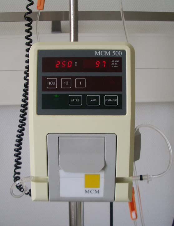
When a physician orders a continuous intravenous infusion of a medication, the flow rate set on the IV pump dictates the total volume of the drug entering the patient's bloodstream over time. The nurse controls the pump; the patient's body responds. If the pump is turned up, the volume of medication delivered increases. If the pump is turned down, the volume decreases. This daily clinical reality is not merely a medical protocol—it is a physical manifestation of a mathematical relationship.
To succeed in the allied health sciences, and specifically on the ATI TEAS 7 exam, you must understand how to quantify, visualize, and predict these relationships. Biology and chemistry are governed by variables interacting with one another. Whether you are titrating a dosage, analyzing the relationship between caloric intake and body mass index, or studying the inverse relationship between the volume of a lung and the pressure within it (Boyle’s Law), you are navigating the mathematics of variation.
Here, we will dismantle the architecture of mathematical models, explore how variables influence one another, and learn how to interpret the visual language of data.
Every scientific experiment and mathematical model starts with a question: If I change this, what happens to that? To answer this, we must isolate the parts of our system into two distinct categories: the cause and the effect, or more precisely, the independent and dependent variables.
Independent Variable: An independent variable is a variable that is changed or controlled in a mathematical model. It is the "dial" you are turning.
Dependent Variable: A dependent variable is a variable being tested or measured in a mathematical model. It is the "meter" you are reading.
The defining characteristic of this relationship is simple but absolute: the value of a dependent variable changes in response to changes in the independent variable. You cannot directly control a dependent variable; you can only alter the independent variable and observe the resulting cascade.
Imagine you are studying the effect of sleep deprivation on a student's TEAS exam score. The amount of sleep the student gets is the independent variable—it is the condition being manipulated. The resulting test score is the dependent variable—it is the outcome being measured.
Plotting Reality: The Coordinate Plane
When we map these relationships visually, we rely on a strict cartesian convention. Mathematicians and scientists universally agree on how to organize this data so that anyone, anywhere in the world, can read a graph and instantly understand the experiment.
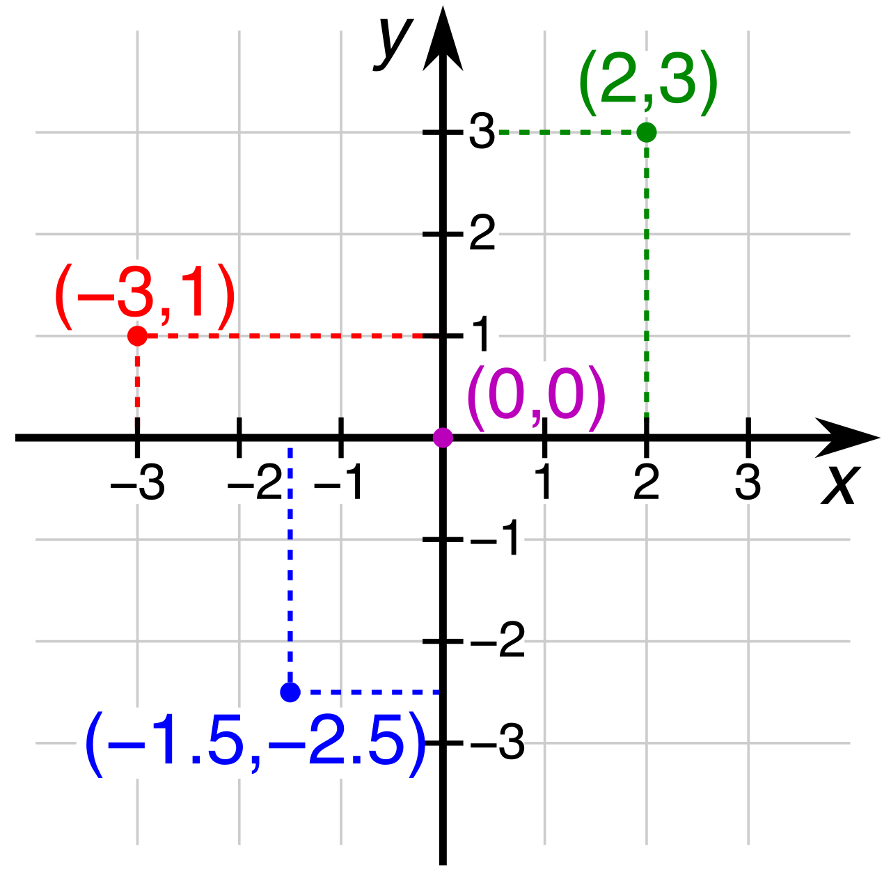
- In a standard coordinate plane, the independent variable is plotted on the horizontal x-axis. (Think of the x-axis as the foundation, the baseline condition you are setting).
- In a standard coordinate plane, the dependent variable is plotted on the vertical y-axis. (Think of the y-axis as the height the data reaches in response).
Whenever you look at a graph in a patient's chart, whether it is showing time (x-axis) versus temperature (y-axis), or drug concentration (x-axis) versus heart rate (y-axis), you are looking at the dependent variable reacting to the independent variable.
Variables rarely move in isolation. When one shifts, the other frequently follows suit, bound by mathematical rules. We categorize the nature of these movements as either direct or inverse relationships.
Direct Relationships
A direct relationship occurs when an increase in one variable leads to an increase in another variable. Equally true, a direct relationship occurs when a decrease in one variable leads to a decrease in another variable. They walk in lockstep.
Consider an hourly wage. If you earn $25 an hour, working more hours (increase) directly leads to a higher paycheck (increase). Working fewer hours (decrease) leads to a smaller paycheck (decrease).
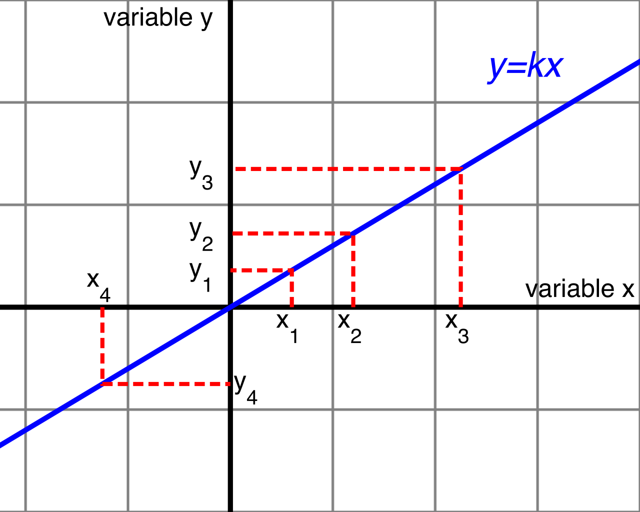
We can write this elegantly in mathematical shorthand. The mathematical equation for a direct variation is y=kx.
In this equation:
- y is our dependent variable (the total paycheck).
- x is our independent variable (the hours worked).
- In variation equations, the variable k represents the constant of proportionality.
What does a "constant of proportionality" actually mean? It is the fixed conversion rate between your two variables. In our wage example, k is the $25 an hour. No matter how many hours (x) you work, we multiply it by that constant rate (k) to find your total pay (y).
Inverse Relationships
Nature is not always so cooperative as to move in the same direction. Often, variables act like a seesaw.
An inverse relationship occurs when an increase in one variable leads to a decrease in another variable.
In pharmacology, consider the relationship between the clearance rate of a drug and its half-life. If the kidneys are highly efficient and the clearance rate increases, the time the drug remains active in the body (its half-life) decreases.
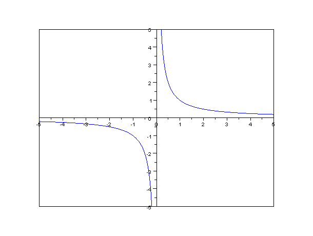
The mathematical equation for an inverse variation is y=k/x.
Notice where our independent variable (x) is located—it is in the denominator. As x grows larger and larger, we are dividing our constant (k) by a larger number, which forces our dependent variable (y) to become smaller and smaller.
Summary of Variation Rules
| Type of Relationship | Movement | Mathematical Model | Clinical Example |
|---|---|---|---|
| Direct | Both variables move in the same direction. | y=kx | Fluid intake vs. urine output. |
| Inverse | Variables move in opposite directions. | y=k/x | Vessel diameter vs. resistance to blood flow. |
In textbook math problems, relationships are perfectly clean. y=kx gives you a pristine, predictable number every time. But in biological sciences and healthcare, data is messy. Human bodies have minute variations. Machines have margins of error. When we collect real-world data, we rarely get a perfect straight line; we get a cloud of data points.
To make sense of this, we use a scatter plot, which is a graphical representation used to observe relationships between two numeric variables.
Imagine throwing a handful of darts at a board. If you chart the height and weight of fifty random patients, each patient becomes a single dot on the graph (x = height, y = weight). By stepping back and looking at the "scatter" of these dots, we look for a pattern.
Understanding Correlation
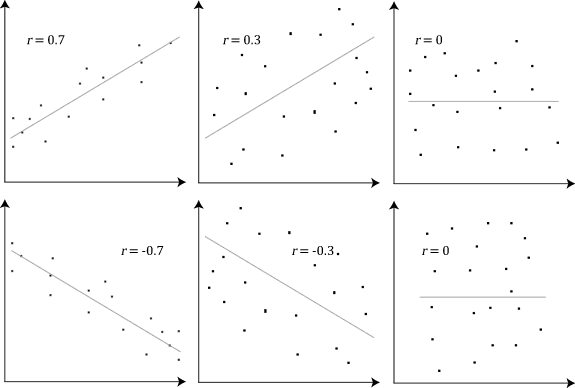
When we evaluate that pattern, we are looking for correlation. Correlation describes the degree to which two variables move in coordination with one another. We analyze correlation in three ways: its direction, its strength, and its central trend.
1. The Direction of Correlation
- Positive Correlation: Just like a direct relationship, a positive correlation on a scatter plot shows data points rising from left to right. As the x-axis variable increases, the y-axis variable tends to increase. (e.g., Patient age and cumulative lifetime sun exposure).
- Negative Correlation: Similar to an inverse relationship, a negative correlation on a scatter plot shows data points falling from left to right. As the x-axis variable increases, the y-axis variable tends to decrease. (e.g., Hours spent exercising per week and resting heart rate).
- Zero Correlation: Sometimes, variables have absolutely nothing to do with one another. A graph shows zero correlation when data points are scattered randomly with no clear trend. (e.g., A patient's shoe size and their visual acuity).
2. The Strength of Correlation
Not all patterns are equally obvious. The strength of a correlation tells us how reliably the variables are tied to one another.
- A strong correlation is indicated by data points clustering tightly together along a trend line. If the data is tightly packed, the independent variable is an excellent predictor of the dependent variable.
- A weak correlation is indicated by data points spreading loosely away from a trend line. A general pattern exists, but there is a lot of "noise" or interference from other unmeasured factors.
3. Finding the Signal: The Line of Best Fit
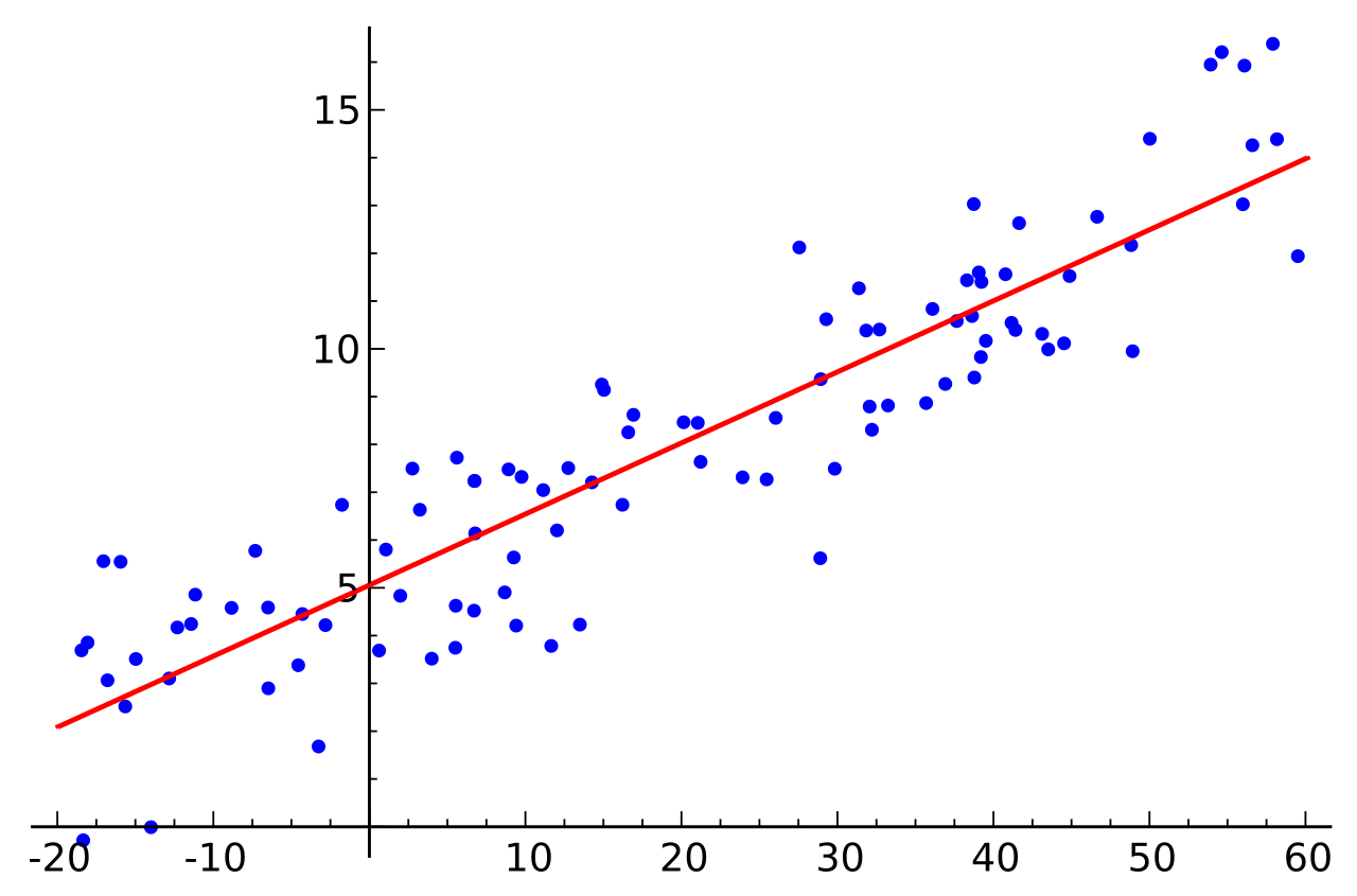
When we identify a correlation on a scatter plot, we want to summarize it. We do this by drawing a line of best fit, which is a straight line drawn through the center of the data points on a scatter plot.
This line acts as a visual average, cutting through the center of the "cloud" of data, with roughly half the points sitting above it and half sitting below it. It allows us to approximate our messy data into a clean, predictive model (like our y=kx equations).
By simply looking at the angle, or slope, of this line, we can immediately classify the relationship:
- A positive slope on a line of best fit indicates a positive correlation between the plotted variables. The line points uphill.
- A negative slope on a line of best fit indicates a negative correlation between the plotted variables. The line points downhill.
We have established how to identify variables, plot them, find a line of best fit, and declare a correlation. But there is a lethal trap in data analysis, one that has misled thousands of researchers and medical professionals.
You must sear this final principle into your mind: The phrase "correlation does not imply causation" means an observed relationship between variables does not prove one causes the other.
Just because two variables move together in perfect harmony on a scatter plot does not mean that Variable A is fundamentally creating the change in Variable B.
Consider this classic example: If you plot the monthly sales of ice cream (x-axis) against the number of monthly drowning incidents (y-axis) in a coastal city, you will see a highly positive correlation. The data points will cluster tightly, rising from left to right. The line of best fit will have a steep positive slope.
If you assume correlation implies causation, you would conclude that eating ice cream causes people to drown.
This is, of course, nonsense. The two variables are entirely independent of one another. The real culprit is a hidden third factor—a confounding variable—which in this case is the summer heat. High temperatures cause both ice cream sales and swimming (and consequently, drownings) to spike simultaneously.
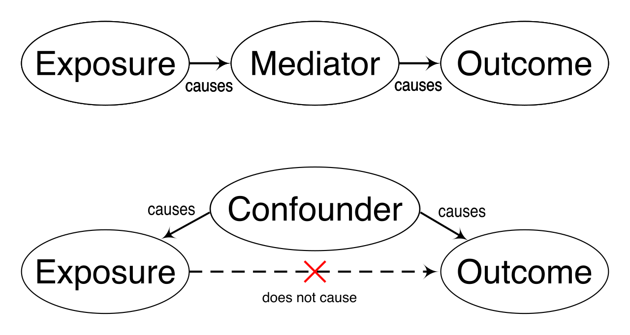
In medicine, assuming causation from correlation leads to dangerous misdiagnoses. It is the job of the nurse, the physician, and the scientist to observe the mathematical correlation, and then use rigorous critical thinking to uncover the true physiological mechanism beneath it.
Mastering these concepts allows you to read the language of the physical world. When you sit for the ATI TEAS 7, do not view these variables and graphs as abstract math problems designed to confuse you. View them as the fundamental tools you will soon use to map, interpret, and ultimately save human lives.