Market and Technical Analysis
Imagine standing on a balcony overlooking a bustling city square. You do not need to inspect the architectural blueprints of the surrounding buildings or audit the financial health of the local businesses to predict where the crowd will flow; you simply watch the footprints, the momentum, and the bottlenecks. If a massive crowd is surging toward a narrow alley, you can predict a slowdown, regardless of what the businesses in that alley are selling.
This is the essence of market analysis for the registered representative. While fundamental analysts pore over balance sheets and income statements, technical analysis is the study of historical market data to predict future price movements. It operates on a powerful premise: all known fundamental information is already priced into the asset. Therefore, technical analysts focus strictly on price changes and trading volume rather than a company's fundamental financial statements.
As a Series 7 candidate, you will spend your career interpreting market behavior for your clients. To do so, you must master the geometry of price charts, the psychology of market sentiment, and the specialized indices used to track the municipal debt markets.
Before we draw lines on a chart, we must understand the mood of the investors trading the securities. Market sentiment describes the overall attitude of investors toward a particular security or the broader financial market.
Interestingly, some of the most powerful tools in technical analysis rely on the assumption that the crowd is entirely wrong.
The Coiled Spring of Short Interest
Short interest is the total number of shares of a particular stock that have been sold short and not yet repurchased. A novice might assume that heavy short selling is a profoundly negative sign. After all, a multitude of investors are betting the stock will fail.
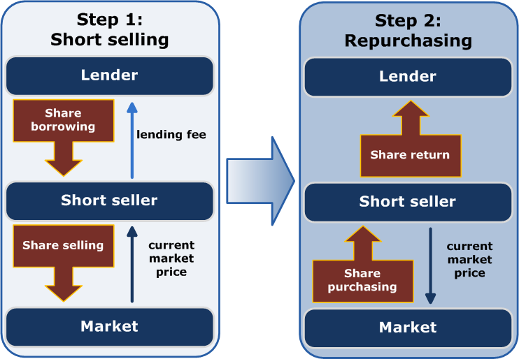
The seasoned technical analyst, however, views this through the lens of the Short Interest Theory, which is a contrarian technical indicator. According to this theory, high short interest actually indicates a bullish market signal.
Why? Because every short seller has borrowed shares they must eventually return. High short interest means short sellers must eventually purchase stock to close their positions. This creates a massive pool of guaranteed future buyers. When a catalyst forces them to cover their positions, their mandatory buying acts like a coiled spring, driving stock prices upward in what is known as a "short squeeze."
The Put/Call Ratio
In the options market, sentiment is quantified mathematically. The put/call ratio is calculated by dividing the volume of put options traded by the volume of call options traded.
Puts are generally bearish bets; calls are bullish bets. If the ratio is unusually high, it means the market is buying far more downside protection than upside exposure. But just like short interest, contrarian investors interpret a high put/call ratio as a bullish market signal. A high put/call ratio suggests that the market is overly pessimistic and due for an upward reversal. When everyone is expecting the sky to fall, there is often no one left to sell, and the path of least resistance becomes up.
The Odd-Lot Theory
Who is most likely to panic and sell at the absolute bottom of a market crash, or buy at the euphoric top? Historically, it has been the retail investor with limited capital.
An odd-lot transaction involves fewer than 100 shares of stock. Institutional players trade in "round lots" of 100 shares or more. The Odd-Lot Theory assumes that small retail investors consistently make incorrect trading decisions. Consequently, technical analysts utilizing the Odd-Lot Theory buy stocks when odd-lot selling volume peaks. They deliberately trade against the retail crowd.
To determine if a market is truly strong, we must look beneath the surface of the headline indexes. Is the entire market rising, or are just a few massive tech stocks dragging the averages higher while the rest of the market bleeds?
The Advance/Decline Line The advance/decline line measures market breadth by comparing the number of advancing stocks to the number of declining stocks on a given day. A rising advance/decline line is considered a bullish indicator of broad market strength, proving that the foundation of the rally is wide and structurally sound.
To confirm major macroeconomic trends, analysts look to the Dow Theory. This foundational theory states that a major market trend is confirmed only when the Dow Jones Industrial Average and the Dow Jones Transportation Average both reach new highs or new lows. The logic is wonderfully intuitive: if industrial companies are truly booming and manufacturing more goods, transportation companies must logically be booming to ship those goods. If one index hits a new high but the other does not, the trend is unconfirmed and potentially fragile.
When we look at a price chart, we are looking at the graphical representation of a battle between buyers (demand) and sellers (supply).
- Support Level: A support level is a price point at which a downward trending stock experiences increased buying demand. Imagine a floor where investors step in, believing the stock is too cheap to pass up, halting the decline.
- Resistance Level: A resistance level is a price point at which an upward trending stock experiences increased selling pressure. This is the ceiling where investors decide the stock is too expensive and begin to take profits.
When a security's price trades within a narrow range between established support and resistance levels, it is stuck in a consolidation phase. The market is catching its breath, deciding who will win the tug-of-war.
Breakouts and the Necessity of Volume
Eventually, the consolidation ends. A breakout occurs when a security's price moves above an established resistance level or below an established support level.
- A breakout above a resistance level is considered a bullish signal. The ceiling has shattered.
- A breakout below a support level is considered a bearish signal. The floor has collapsed.
However, price movement alone is not enough. Technical analysts look for a significant increase in trading volume to confirm a valid price breakout. If a stock breaks above resistance on low volume, it is likely a "false breakout"—a momentary glitch without the conviction of the broader market behind it.
Smoothing the Noise: Moving Averages and Trendlines
Daily price action is highly volatile. To find the true trajectory, analysts use a moving average, a technical indicator that smooths out price data by creating a constantly updated average price over a specific time period (e.g., 50 days or 200 days).
- A stock price crossing upward through its moving average is a bullish technical indicator.
- A stock price crossing downward through its moving average is a bearish technical indicator.
Similarly, we can draw a trendline directly on the chart to identify prevailing momentum.
- A trendline connects a series of higher lows in an uptrend to identify the prevailing upward market direction.
- Conversely, a trendline connects a series of lower highs in a downtrend to identify the prevailing downward market direction.
When these trends move too violently, the market requires an elastic snapback. An overbought market condition suggests that prices have risen too quickly and a downward price correction is imminent. Conversely, an oversold market condition suggests that prices have fallen too quickly and an upward price correction is imminent.
When market trends exhaust themselves, they often form distinct, recognizable geometric patterns before reversing. Identifying these patterns allows you to spot shifts in momentum before the crowd does.
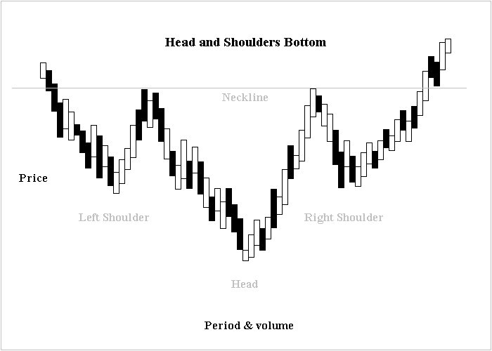
Head-and-Shoulders Patterns
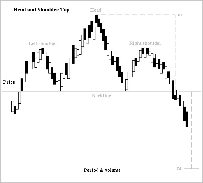
The most famous reversal pattern is the head-and-shoulders formation.
- Head-and-Shoulders Top: This pattern indicates the reversal of an upward trend into a downward trend. It consists of three price peaks, with the middle peak (the head) being the highest, flanked by two lower peaks (the shoulders). It signifies that buyers tried to push the price to a new high, succeeded once, but failed on the third attempt, transferring control to the sellers.
- Head-and-Shoulders Bottom: This pattern indicates the reversal of a downward trend into an upward trend. Because it is visually flipped, a head-and-shoulders bottom pattern is frequently referred to as an inverted head-and-shoulders pattern.
Saucer Patterns
Trends do not always reverse violently; sometimes, they turn slowly, like a massive ocean liner.
- A saucer pattern is a gradual, U-shaped formation that indicates the reversal of a bearish market trend into a bullish market trend.
- An inverted saucer pattern is an upside-down U that indicates the reversal of a bullish market trend into a bearish market trend.
Beyond price and volume, derivatives provide clues about future market behavior. Options volatility measures the magnitude of price fluctuations of an underlying asset over a specific period.
When you look at options chains, pay close attention to implied volatility. High options implied volatility indicates that the market expects significant future price movement in the underlying security. It does not necessarily tell you which direction the stock will move, but it tells you the market is pricing in an explosive event, such as an upcoming earnings call or an FDA drug approval.
The technical tools we have discussed apply heavily to equities. However, your Series 7 responsibilities will also require you to analyze the municipal bond market. Unlike stocks, which trade on centralized exchanges, municipal bonds trade over-the-counter and are highly fragmented.
To analyze the "sentiment" and pricing trends of municipal debt, professionals rely on The Bond Buyer, a daily financial publication specializing in the municipal bond market.
The Bond Buyer publishes several crucial indexes that you must know intimately. Pay careful attention to their underlying credit quality, as yield is always inversely proportional to credit rating (higher credit quality equals lower yield).
The Bond Buyer Municipal Bond Index (Price-Based)
First, we have the broader daily tracker: The Bond Buyer Municipal Bond Index. This index tracks the prices of 40 recently issued and actively traded long-term municipal bonds. Because it tracks highly liquid active bonds, the Bond Buyer Municipal Bond Index is updated and published daily.
The Weekly Yield Indexes
The following three indices track yields (not prices) and are updated weekly.
| Index Name | Composition | Maturity | Average Credit Rating | Key Relationship |
|---|---|---|---|---|
| 20-Bond GO Index | Average yield of 20 General Obligation (GO) municipal bonds. | 20 years | Aa2 (Moody's) or AA (S&P) | The baseline indicator for general obligation debt. |
| 11-Bond GO Index | Average yield of 11 select GO bonds. These 11 bonds are chosen strictly from the bonds within the 20-Bond GO Index. | 20 years | Aa1 (Moody's) or AA+ (S&P) | The yield on the 11-Bond GO Index is always lower than the yield on the 20-Bond GO Index due to the higher average credit quality of the 11-bond group. |
| Revenue Bond Index (Revdex) | Average yield of 25 municipal revenue bonds. | 30 years | A1 (Moody's) or A+ (S&P) | Yields are typically higher than GO indexes due to lower credit ratings and longer maturities. |
As a registered representative, recognizing the spread between the 11-Bond GO, the 20-Bond GO, and the Revdex allows you to instantly diagnose the risk appetite of the municipal market. If the yield on the 30-year Revdex spikes significantly higher compared to the 20-year GO indexes, you know investors are demanding a much higher premium to take on revenue-backed risk.
Whether you are tracing the geometry of a head-and-shoulders top on a volatile tech stock, reading the contrarian tea leaves of short interest, or quoting the 20-Bond GO Index to a high-net-worth client seeking tax-free income, these analytical tools form the absolute bedrock of market awareness. Master them, and you master the currents of the market.